
Image : Bone Density Scan Comparison of Healthy Bone and Osteoporosis
Publié :
Dernière mise à jour : 16 juillet 2026 à 20:43:57 UTC
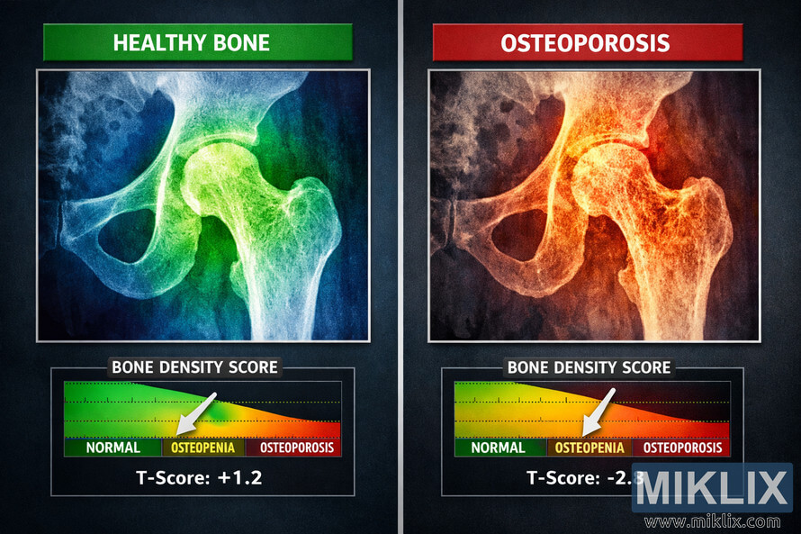
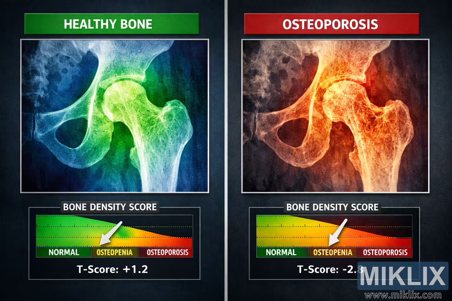
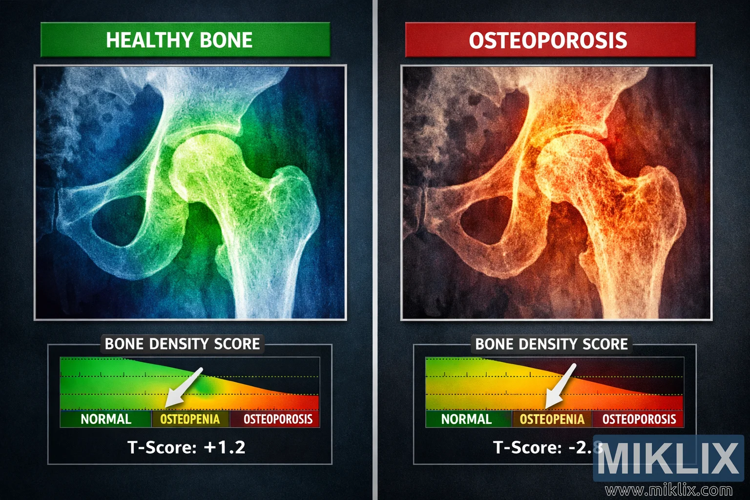
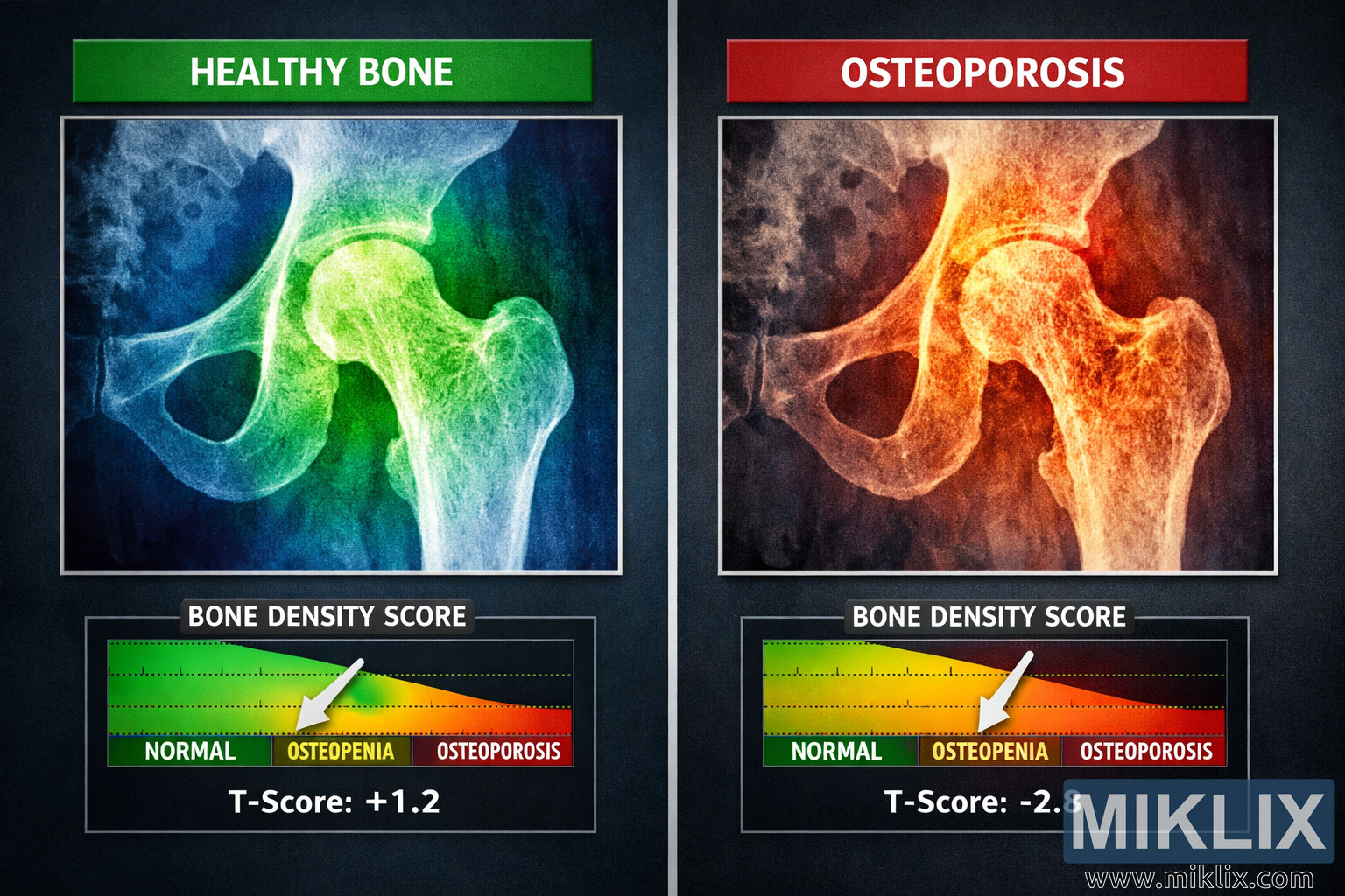
High-resolution bone density scan comparison image showing a healthy hip bone versus an osteoporotic hip bone, with color-coded DEXA scans and T-score graphs illustrating normal bone density and osteoporosis.
Bone Density Scan Comparison of Healthy Bone and Osteoporosis
Versions disponibles de cette image
Les fichiers images téléchargeables ci-dessous sont moins compressés et de meilleure résolution - et donc de meilleure qualité - que les images intégrées dans les articles et les pages de ce site web, qui sont davantage optimisées pour la taille des fichiers afin de réduire la consommation de la bande passante.
Taille normale (1,536 x 1,024)
Grande taille (3,072 x 2,048)
Très grande taille (4,608 x 3,072)
Taille extra-large (6,144 x 4,096)
Taille comique (1,048,576 x 699,051)
- Toujours en cours de téléchargement... ;-)
Description de l'image
This image is a high-resolution, landscape-oriented digital medical illustration that visually compares bone density in a healthy hip bone versus an osteoporotic hip bone. The composition is divided into two equal vertical panels placed side by side against a dark, neutral background that enhances contrast and readability. On the left side, the panel is dedicated to the representation of a healthy bone, while the right side focuses on a bone affected by osteoporosis. Together, these panels create a clear, educational comparison that highlights the differences in bone density and structural integrity between normal bone and bone weakened by disease.
At the top of the left panel, a bold, rectangular label reads "HEALTHY BONE" in white, uppercase text set against a green background. This green label immediately signals that the left scan represents normal bone density and serves as a visual cue for viewers who may be unfamiliar with medical imaging. Below this label, a DEXA (dual-energy X-ray absorptiometry) scan of a hip is displayed. The scan includes the femur and part of the pelvis, showing the ball-and-socket joint of the hip. The bone structures are rendered in bright white, standing out sharply against the darker surrounding tissues. Around the bone, a color-coded density scale overlays the image, transitioning smoothly from green to yellow to blue. These colors represent varying levels of bone mineral density, with green indicating higher density, yellow indicating moderate density, and blue indicating lower—but still within normal or near-normal—density. The overall impression of the left scan is that the bone is solid, well-mineralized, and structurally sound.
Directly beneath the healthy bone scan, a horizontal graph titled "BONE DENSITY SCORE" is displayed on a black background. The graph is divided into three distinct color-coded sections arranged from left to right: green, yellow, and red. The green section on the left is labeled "NORMAL," the yellow middle section is labeled "OSTEOPENIA," and the red section on the right is labeled "OSTEOPOROSIS." These labels are written in clear, legible text, making the graph easy to interpret even for viewers without medical training. A white arrow overlays the graph, pointing firmly into the green "NORMAL" section, visually reinforcing that the bone density in the left panel is within a healthy range. Beneath the graph, in crisp white text, the T-score is displayed as "T-Score: +1.2." This positive T-score value indicates that the bone density is above the average reference value for a young, healthy adult, further emphasizing the robustness of the bone shown in the left panel.
On the right side of the image, the panel is dedicated to illustrating osteoporosis. At the top, a rectangular label reads "OSTEOPOROSIS" in white, uppercase text set against a vivid red background. The red label immediately conveys a sense of warning or concern, signaling that the bone depicted in this panel is compromised. Below the label, another DEXA scan of a hip is shown, mirroring the anatomical region seen in the left panel. The femur and part of the pelvis are again visible, but the visual characteristics of the bone differ markedly from the healthy scan. The bone structures are still highlighted in white, but the surrounding color-coded density scale now transitions from yellow to orange to red. These warmer colors indicate reduced bone mineral density, with yellow representing mildly decreased density, orange indicating more significant loss, and red highlighting areas of severely diminished density. The overall impression of the right scan is that the bone is fragile, porous, and at increased risk of fracture.
Beneath the osteoporotic bone scan, a second "BONE DENSITY SCORE" graph is displayed, mirroring the layout of the graph under the healthy bone scan. This graph also features three horizontal sections: green on the left labeled "NORMAL," yellow in the middle labeled "OSTEOPENIA," and red on the right labeled "OSTEOPOROSIS." The consistent design between the two graphs helps viewers quickly compare the bone density status of each hip. In the right panel, a white arrow overlays the graph and points decisively into the red "OSTEOPOROSIS" section, visually indicating that the bone density has fallen into the range associated with osteoporosis. Beneath this graph, the T-score is shown in white text as "T-Score: -2.8." This negative T-score value reflects a significant reduction in bone mineral density compared to a young, healthy reference population, confirming the diagnosis of osteoporosis and underscoring the severity of bone loss.
The two panels are carefully aligned so that the hip scans and their corresponding graphs form a balanced, symmetrical composition. The healthy and osteoporotic hips are positioned at similar heights, allowing viewers to compare the anatomical structures directly. The color schemes of the density scales and graphs are intentionally coordinated: green is consistently associated with normal bone density, yellow with intermediate or borderline density, and red with severely reduced density. This consistent use of color coding makes the image intuitive and accessible, even for those without a medical background.
The background of the entire image is dark and unobtrusive, ensuring that the bright white bones and vivid color gradients stand out clearly. The lighting is even and uniform across both panels, with no glare or shadowing that might obscure important details. The text labels, arrows, and graph divisions are all rendered with high clarity, using simple fonts and strong contrast to maximize legibility. The overall visual style is clinical and professional, resembling the type of educational material that might be used in a medical textbook, patient brochure, or healthcare presentation.
In addition to its aesthetic qualities, the image serves a strong educational purpose. It visually explains the concept of bone density and how it is measured using T-scores. By placing the healthy bone and osteoporotic bone side by side, the image highlights the progression from normal bone density to severe bone loss. The healthy bone panel demonstrates what a robust, well-mineralized hip looks like, with a T-score in the positive range and a density scale dominated by cooler colors such as green and blue. In contrast, the osteoporotic bone panel shows the consequences of chronic bone loss, with a markedly negative T-score and a density scale dominated by warmer colors such as orange and red.
The image also subtly conveys the clinical implications of these findings. The healthy bone, with its strong density and positive T-score, suggests resilience and a lower risk of fracture. The osteoporotic bone, with its weakened structure and negative T-score, suggests vulnerability and a higher risk of fractures, particularly in the hip region, which is a common site of serious injury in individuals with osteoporosis. By presenting these two states side by side, the image encourages viewers to understand the importance of maintaining bone health through lifestyle, nutrition, and medical care.
Overall, this bone density scan comparison image is a detailed, high-quality visual representation of the difference between healthy bone and bone affected by osteoporosis. It combines anatomical accuracy, clear color coding, and informative text elements to create a powerful educational tool. The side-by-side layout, labeled panels, T-score graphs, and contrasting color schemes work together to make the complex concept of bone density accessible and understandable to a wide audience, including patients, students, and healthcare professionals.
L'image est liée à : Health Benefits of Chives: Nature's Nutritional Powerhouse