
Hoto: Healthy vs. Unhealthy Potato Preparation: A Visual Comparison of Calories and Nutrition
Buga:
An sabunta ta ƙarshe: 4 Agusta, 2026 da 13:57:22 UTC
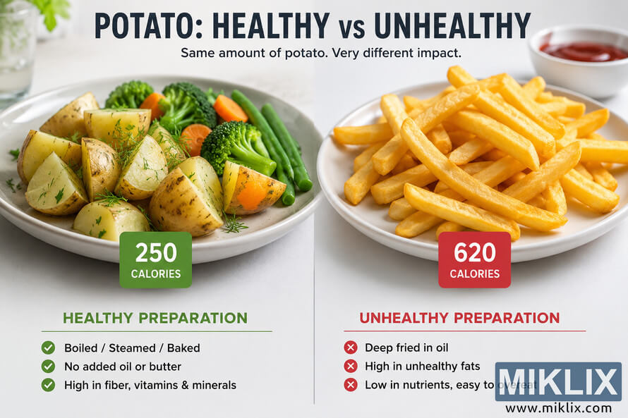
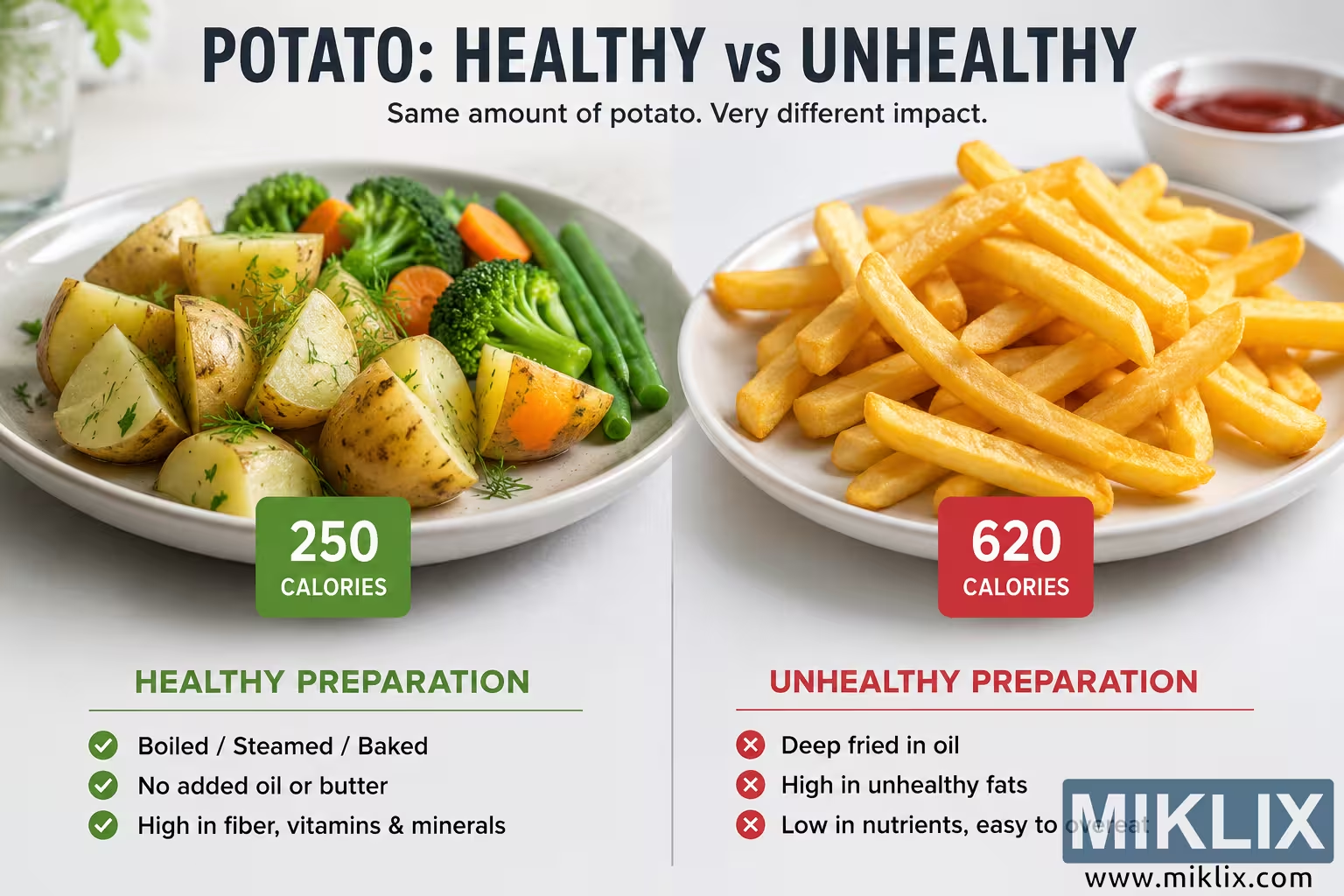
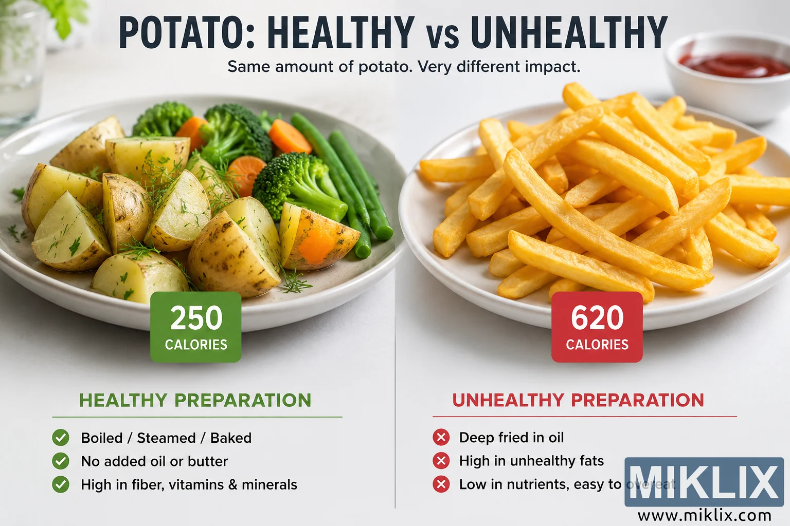
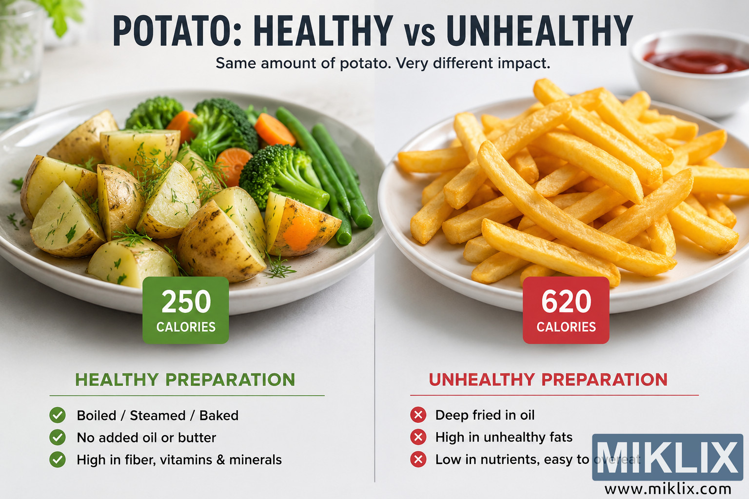
A landscape infographic illustrating the difference between healthy and unhealthy potato preparation methods. It compares boiled or baked potatoes with vegetables against deep-fried fries, highlighting the substantial difference in calories and nutritional impact through a clean side-by-side visual layout.
Healthy vs. Unhealthy Potato Preparation: A Visual Comparison of Calories and Nutrition
Sigar da ake da ita ta wannan hoton
Fayilolin hotunan da ake da su don saukewa a ƙasa ba su da matsewa kuma suna da ƙuduri mafi girma - kuma sakamakon haka, inganci mafi girma - fiye da hotunan da aka saka a cikin labarai da shafuka akan wannan gidan yanar gizon, waɗanda aka fi inganta su don girman fayil don rage yawan amfani da bandwidth.
Girman yau da kullun (1,536 x 1,024)
Babban girma (3,072 x 2,048)
Girma mai girma sosai (4,608 x 3,072)
Girman da ya fi girma (6,144 x 4,096)
Girman barkwanci mai girma (1,048,576 x 699,051)
- Har yanzu ana lodawa... ;-)
Bayanin Hoto
This landscape-oriented infographic presents a clear, side-by-side comparison between two different ways of preparing potatoes, emphasizing how cooking methods can dramatically influence calorie content and nutritional value. The overall design is clean, bright, and modern, using a balanced composition with a neutral light-colored background that keeps attention focused on the food. The image is divided vertically into two equal halves, creating an immediate visual contrast between a healthier preparation on the left and a less healthy preparation on the right. At the very top, a large bold headline reads "POTATO: HEALTHY vs UNHEALTHY," followed by a smaller subtitle explaining that the same amount of potato can have a very different impact depending on how it is prepared. The typography is large, highly legible, and centered across the top of the composition.
On the left side, a large ceramic plate contains chunky pieces of cooked potato with their skins still attached. The potatoes appear lightly seasoned with fresh herbs and have a natural yellow color rather than the golden-brown appearance associated with frying. Surrounding the potatoes are colorful vegetables including bright green broccoli florets, sliced orange carrots, and green beans, reinforcing the concept of a balanced and nutritious meal. The vegetables appear freshly cooked and retain vibrant colors, contributing to an overall impression of freshness and health. Below the plate is a green square badge displaying an approximate calorie value of 250 calories. Underneath, a bold green heading identifies this as the healthy preparation. A short checklist with green checkmark icons explains the characteristics of this preparation, including that the potatoes are boiled, steamed, or baked, contain no added oil or butter, and provide fiber, vitamins, and minerals. The green color palette throughout this section visually reinforces the message of health and positive nutritional value.
The right side presents a contrasting plate filled with thick-cut deep-fried potato fries. The fries are golden in color with a crisp exterior and are stacked into a generous pile. A small bowl containing a red dipping sauce is positioned in the upper background, adding context to the meal while remaining secondary to the fries themselves. Below the plate is a red square badge displaying an approximate calorie value of 620 calories. A bold red heading identifies this as the unhealthy preparation. Beneath the heading, a checklist marked with red circular icons containing white "X" symbols highlights several negative characteristics. These include deep frying in oil, a higher level of unhealthy fats, and lower nutrient density combined with an increased likelihood of overeating. The consistent use of red coloring distinguishes this side from the healthier alternative and visually communicates caution.
A thin vertical dividing line separates the two halves of the infographic, making the comparison immediately understandable. The lighting across the entire image is soft and even, creating a realistic food-photography appearance with subtle shadows beneath the plates. The dishes themselves are presented on similar white plates to ensure that differences in appearance are primarily due to preparation method rather than presentation. No recognizable commercial brands, logos, trademarks, or packaging are visible anywhere in the composition. The emphasis remains entirely on the visual comparison between cooking methods and their potential nutritional consequences.
Overall, the infographic communicates that potatoes themselves are not inherently unhealthy but that preparation choices can substantially influence calorie intake and nutritional quality. By placing minimally processed potatoes with vegetables alongside deep-fried fries and pairing each with color-coded calorie indicators and concise explanatory bullet points, the design creates an educational visual that is easy to understand at a glance while still providing meaningful supporting information. The landscape layout, balanced spacing, high contrast, and simple organization make the infographic suitable for educational materials, nutrition discussions, presentations, health-related articles, wellness blogs, and informational websites.
Hoton yana da alaƙa da: The Surprising Health Benefits of Potatoes: A Complete Nutrition Guide