
Image: Dill Nutrition Facts Label Highlighting Vitamins, Minerals, and Health Benefits
Published: July 23, 2026 at 6:43:02 PM UTC
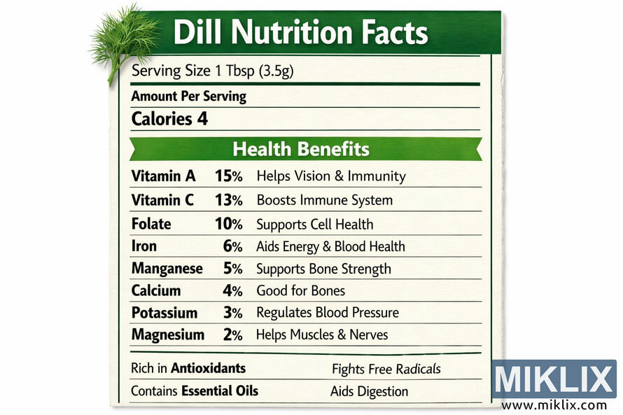
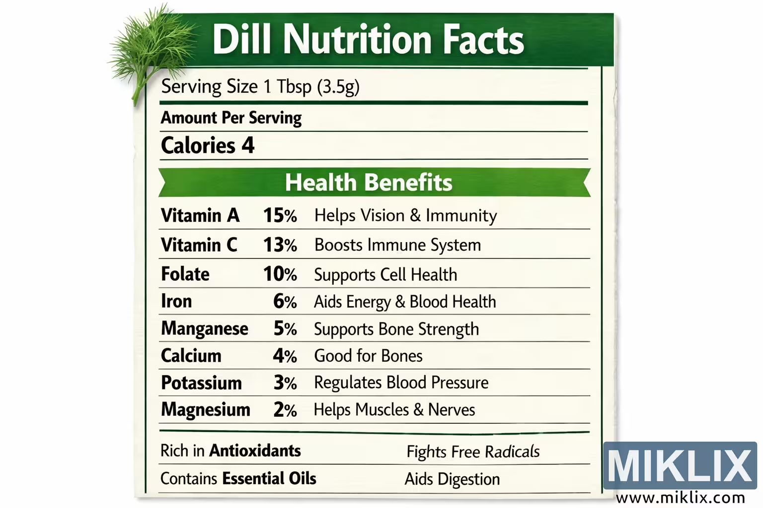
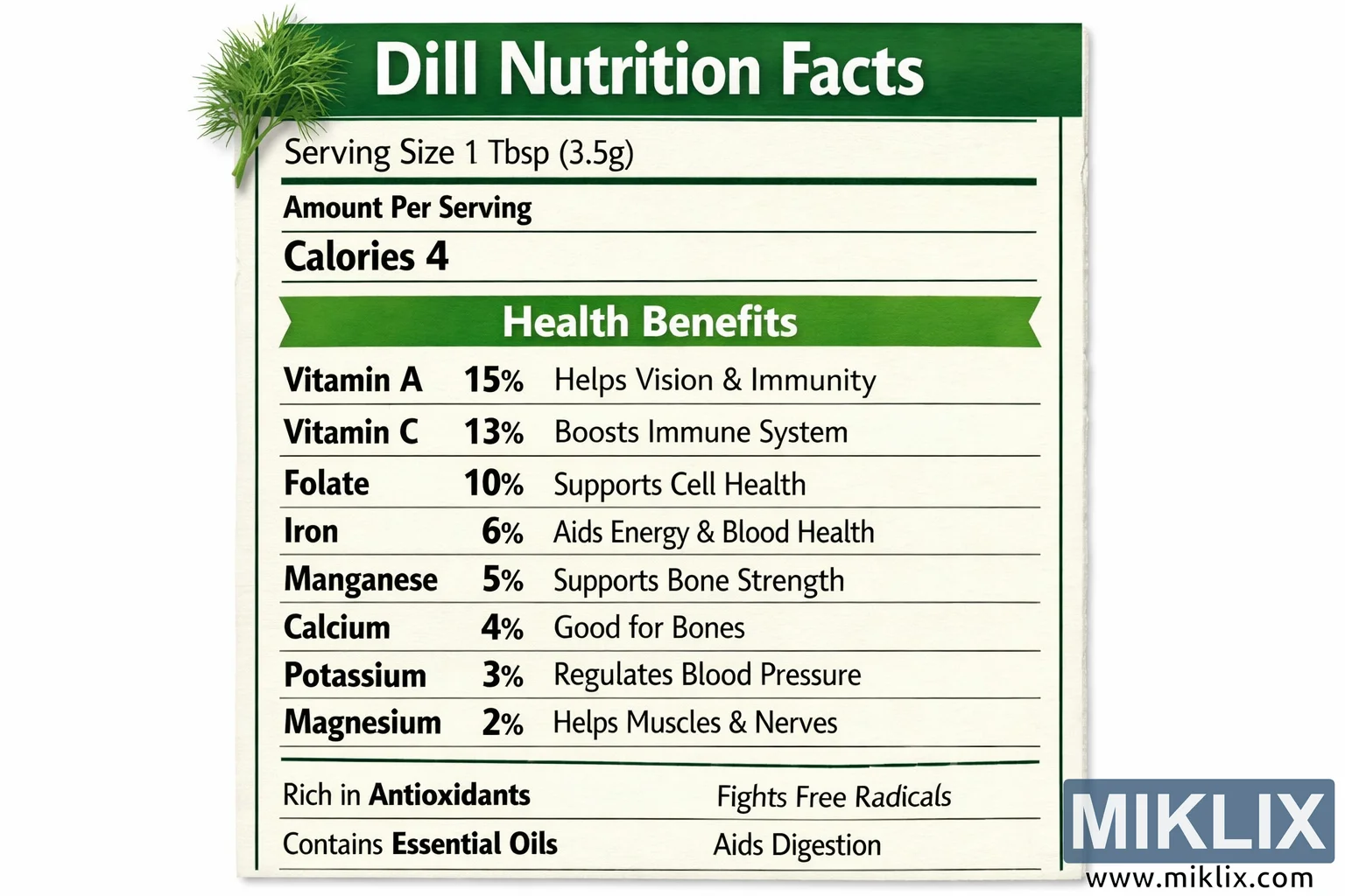
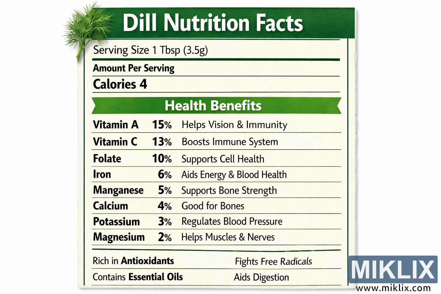
High-resolution landscape image of a dill nutrition facts label featuring serving size, calories, key vitamins and minerals, and clearly listed health benefits such as immune support, bone strength, blood pressure regulation, antioxidant protection, and digestive aid, all presented on a clean white background with green accents and a fresh dill illustration.
Available versions of this image
The image files available for download below are less compressed and higher resolution - and as a result of that, higher quality - than the images embedded in articles and pages on this website, which are more optimized for file size in order to reduce bandwidth consumption.
Regular size (1,536 x 1,024)
Large size (3,072 x 2,048)
Very large size (4,608 x 3,072)
Extra large size (6,144 x 4,096)
Comically large size (1,048,576 x 699,051)
- Still uploading... ;-)
Image description
This image presents a clean, modern nutrition facts label dedicated specifically to dill, designed to look like a professional food packaging panel while emphasizing the herb’s vitamins, minerals, and health benefits. The layout is in landscape orientation, filling the frame with a crisp white background bordered and structured by green and black elements that guide the viewer’s eye from top to bottom. At the very top of the label, a wide green banner stretches horizontally across the image. Centered within this banner, in large, bold, white text, is the title "Dill Nutrition Facts." The typeface is simple and highly legible, reminiscent of standard nutrition labels but with a slightly more contemporary feel. To the left of the title, overlapping the green banner, there is a stylized illustration of a sprig of fresh dill. The dill is depicted with delicate, feathery leaves branching out from thin stems, rendered in a vibrant green that visually reinforces the herb’s freshness and natural origin. This illustration adds a touch of organic character to the otherwise structured and informational design. Directly beneath the green title banner, the main body of the label begins. The first line reads "Serving Size 1 Tbsp (3.5g)" in black text on the white background, clearly indicating the portion used for the nutritional and health information that follows. The font here is slightly smaller than the title but still bold enough to stand out as a key detail. Below this, another line in bold text states "Amount Per Serving," functioning as a heading for the primary quantitative information. Underneath that heading, the word "Calories" appears in bold black text, followed by the number "4" in a larger, heavier font, emphasizing that dill is very low in calories. This top section mirrors the familiar structure of standard nutrition panels, making the information feel intuitive and easy to interpret. A solid horizontal line separates this upper portion from the more detailed health information below, visually dividing the basic serving and calorie data from the benefits section. Under this line, a new heading appears: "Health Benefits," written in bold green text against the white background. This heading is slightly larger than the surrounding body text and serves as a clear transition from numeric nutrition data to descriptive wellness information. The "Health Benefits" section is organized into a neat list of eight key nutrients found in dill, each presented on its own line. On the left side of each line, the nutrient name is written in bold black text, followed immediately by its percentage of the daily value, also in bold. To the right of each nutrient and percentage, in smaller, regular-weight text, is a short phrase describing the associated health benefit. The first line reads "Vitamin A 15% Helps Vision & Immunity," highlighting dill’s contribution to eye health and immune function. The second line states "Vitamin C 13% Boosts Immune System," reinforcing dill’s role in supporting immune defenses. The third line lists "Folate 10% Supports Cell Health," pointing to its importance in cellular function and growth. The fourth line shows "Iron 6% Aids Energy & Blood Health," connecting iron intake with vitality and healthy blood. The fifth line reads "Manganese 5% Supports Bone Strength," emphasizing skeletal support. The sixth line states "Calcium 4% Good for Bones," further underscoring bone health. The seventh line presents "Potassium 3% Regulates Blood Pressure," linking dill to cardiovascular balance. The eighth line concludes with "Magnesium 2% Helps Muscles & Nerves," indicating benefits for muscular and nervous system function. Each of these lines is carefully aligned, with the nutrient names and percentages forming a left column and the health benefit phrases forming a right column. The consistent alignment and spacing create a sense of order and clarity, making it easy for the viewer to scan the list and understand how dill contributes to different aspects of health. The use of bold text for the nutrient names and percentages ensures that the quantitative information stands out, while the smaller descriptive text provides context without overwhelming the viewer. Below the list of eight nutrients, another horizontal line separates the main health benefits section from two additional highlighted statements at the bottom of the label. The first statement reads "Rich in Antioxidants" on the left, with "Fights Free Radicals" on the right. This pairing succinctly communicates that dill contains compounds that help protect the body from oxidative stress. The second statement reads "Contains Essential Oils" on the left, with "Aids Digestion" on the right, suggesting that dill’s aromatic components may support digestive comfort and function. These two lines are presented in the same structured, left-right format as the nutrient list, maintaining visual consistency and reinforcing the idea that dill offers multiple layers of wellness benefits beyond basic vitamins and minerals. The overall color scheme of the label is limited to white, green, and black, creating a clean and trustworthy aesthetic. The white background keeps the design bright and uncluttered, while the green elements—such as the title banner, the "Health Benefits" heading, and the dill illustration—evoke freshness, nature, and vitality. Black text is used for most of the informational content, ensuring maximum readability and contrast. The typography is straightforward and sans-serif, with variations in weight and size used to establish hierarchy rather than decorative flourishes. The image is captured as a full, straight-on shot of the label, with even, well-balanced lighting that eliminates glare and shadows. Every line of text, every horizontal divider, and the dill illustration are sharp and clearly visible, suggesting a high-resolution print or digital rendering. The composition is symmetrical and centered, with the title, sections, and text blocks all aligned to create a harmonious visual flow from top to bottom. The focal points of the image are the "Dill Nutrition Facts" title at the top and the "Health Benefits" section in the middle, drawing the viewer’s attention first to the identity of the product and then to the detailed wellness information. Overall, the image communicates that dill is a low-calorie herb rich in vitamins, minerals, antioxidants, and beneficial essential oils, presented in a format that feels familiar, authoritative, and easy to understand.
The image is related to: Health Benefits of Dill: Your Complete Guide to This Powerful Herb