
图像: Cholesterol Levels Decreasing on Medical Chart
已出版:
最后更新 2026年9月7日 UTC 06:31:55
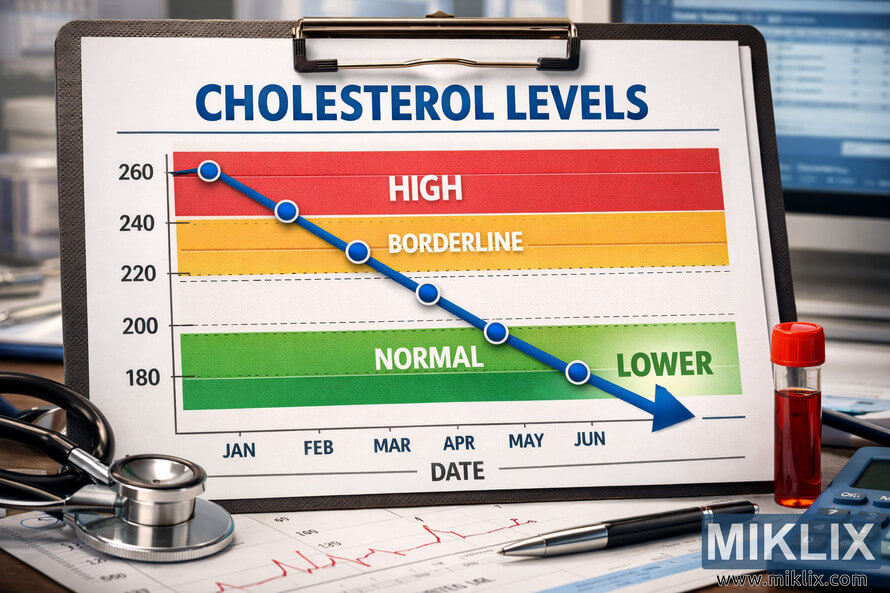
A detailed medical illustration depicting cholesterol levels decreasing on a professional health chart, symbolizing improved cardiovascular health and effective treatment outcomes.
Cholesterol Levels Decreasing on Medical Chart
该图片的可用版本
与本网站文章和网页中嵌入的图片相比,以下可供下载的图片文件压缩程度更低,分辨率更高,因此质量也更高。
正常尺寸 (1,536 x 1,024)
大尺寸 (3,072 x 2,048)
尺寸非常大 (4,608 x 3,072)
超大尺寸 (6,144 x 4,096)
夸张的大尺寸 (1,048,576 x 699,051)
- 仍在上传......;-)
图片说明
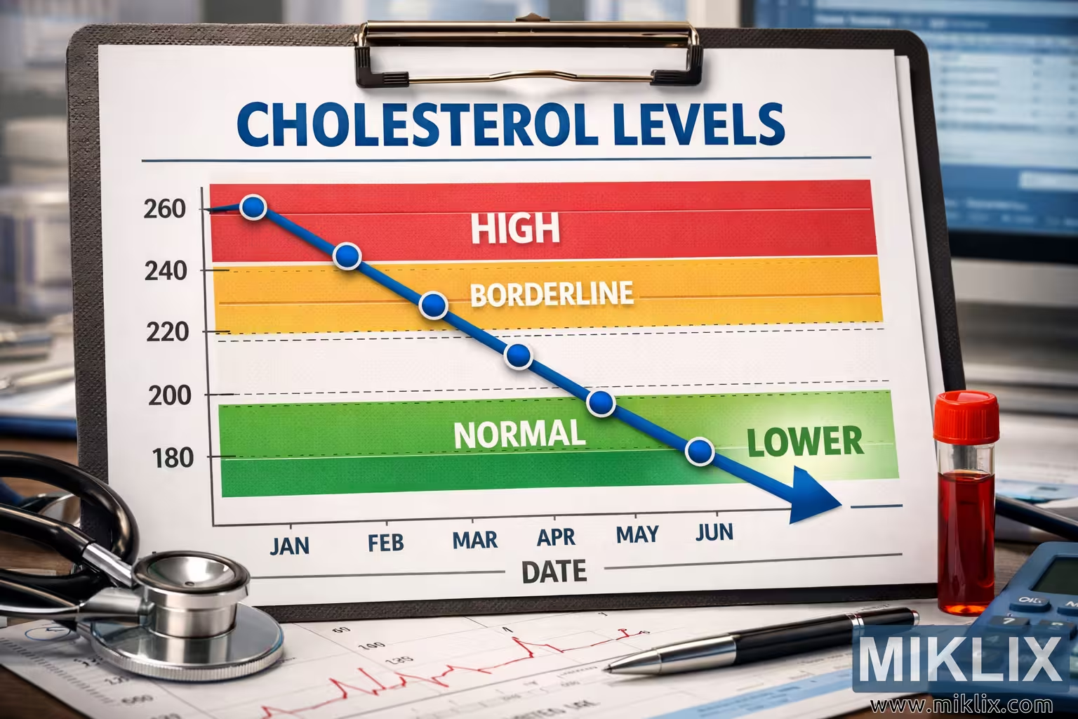
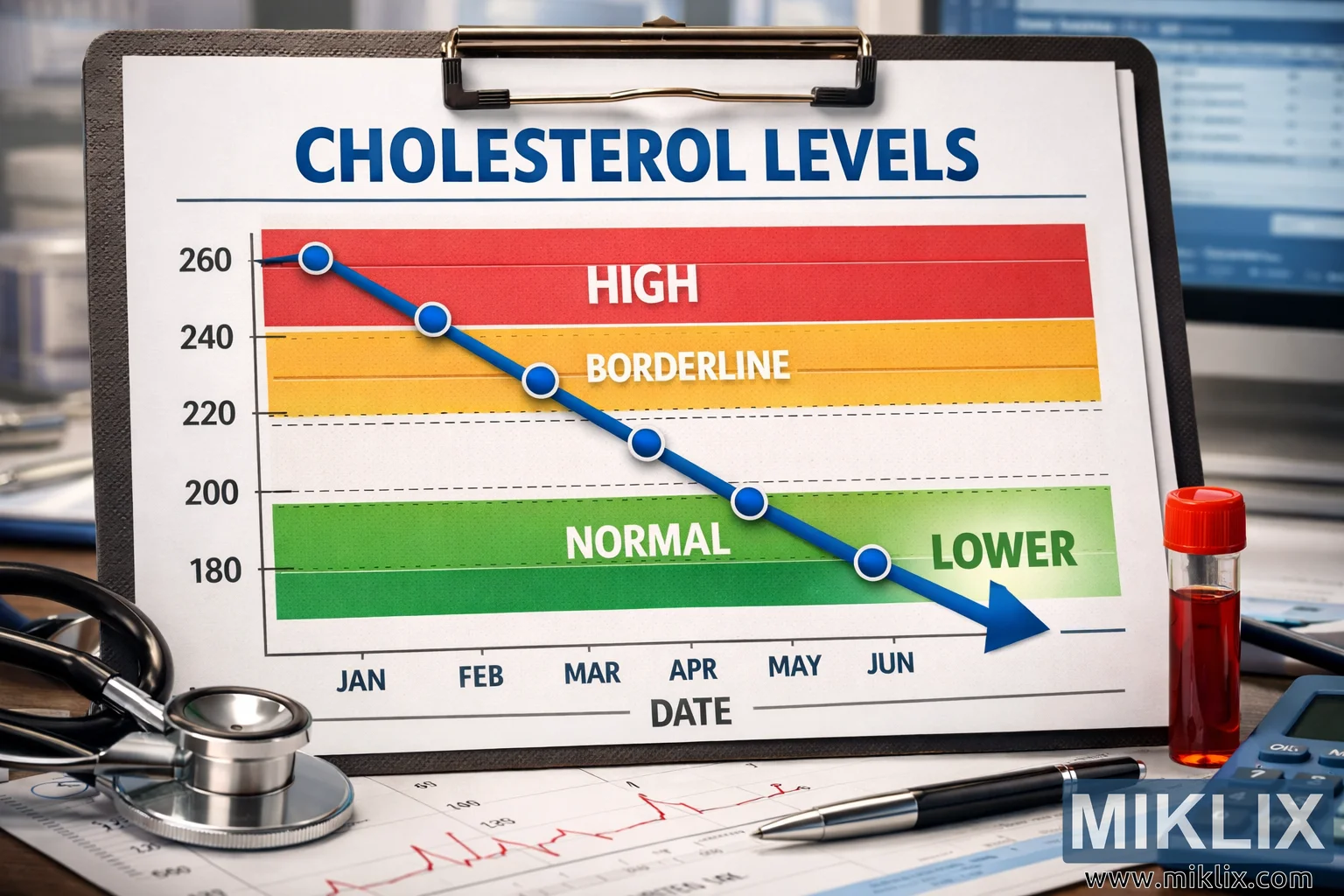
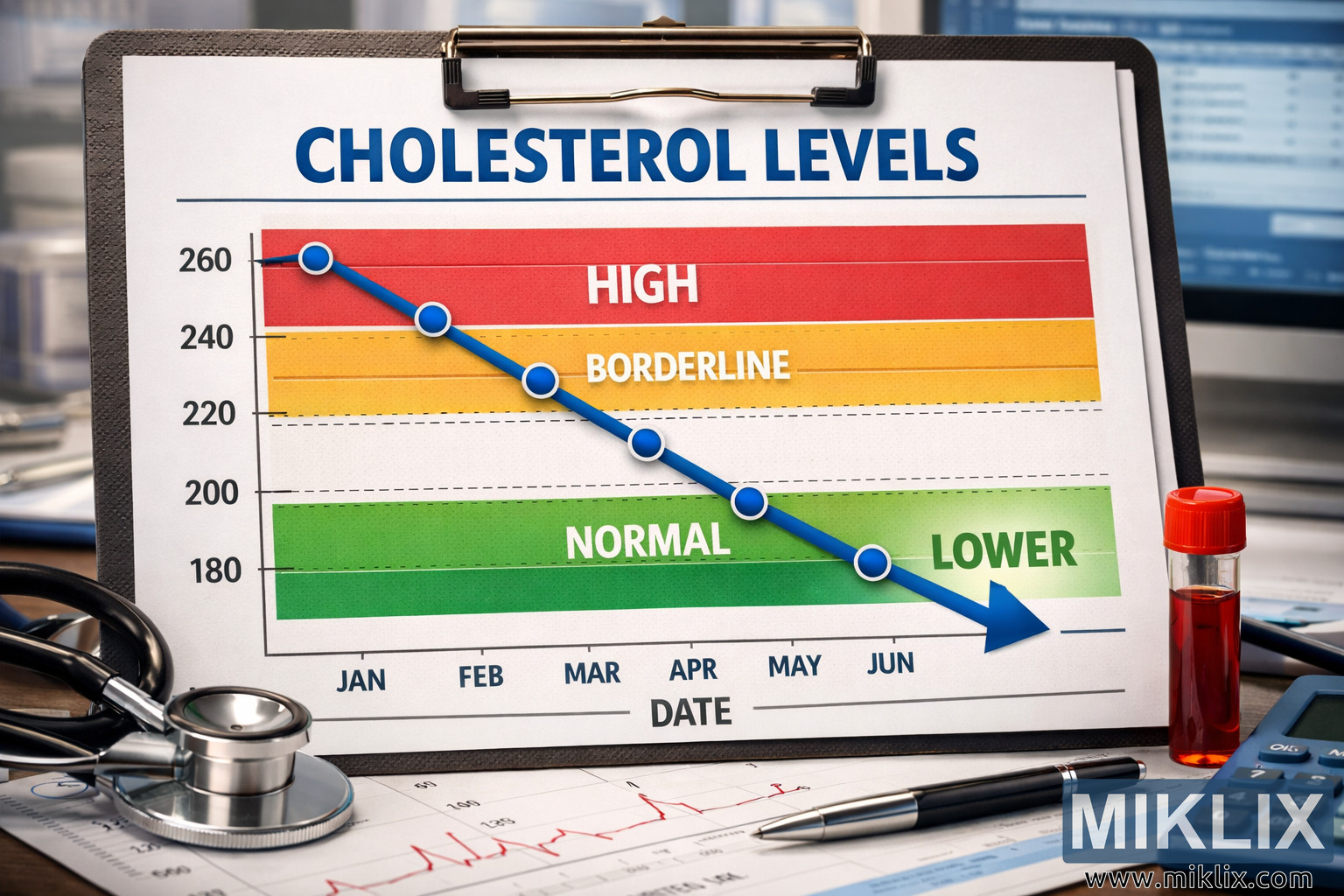
The image presents a meticulously arranged medical scene centered around a cholesterol monitoring chart that visually communicates a steady improvement in cardiovascular health. The chart itself is the focal point, occupying the majority of the frame in a landscape orientation. It is printed on crisp white paper and secured to a metallic clipboard, which rests on a clean, professional desk surface. The title 'CHOLESTEROL LEVELS' appears prominently at the top of the chart in bold, blue, capitalized letters, immediately drawing the viewer’s attention and establishing the subject matter. Beneath the title, three horizontal color-coded sections divide the chart into distinct zones: the upper red section labeled 'HIGH,' the middle yellow section labeled 'BORDERLINE,' and the lower green section labeled 'NORMAL.' These zones represent the gradations of cholesterol measurement, from unhealthy to optimal levels.
A blue line graph traverses diagonally across the chart from the upper left corner to the lower right, symbolizing a consistent decline in cholesterol levels over time. Each data point along this line is marked with a small blue circle, connected by a smooth line that descends through the red and yellow zones before settling firmly in the green 'NORMAL' area. The final data point is emphasized with a downward-pointing arrow and the word 'LOWER' in bold, green capital letters, reinforcing the positive trend. The x-axis at the bottom of the chart is labeled 'DATE' and includes monthly markers—JAN, FEB, MAR, APR, MAY, and JUN—indicating a six-month monitoring period. The y-axis on the left side is labeled 'CHOLESTEROL LEVEL' and features numerical values ranging from 260 at the top to 180 at the bottom, providing a clear quantitative scale.
Surrounding the chart are several medical instruments and contextual elements that enhance the realism and professional tone of the image. To the left, a stethoscope with a silver chest piece and black tubing lies partially visible, suggesting the involvement of a healthcare professional in monitoring the patient’s progress. To the right, a capped blood sample vial filled with red liquid rests near the chart, symbolizing laboratory testing and analysis. A silver pen with a polished clip and tip is positioned on the lower right corner of the chart, ready for annotation or signature. Behind the chart, a blue calculator and a blurred computer monitor displaying medical data contribute to the atmosphere of a clinical workspace, emphasizing precision and data-driven healthcare.
The lighting in the image is bright and evenly distributed, highlighting the chart’s details while maintaining a natural tone. The colors are vivid yet balanced—the red, yellow, and green zones contrast effectively with the white background, while the blue line and text add a sense of calm and professionalism. The composition is carefully arranged to evoke a sense of progress and optimism, with the downward slope of the line graph visually guiding the viewer’s eye toward the 'NORMAL' zone. The overall aesthetic conveys a message of successful treatment, disciplined health management, and measurable improvement.
In the background, subtle blur effects ensure that the viewer’s focus remains on the chart and its message. The computer screen, though indistinct, hints at ongoing data analysis and medical recordkeeping. The desk surface is uncluttered, reinforcing the sense of order and professionalism typical of a medical environment. The image’s high resolution allows for fine details—such as the texture of the paper, the metallic sheen of the clipboard clip, and the reflective surfaces of the stethoscope and pen—to be clearly visible. These details contribute to the authenticity and depth of the composition.
Overall, the image encapsulates the concept of health improvement through visual storytelling. It combines scientific precision with aesthetic clarity, making it suitable for educational, medical, or wellness contexts. The downward trend of the cholesterol line is not merely a graphical element but a metaphor for positive change, discipline, and effective healthcare intervention. The viewer is left with a sense of reassurance and accomplishment, as the visual narrative celebrates the journey from high cholesterol toward a healthier, balanced state.
图片与此有关: Pumpkins: The Nutrient-Packed Superfood You Should Eat Year-Round