
Image: Grain and Hops Ratio: A Visual Guide to Beer Styles
Published: September 22, 2026 at 3:49:16 PM UTC
Explore a visual guide to grain and hops ratios across common beer styles, illustrated with beer glasses, grains, hops, example ratios, and brewing balance tips.
Available versions of this image
The image files available for download below are less compressed and higher resolution - and as a result of that, higher quality - than the images embedded in articles and pages on this website, which are more optimized for file size in order to reduce bandwidth consumption.
Regular size (1,536 x 1,024)
Large size (3,072 x 2,048)
Very large size (4,608 x 3,072)
Extra large size (6,144 x 4,096)
Comically large size (1,048,576 x 699,051)
- Still uploading... ;-)
Image description
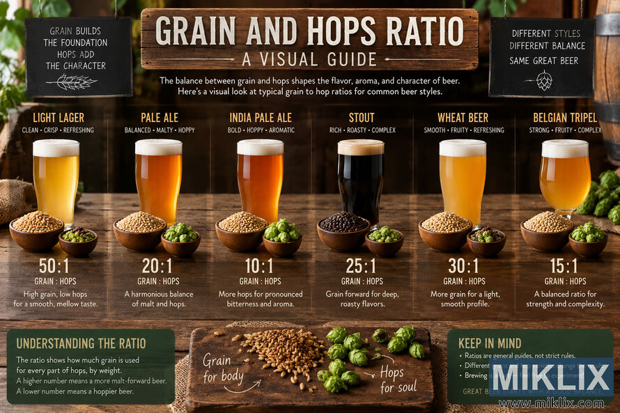
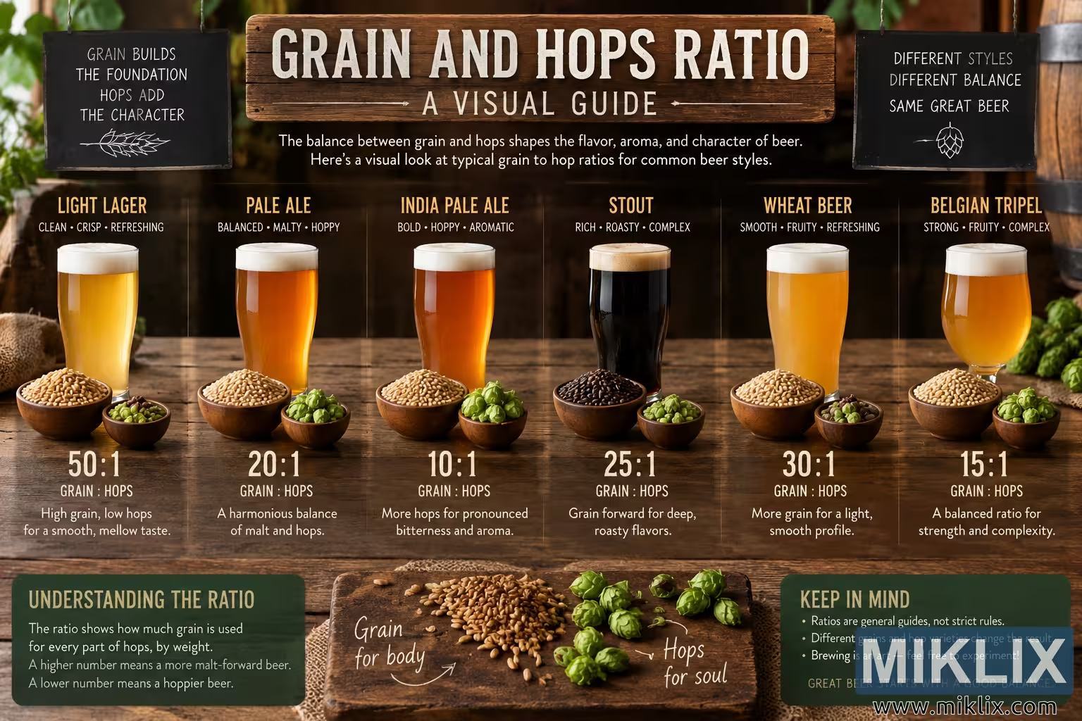
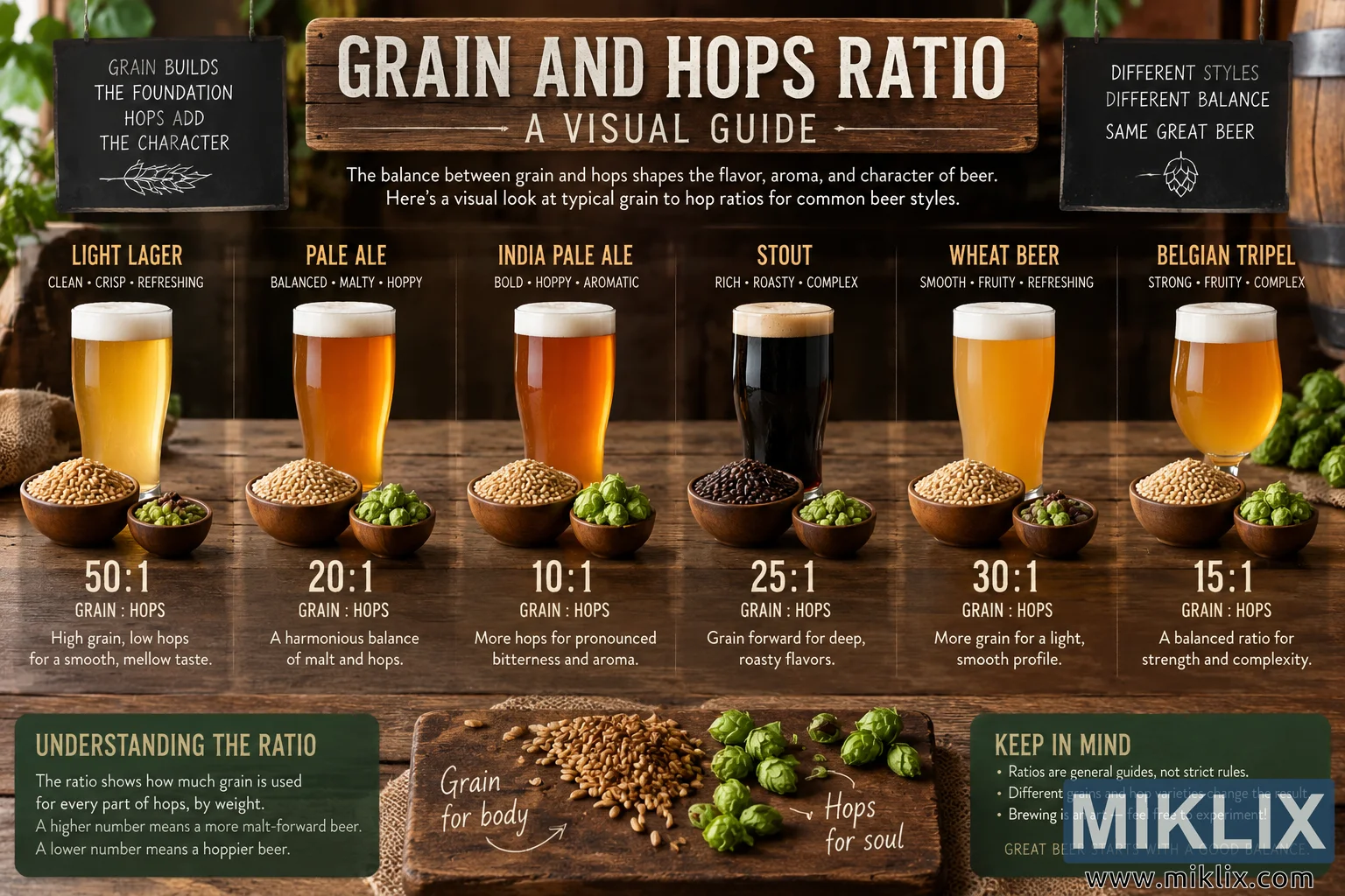
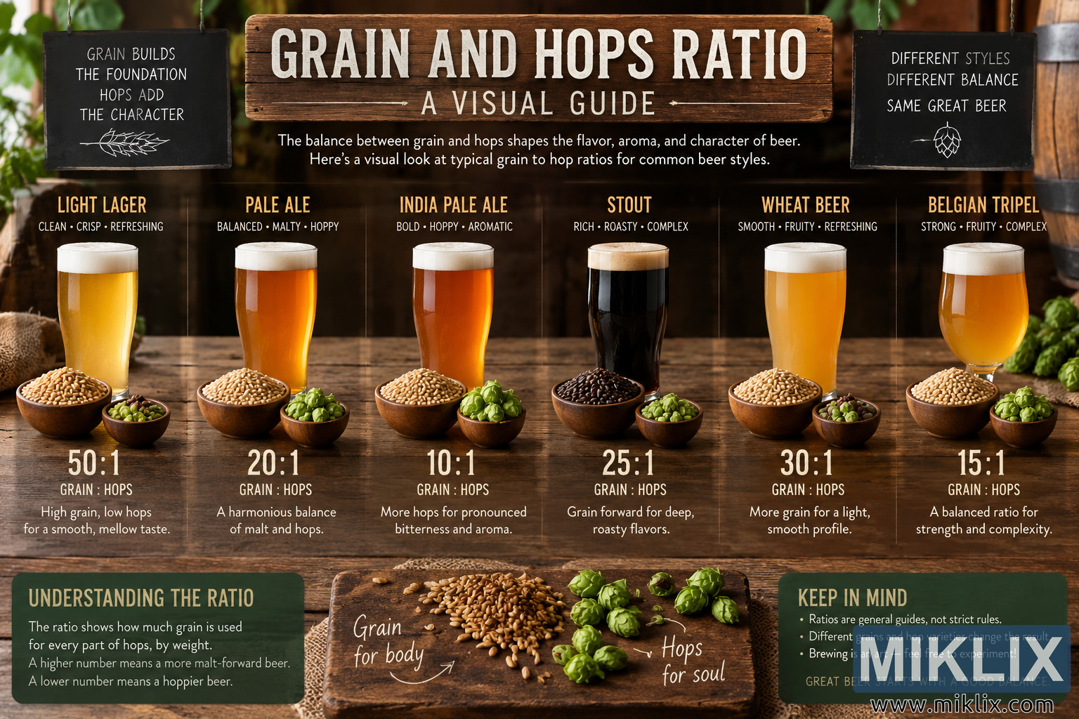
A wide, landscape-oriented educational infographic presents a visual guide to the relationship between grain and hops in beer recipes. The scene is styled like a warm, rustic brewery or taproom, with a dark wooden background, a substantial wooden tabletop, softly blurred greenery, and portions of brewing barrels visible around the edges. The overall palette is dominated by natural brown wood tones, golden and amber beer colors, fresh green hops, pale tan grain, cream-colored foam, and dark chalkboard panels. No commercial logos, packaging, trademarks, or recognizable brand identities appear anywhere in the composition.
At the top center, a large weathered wooden sign carries the main heading, “GRAIN AND HOPS RATIO,” in prominent white lettering, followed by the subtitle “A VISUAL GUIDE.” Beneath the sign is a short introductory statement explaining that the balance between grain and hops shapes the flavor, aroma, and character of beer and that the infographic provides a visual look at typical grain-to-hop ratios for common beer styles. Hanging on the upper left is a small black chalkboard with handwritten-style text stating that grain builds the foundation while hops add the character, accompanied by a simple botanical line drawing. A matching chalkboard on the upper right emphasizes that different styles have different balances while sharing the broader concept of beer, with a small hop illustration underneath.
The central portion of the infographic is divided into six vertical sections, each representing a different general beer style. Every section contains a glass of beer, bowls representing grain and hops, a numerical grain-to-hops ratio, and a short explanation of the resulting balance. The first section represents a light lager. Its tall glass contains a very pale golden beer topped with a clean white foam head. A relatively large bowl of light-colored grain and a much smaller bowl of green hops sit in front of the glass. The displayed ratio is 50:1 grain to hops, visually communicating a strongly grain-forward balance intended to create a smooth and mellow character.
The second section represents pale ale. The beer is deeper amber-gold, again shown with a foamy white head. Grain and hop bowls sit prominently in front, and the displayed ratio is 20:1. The accompanying wording characterizes the relationship as a harmonious balance between malt and hops. The third section represents India pale ale. Its beer is a saturated orange-amber color, while the bowl of hops appears more prominent than in the lighter lager example. The ratio shown is 10:1 grain to hops, illustrating a recipe direction with comparatively more hops and therefore more pronounced bitterness and aroma.
The fourth section depicts stout. A straight-sided glass contains an almost black beer with a tan or light brown foam head, creating a strong visual contrast with the golden beers surrounding it. The grain bowl is filled with much darker roasted material, reinforcing the roasted malt character commonly associated with this style. A small bowl of green hops accompanies it. The displayed ratio is 25:1 grain to hops, with explanatory text indicating that the grain-forward composition supports deep, rich, roasted flavors.
The fifth section represents wheat beer. The glass contains a hazy-looking golden-orange beer beneath a pale foam head. Light-colored grain and green hops are arranged in bowls at its base. A 30:1 grain-to-hops ratio is displayed, accompanied by wording that associates the higher grain proportion with a light, smooth profile. The sixth and final section represents Belgian tripel. The beer is presented in a rounded, stemmed glass and has a bright golden to amber appearance with a white foam cap. Bowls of pale grain and vivid green hops appear in the foreground. Its displayed ratio is 15:1, described as a balanced relationship intended to complement strength, fruitiness, and complexity.
Across all six sections, the glasses form a visually consistent row while differences in glass shape, beer color, grain color, and ingredient proportions help distinguish the styles. The bowls are rendered with a tactile, photographic appearance: individual kernels can be seen in the grain, while the hops have layered green cones and leafy textures. Warm directional lighting creates highlights on the glassware and ingredients and casts soft shadows across the rough wooden surface, giving the educational graphic a realistic food-photography quality rather than the flat appearance of a conventional chart.
The lower portion of the image contains additional explanatory panels. On the left, a dark green-black chalkboard titled “UNDERSTANDING THE RATIO” explains the basic concept: the ratio indicates how much grain is used for each part of hops by weight, with a higher number generally corresponding to a more malt-forward beer and a lower number corresponding to a hoppier beer. In the center, a rustic wooden board displays a loose pile of tan grain on the left and several bright green hop cones on the right. Handwritten-style annotations label the ingredients with the phrases “Grain for body” and “Hops for soul,” visually reinforcing the idea that the two ingredients contribute different dimensions to the finished drink.
On the lower right, another dark chalkboard titled “KEEP IN MIND” adds context to the numerical examples. It notes that ratios should be treated as general guides rather than strict rules, that different grain types and hop varieties can alter the result, and that brewing allows room for experimentation. A final line emphasizes the theme of achieving a good balance. The composition therefore functions as both an attractive brewery-inspired still life and an introductory educational chart. It uses repeated ingredient bowls, differently colored beers, clear numerical ratios, and concise explanatory copy to make the grain-versus-hops concept visually accessible. The overall mood is warm, handcrafted, traditional, and approachable, with rustic timber, chalkboard typography, natural ingredients, and softly lit glassware creating the atmosphere of an artisanal brewing environment without referencing or promoting any actual beer brand.
The image is related to: Hops in Beer Brewing: Defender