
Image: American Cascade vs. Dr Rudi Hops: Visual Aroma and Flavor Comparison
Published: September 24, 2026 at 2:44:22 PM UTC
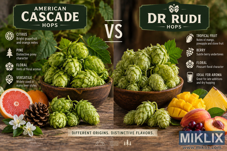
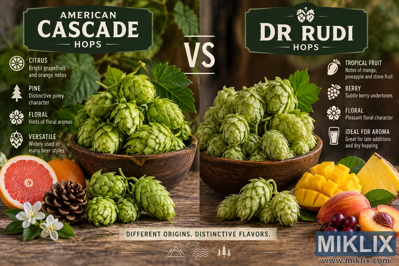
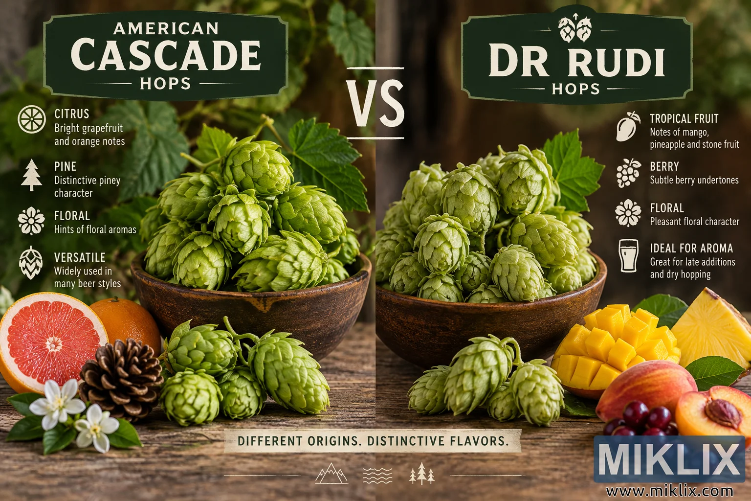
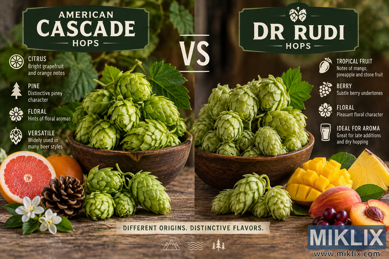
Visual comparison of American Cascade and Dr Rudi hops, highlighting their contrasting citrus, pine, floral, tropical fruit, berry and stone-fruit aroma characteristics.
Available versions of this image
The image files available for download below are less compressed and higher resolution - and as a result of that, higher quality - than the images embedded in articles and pages on this website, which are more optimized for file size in order to reduce bandwidth consumption.
Regular size (1,536 x 1,024)
Large size (3,072 x 2,048)
Very large size (4,608 x 3,072)
Extra large size (6,144 x 4,096)
Comically large size (1,048,576 x 699,051)
- Still uploading... ;-)
Image description
A landscape-format comparison image presents American Cascade hops and Dr Rudi hops side by side in a warm, rustic, editorial-style composition. The scene is arranged as a symmetrical visual comparison, with American Cascade occupying the left half and Dr Rudi occupying the right half. Both hop varieties are represented by generous piles of fresh green hop cones placed in dark brown, weathered ceramic bowls on a rough wooden tabletop. The background is softly blurred and filled with natural brown and green tones, suggesting a hop garden, brewery, farm, or other agricultural setting. Warm directional lighting highlights the layered texture of the hop cones, giving their overlapping green bracts a fresh, tactile appearance while maintaining a natural and inviting atmosphere.
At the upper left, a large dark green vintage-style sign identifies the first variety with prominent cream-colored lettering reading “AMERICAN CASCADE HOPS.” The word “CASCADE” is the largest element in this heading, while “AMERICAN” and “HOPS” appear as supporting text. Beneath the heading, a vertical group of illustrated tasting and usage notes appears along the left edge. A citrus-slice icon accompanies the heading “CITRUS,” followed by text describing bright grapefruit and orange notes. A stylized evergreen tree represents “PINE,” emphasizing the variety’s distinctive piney character. A flower icon introduces “FLORAL,” indicating hints of floral aromas. A hop-cone symbol accompanies “VERSATILE,” describing the hop as widely used in many beer styles. These icons and descriptions use a light cream color that contrasts clearly with the darker, softly focused background.
The central visual focus of the American Cascade side is a rustic bowl overflowing with vivid green hop cones. Several cones extend above the rim, with fresh hop leaves and stems rising behind them. Additional loose hop cones are scattered across the wooden surface in front of the bowl. At the lower left, supporting ingredients visually reinforce the stated aroma profile. A halved pink grapefruit with a bright citrus interior sits beside an orange-colored citrus fruit. A brown pine cone provides a literal visual reference to the pine descriptor, while small white blossoms with glossy green leaves represent the floral aspect. Together, these elements create an immediate visual interpretation of the citrus, pine, and floral characteristics associated with the American Cascade side of the comparison.
The right half mirrors this arrangement for Dr Rudi. At the upper right, another large dark green vintage-style sign displays “DR RUDI HOPS” in bold cream lettering, with a small decorative hop illustration positioned above the name. Beneath and to the right of the sign, a second vertical set of aroma and usage notes describes the variety. A fruit icon accompanies “TROPICAL FRUIT,” with text referring to mango, pineapple, and stone-fruit notes. A berry-cluster icon accompanies “BERRY,” describing subtle berry undertones. A flower icon marks “FLORAL,” indicating a pleasant floral character. A glass-shaped icon appears beside “IDEAL FOR AROMA,” with supporting text stating that the hops are suitable for late additions and dry hopping. The visual treatment of these notes matches the left side, producing a coherent two-column comparison.
A second dark, rustic ceramic bowl dominates the center-right area and is filled with fresh green hop cones. The cones are densely arranged and illuminated to reveal their layered, papery structure. Green leaves rise behind the bowl, while several loose cones rest on the tabletop in front. At the lower right, colorful fruit elements represent the aromatic descriptors shown in the text. Bright yellow mango cubes are arranged beside a large wedge of pineapple. A red-and-yellow stone fruit, a cut stone fruit showing its pit, and a cluster of dark reddish-purple berries add further color and reinforce the tropical-fruit, berry, and stone-fruit theme. The saturated yellows, oranges, reds, and purples of these fruits provide a vivid counterpoint to the dominant green hues of the hops.
Between the two varieties, a large cream-colored “VS” is positioned near the upper center of the image. Thin horizontal decorative lines above and below the letters emphasize the head-to-head comparison. The two bowls nearly meet at the center, strengthening the impression that the hop varieties are being evaluated directly against one another. Although the composition is divided into left and right sections, consistent lighting, matching bowls, similar quantities of hops, and a continuous wooden surface visually unite the scene.
Along the bottom center, a light-colored banner carries the phrase “DIFFERENT ORIGINS. DISTINCTIVE FLAVORS.” in dark uppercase lettering. Beneath it are small decorative line illustrations suggesting mountains, water, and trees, accompanied by thin horizontal lines. These details reinforce the natural and agricultural character of the composition without introducing any commercial branding. The overall design combines realistic food and botanical photography with infographic-style typography and icons. Its palette is dominated by fresh hop green, forest green, earthy brown, cream, and the brighter colors of citrus and tropical fruit. The result is an approachable visual comparison intended to communicate differences in aroma and flavor associations between American Cascade and Dr Rudi hops at a glance. No actual commercial brand logos, packaging, brewery names, or branded products are visible; the named elements refer only to the hop varieties being compared.
The image is related to: Hops in Beer Brewing: Dr Rudi