
Image: Organic Certified Goldings (NZ) Hops Package in a Natural New Zealand-Inspired Landscape
Published: September 29, 2026 at 3:34:08 PM UTC
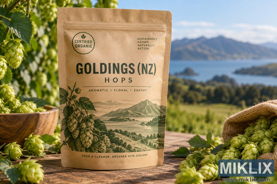
Photorealistic organic Goldings (NZ) hops package surrounded by fresh hop cones in a rustic New Zealand-inspired landscape with water and mountains.
Available versions of this image
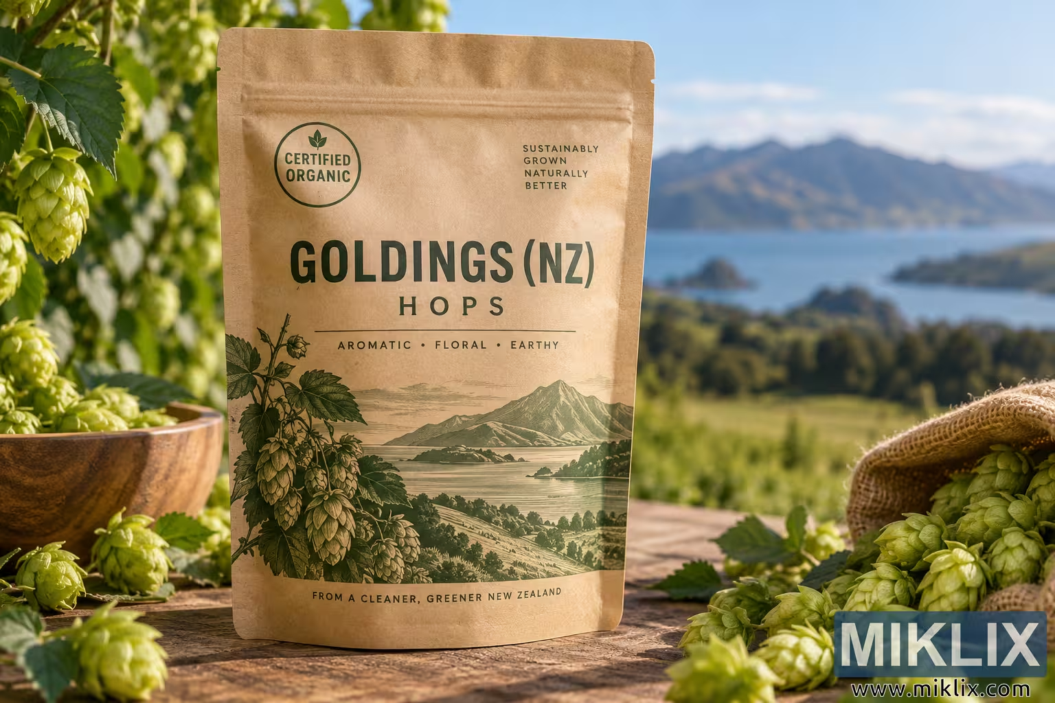
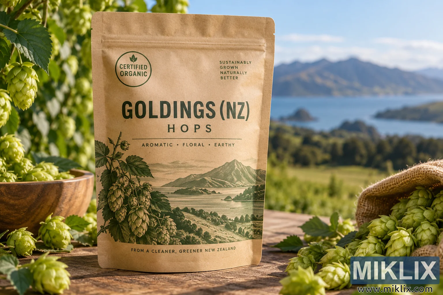
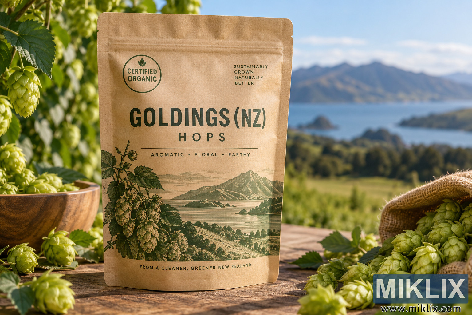
The image files available for download below are less compressed and higher resolution - and as a result of that, higher quality - than the images embedded in articles and pages on this website, which are more optimized for file size in order to reduce bandwidth consumption.
Regular size (1,536 x 1,024)
Large size (3,072 x 2,048)
Very large size (4,608 x 3,072)
Extra large size (6,144 x 4,096)
Comically large size (1,048,576 x 699,051)
- Still uploading... ;-)
Image description
A wide, landscape-oriented photorealistic product image presents a package of Goldings (NZ) hops in a bright, natural agricultural setting. The composition centers on a tall, freestanding resealable pouch made from matte brown kraft-paper material. The package occupies much of the central foreground and is photographed almost straight on, allowing the printed design to remain prominent and legible. Its neutral, earthy packaging and dark green typography reinforce an organic, natural, environmentally conscious visual identity without displaying an actual commercial brand.
Near the upper left portion of the pouch is a circular green certification-style graphic containing a small leaf symbol and the words “CERTIFIED ORGANIC.” On the upper right is a compact block of uppercase text reading “SUSTAINABLY GROWN NATURALLY BETTER.” The primary product name, “GOLDINGS (NZ),” appears in large, bold, condensed dark green lettering across the upper-middle section of the package. Directly below, the word “HOPS” is set in widely spaced uppercase letters. A fine horizontal divider separates this heading area from a short flavor and aroma descriptor reading “AROMATIC • FLORAL • EARTHY.” The overall typography is restrained and utilitarian, combining a traditional agricultural character with contemporary specialty-food packaging aesthetics.
The lower half of the pouch contains an intricate botanical and landscape illustration printed primarily in muted dark green. On the left side of the illustration, a hop plant rises vertically with textured leaves, slender stems, and multiple hanging hop cones. The plant transitions into an engraved or vintage-print-style depiction of a broad New Zealand-inspired landscape. Rolling terrain descends toward a large body of water, with islands or peninsulas visible in the middle distance and a dramatic mountain formation rising beyond the shoreline. The detailed line work gives this portion of the package a traditional botanical-label appearance. Along the bottom edge of the pouch, a small uppercase statement reads “FROM A CLEANER, GREENER NEW ZEALAND.”
The package stands on a weathered wooden tabletop with visible grain, knots, irregular markings, and warm brown tones. Fresh green hop cones and leaves are arranged around the product to establish the agricultural origin of the contents. On the left side of the frame, several hop cones rest directly on the tabletop, accompanied by green leaves and short pieces of vine. Behind them sits a rounded wooden bowl filled with additional hops. More hop vines extend down from the upper-left corner, where clusters of pale green cones hang naturally among broad, serrated leaves. This vegetation creates a partial natural frame around the package while adding depth to the scene.
On the right side of the foreground, a coarse woven burlap sack lies tipped on its side. A generous quantity of fresh hop cones appears to spill from its opening onto the wooden surface. The cones vary slightly in size and orientation, showing overlapping layers of pale green bracts and giving the foreground a tactile, freshly harvested quality. Scattered leaves and stems connect this group visually to the plants on the opposite side of the image. The rough burlap fibers, weathered timber, matte paper pouch, glossy leaves, and delicately layered hop cones create a rich combination of natural textures.
The background is intentionally rendered with shallow depth of field so that the package and foreground hops remain the principal subjects. Beyond the table is a lush green rural landscape that suggests farmland or a hop-growing region. A broad blue body of water stretches horizontally through the middle distance. On the far side of the water, dark green hills and a prominent mountain range rise against the horizon. The mountain silhouettes are softly blurred but remain recognizable as an important part of the environmental context. The scenery evokes the clean, expansive landscapes associated with New Zealand without depicting a specific identifiable location.
The sky is clear and bright blue with a few soft white clouds distributed near the horizon. Strong natural daylight enters the scene from the upper left, illuminating the kraft pouch, hops, foliage, and wooden table with a warm golden quality. The light creates realistic highlights along the layered surfaces of the hop cones and produces soft directional shadows beneath the package and surrounding objects. Subtle dappled shadows from nearby foliage fall across portions of the pouch, helping integrate the product naturally into the outdoor setting rather than making it appear artificially composited.
The color palette is dominated by fresh botanical greens, warm kraft-paper brown, rustic timber tones, soft lake blue, and clear sky blue. Dark green printing on the pouch visually links the packaging to the surrounding hop plants. The restrained palette gives the photograph a wholesome, premium, craft-oriented character. Despite the abundance of natural material around the product, the composition remains orderly: the centrally positioned package acts as a strong visual anchor, while the bowl, hanging vines, scattered cones, burlap sack, water, and mountains form supporting layers around it.
Overall, the image resembles premium editorial or advertising photography for organically cultivated brewing ingredients. It emphasizes freshness, provenance, sustainability, natural cultivation, and the distinctive New Zealand association of the Goldings (NZ) hop variety. The package is presented as the clear focal point, with the harvested hops providing an immediate visual explanation of the product inside. The combination of rustic packaging, botanical illustration, real hop cones, natural materials, bright outdoor lighting, and an expansive rural landscape creates a cohesive farm-to-product narrative. No recognizable commercial brand name or real-world corporate logo is visible; instead, the package uses generic product labeling and an organic certification-style emblem to communicate its intended identity.
The image is related to: Hops in Beer Brewing: Goldings (NZ)