
Image: New Zealand Hop Varieties: Green Bullet, Motueka, Rakau and Pacific Gem
Published: October 1, 2026 at 4:38:59 PM UTC
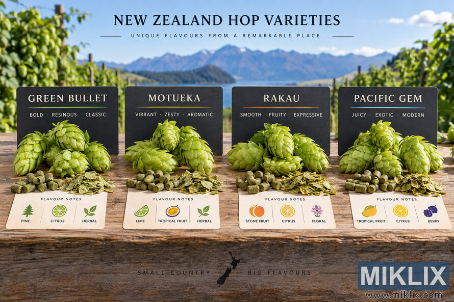
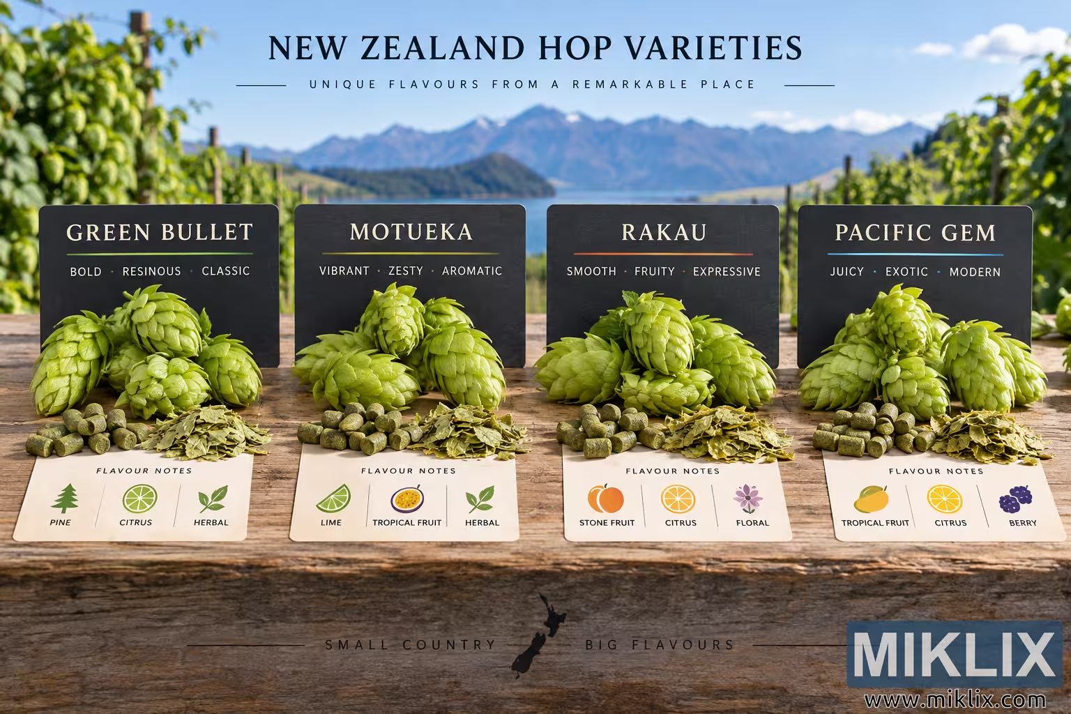
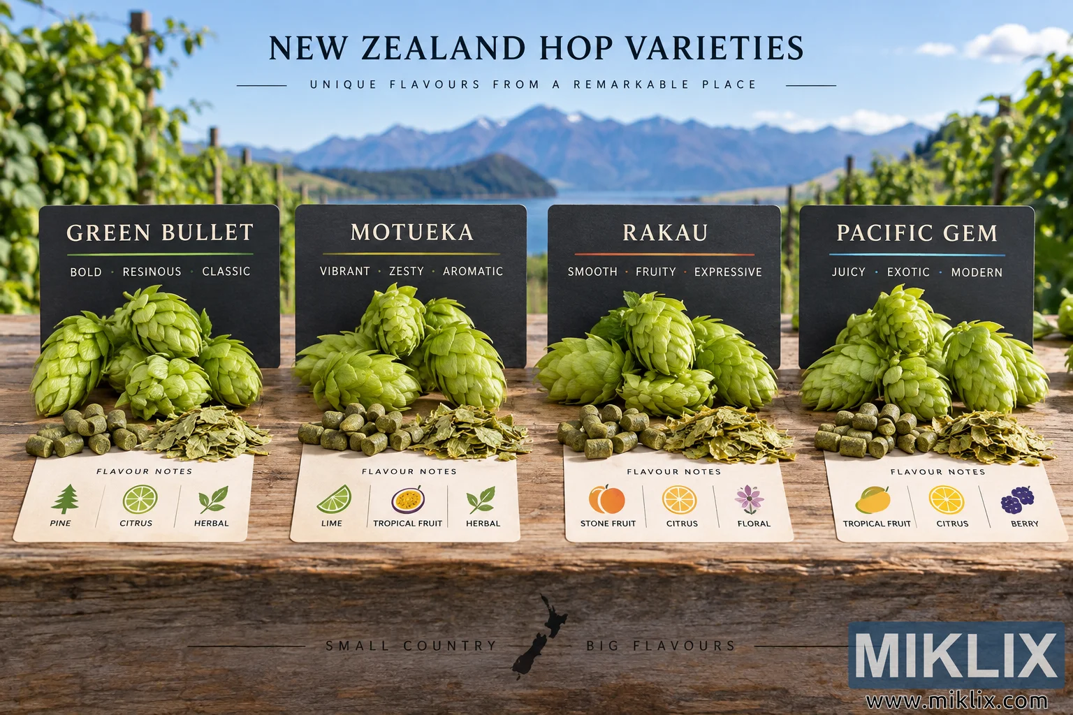
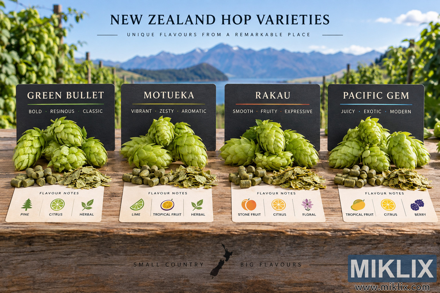
A visual comparison of New Zealand hop varieties Green Bullet, Motueka, Rakau and Pacific Gem, showing hop cones and characteristic flavour notes in a scenic landscape.
Available versions of this image
The image files available for download below are less compressed and higher resolution - and as a result of that, higher quality - than the images embedded in articles and pages on this website, which are more optimized for file size in order to reduce bandwidth consumption.
Regular size (1,536 x 1,024)
Large size (3,072 x 2,048)
Very large size (4,608 x 3,072)
Extra large size (6,144 x 4,096)
Comically large size (1,048,576 x 699,051)
- Still uploading... ;-)
Image description
A wide, landscape-oriented photographic infographic presents a side-by-side comparison of four New Zealand hop varieties: Green Bullet, Motueka, Rakau and Pacific Gem. The composition combines realistic agricultural and product photography with clean informational graphics, creating the appearance of an educational display about New Zealand-grown hops. The scene is set outdoors on a broad, weathered wooden table. Behind the table is a bright and picturesque New Zealand-inspired landscape featuring rows of green hop plants, upright growing structures, a calm blue body of water and a dramatic range of mountains in the distance. The sky is clear and blue with scattered soft white clouds, while natural daylight gives the entire scene a fresh, vibrant appearance. The distant background is slightly blurred so that the hop varieties and information panels in the foreground remain the primary visual focus.
Across the top center of the image, large dark serif lettering reads “NEW ZEALAND HOP VARIETIES.” Directly underneath is the smaller, widely spaced subtitle “UNIQUE FLAVOURS FROM A REMARKABLE PLACE,” framed by thin horizontal lines. This heading establishes the image as a comparative guide to hops associated with New Zealand rather than an advertisement for a particular company or commercial brand.
Four dark rectangular information boards are arranged evenly from left to right across the middle of the scene. Each board identifies one hop variety in large cream-colored uppercase lettering and includes a short set of descriptive words. In front of every board is a generous pile of realistic fresh green hop cones. Small cylindrical green hop pellets and loose pieces of dried hop material are also arranged on the wooden surface, providing a visual comparison between different common forms in which hops may appear.
The first section on the left is labeled “GREEN BULLET.” Beneath the variety name are the descriptors “BOLD · RESINOUS · CLASSIC.” The fresh hop cones are vivid yellow-green, with overlapping papery bracts and a natural, slightly irregular appearance. Below them, a light-colored flavour-note card is placed on the table. It is headed “FLAVOUR NOTES” and contains three simple illustrated symbols. A stylized evergreen tree represents pine, a sliced citrus fruit represents citrus, and a pair of green leaves represents herbal characteristics. The corresponding labels read “PINE,” “CITRUS” and “HERBAL.” Together, these elements communicate a traditional, resinous and botanical flavour profile.
The second section is labeled “MOTUEKA.” Its dark information board uses the descriptors “VIBRANT · ZESTY · AROMATIC.” A cluster of fresh hop cones sits prominently in front of the sign, accompanied by hop pellets and dried hop fragments. The flavour-note card beneath the display contains three colorful illustrations. A green citrus wedge is labeled “LIME,” a halved tropical fruit is labeled “TROPICAL FRUIT,” and a leafy botanical symbol is labeled “HERBAL.” The combination emphasizes a bright, citrus-forward and aromatic impression, visually distinguishing Motueka from the more resinous Green Bullet presentation beside it.
The third section is labeled “RAKAU.” Its accompanying descriptors read “SMOOTH · FRUITY · EXPRESSIVE.” Several plump green hop cones fill the foreground, with additional pellets and dried material scattered neatly in front. The flavour-note card shows a warm orange-colored stone fruit icon labeled “STONE FRUIT,” a citrus slice labeled “CITRUS,” and a purple flower labeled “FLORAL.” These illustrations create a distinctly fruit-driven visual identity for Rakau while adding a softer floral component to the comparison. The warm orange and purple accents contrast with the dominant greens of the hops and surrounding agricultural landscape.
The fourth and rightmost section is labeled “PACIFIC GEM.” Beneath the name, the board displays the descriptors “JUICY · EXOTIC · MODERN.” As with the other varieties, a substantial arrangement of fresh green hop cones is placed directly in front of the board, with compact hop pellets and dried hop material nearby. Its flavour-note card contains three illustrated categories: a yellow tropical fruit symbol labeled “TROPICAL FRUIT,” an orange citrus slice labeled “CITRUS,” and a cluster of dark purple berries labeled “BERRY.” The berry illustration gives this section a distinctive visual cue and reinforces the impression of a richer fruit profile compared with the other varieties.
Although all four displays share a consistent visual structure, small changes in the descriptive text, flavour illustrations and accent colors make it easy to compare them at a glance. The hop cones themselves are rendered with detailed natural textures, including layered bracts, subtle shadows and variations in green and yellow tones. The pellets are compact and cylindrical, while the dried material has a flatter, fragmented leaf-like appearance. These details give the foreground a tactile, realistic quality and reinforce the agricultural subject matter.
The bottom portion of the image consists of the front face of the rustic wooden table or plank. Centered across this area is the phrase “SMALL COUNTRY” on the left and “BIG FLAVOURS” on the right, set in widely spaced dark uppercase letters. Between the two phrases is a small black silhouette map of New Zealand, showing the country's two principal islands. Thin horizontal decorative lines extend outward on both sides, visually balancing the closing statement.
The overall image uses a polished editorial and educational aesthetic. Natural greens, warm wood tones, blue water and sky, and subdued dark information panels create a cohesive palette. The four-column arrangement makes the comparison immediately understandable, while the scenic New Zealand-inspired setting provides geographic context. There are no visible commercial logos, packaging designs or actual brand identities. Instead, the image focuses entirely on the named hop varieties, their physical appearance and their illustrated flavour characteristics. The final result resembles a high-quality brewing, agriculture or hop-education infographic photographed in an idealized New Zealand hop-growing environment.
The image is related to: Hops in Beer Brewing: Green Bullet