
Image: Properly Hopped Beer vs. Improperly Hopped Beer
Published: October 14, 2026 at 3:37:39 PM UTC
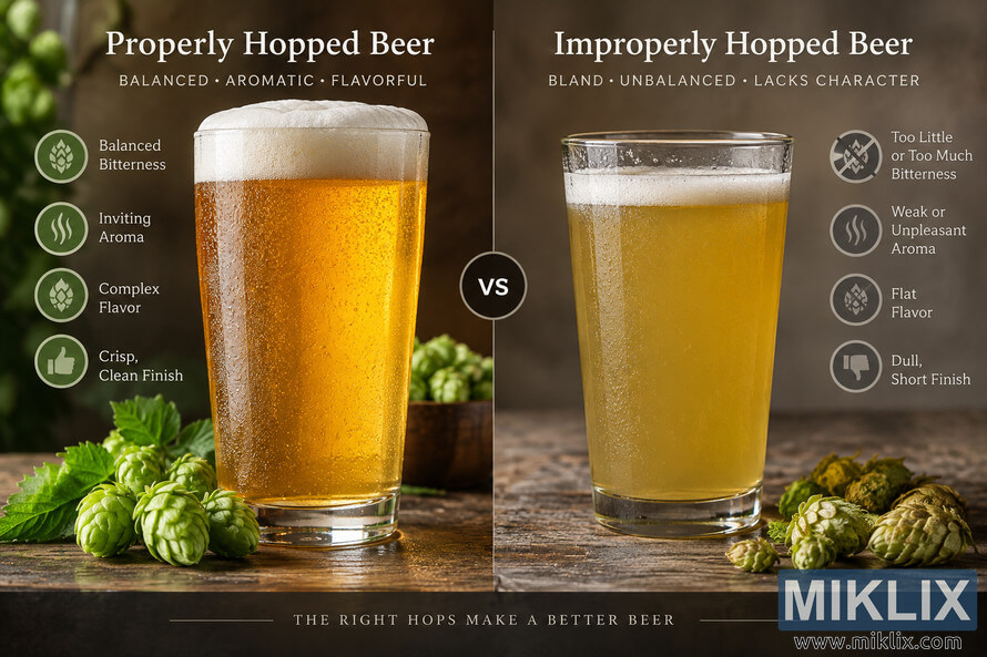
Visual comparison of properly and improperly hopped beer, showing differences in perceived bitterness balance, aroma, flavor complexity, finish, foam, and overall presentation.
Available versions of this image
The image files available for download below are less compressed and higher resolution - and as a result of that, higher quality - than the images embedded in articles and pages on this website, which are more optimized for file size in order to reduce bandwidth consumption.
Regular size (1,536 x 1,024)
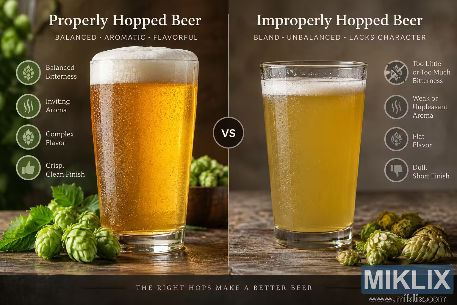
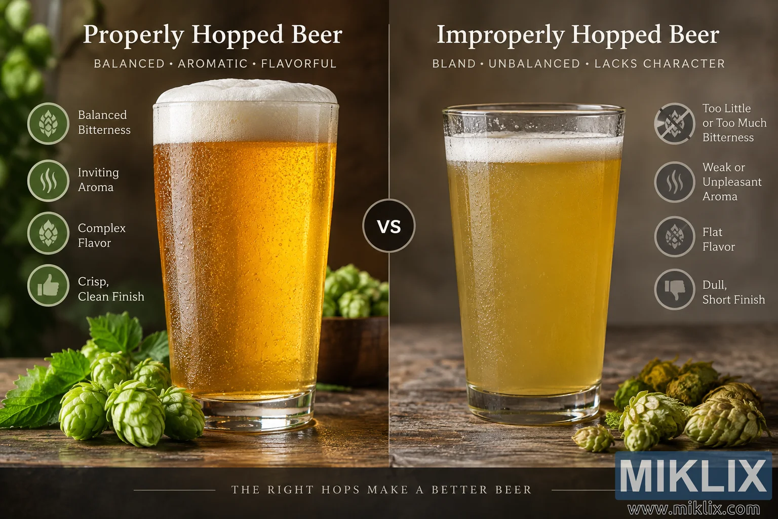
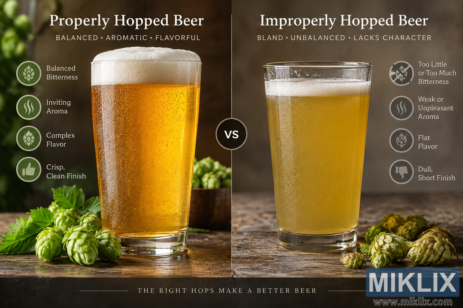
Large size (3,072 x 2,048)
Very large size (4,608 x 3,072)
Extra large size (6,144 x 4,096)
Comically large size (1,048,576 x 699,051)
- Still uploading... ;-)
Image description
A landscape-oriented, split-screen comparison image presents two glasses of beer side by side to illustrate the visual and sensory concept of a properly hopped beer versus an improperly hopped beer. The composition is divided vertically down the center, with the properly hopped example occupying the left half and the improperly hopped example occupying the right half. Both beers are photographed or rendered in a polished, realistic food-photography style on a rustic wooden tabletop. The lighting is warm and atmospheric, giving the image an inviting craft-beverage aesthetic while maintaining a clear educational comparison. No commercial beer brands, brewery logos, product packaging, or other recognizable brand identifiers are visible anywhere in the scene.
On the left side, a large heading at the top reads “Properly Hopped Beer.” Immediately below it, a short descriptive line reads “BALANCED • AROMATIC • FLAVORFUL.” The featured beer is served in a tall, clear pint-style glass positioned prominently near the center of the left panel. The liquid has an attractive, bright golden-to-amber color and appears clear and lively. Numerous tiny bubbles are visible inside the beer and along the glass, suggesting active carbonation. A substantial white foam head rises above the beer and reaches close to the rim, giving the glass a fresh, full appearance. Condensation droplets cover the exterior of the glass, reinforcing the impression that the beer is cold and freshly served. Warm highlights pass through the amber liquid, producing an appealing glow.
Four positive characteristics are arranged vertically along the left side of the glass. Each characteristic is accompanied by a circular green-toned icon. The first reads “Balanced Bitterness” and uses a hop-inspired symbol. The second reads “Inviting Aroma” and is represented by rising aromatic lines. The third reads “Complex Flavor” and again uses a hop-related graphic. The fourth reads “Crisp, Clean Finish” and is paired with a thumbs-up symbol. These visual callouts communicate the intended qualities of appropriate hop usage without referring to a particular beer style, brewery, or commercial product.
Fresh green hop cones and leafy plant material are arranged across the foreground of the left panel. Additional hops appear in a small container behind the glass. The hops have a vivid, healthy green color, visually reinforcing freshness and desirable hop character. The background is softly blurred and predominantly dark brown and green, creating shallow depth of field and keeping attention on the beer. Together, the clear amber color, thick foam, condensation, bubbles, fresh hops, and positive labels make the properly hopped beer appear vibrant and appetizing.
The right half is headed “Improperly Hopped Beer,” with the supporting line “BLAND • UNBALANCED • LACKS CHARACTER” underneath. A second tall, transparent beer glass occupies the center of this panel. In contrast with the left beer, this liquid is noticeably paler, cloudier, and more muted in appearance. Its yellow-gold tone lacks the rich amber glow of the properly hopped example. The foam head is much thinner and flatter, forming only a modest white layer near the top. Condensation remains visible on the outside of the glass, but the overall presentation appears intentionally less lively and less appealing. The subdued beer color and restrained foam visually support the comparison without suggesting that these characteristics alone universally determine brewing quality.
Four negative or cautionary characteristics appear vertically to the right of the second glass, each accompanied by a muted gray circular icon. The first reads “Too Little or Too Much Bitterness,” emphasizing imbalance rather than simply high bitterness. The second reads “Weak or Unpleasant Aroma.” The third reads “Flat Flavor.” The fourth reads “Dull, Short Finish” and is accompanied by a thumbs-down symbol. These labels frame improper hopping as a problem of balance, aroma, flavor development, and finish rather than merely the quantity of hops used.
Several hop cones are scattered on the wooden surface in the foreground of the right panel. Unlike the vivid hops on the left, these hops appear duller, more yellow-brown, wilted, or dried, helping create a visual contrast between freshness and undesirable character. The background is neutral brown-gray and softly out of focus, making this half of the image feel more subdued than the lush green-and-brown environment on the left.
A thin vertical divider separates the two panels. Near the center of the composition, a dark circular badge containing the white letters “VS” overlaps the divider, clearly establishing the side-by-side comparison. The symmetrical arrangement makes it easy to scan from the positive example on the left to the negative example on the right. The two glasses are similar in size and perspective, allowing the differences in color, foam, clarity, hop presentation, and accompanying labels to be compared directly.
A dark horizontal footer spans the full width of the bottom of the image. Centered within it is the statement “THE RIGHT HOPS MAKE A BETTER BEER,” set in widely spaced uppercase lettering and flanked by thin decorative horizontal lines. The overall visual language combines realistic beverage photography with infographic-style typography and icons. Warm lighting, rustic surfaces, shallow depth of field, and carefully arranged hop cones evoke a craft-brewing environment, while the structured labels make the image suitable for educational or explanatory material about hopping and beer flavor. The image communicates that successful hopping is primarily about achieving an appropriate balance of bitterness, aroma, flavor complexity, and finish, whereas poorly managed hopping can result in characteristics that seem weak, excessive, unbalanced, or lacking in character.
The image is related to: Hops in Beer Brewing: MultiHead