
Image: Fresh vs. Old Hops: Visual Quality Comparison
Published: October 14, 2026 at 3:37:39 PM UTC
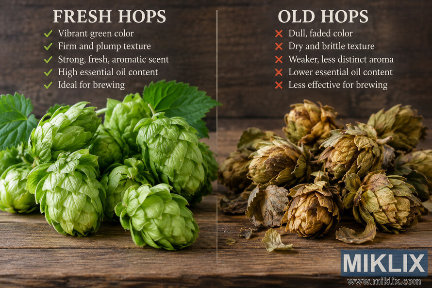
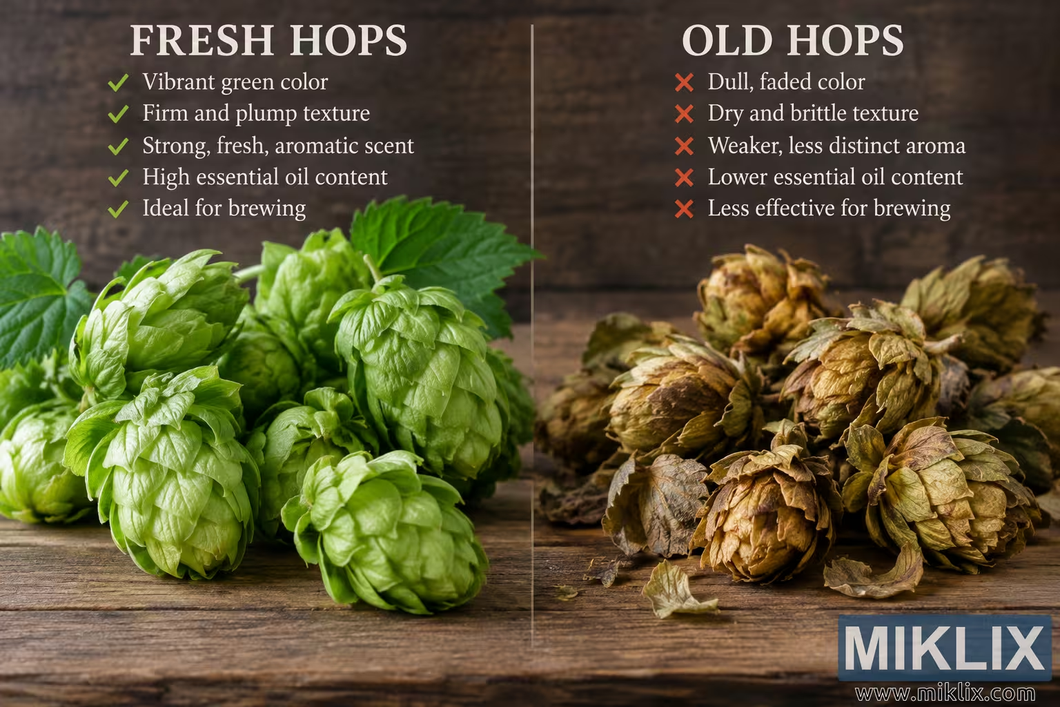
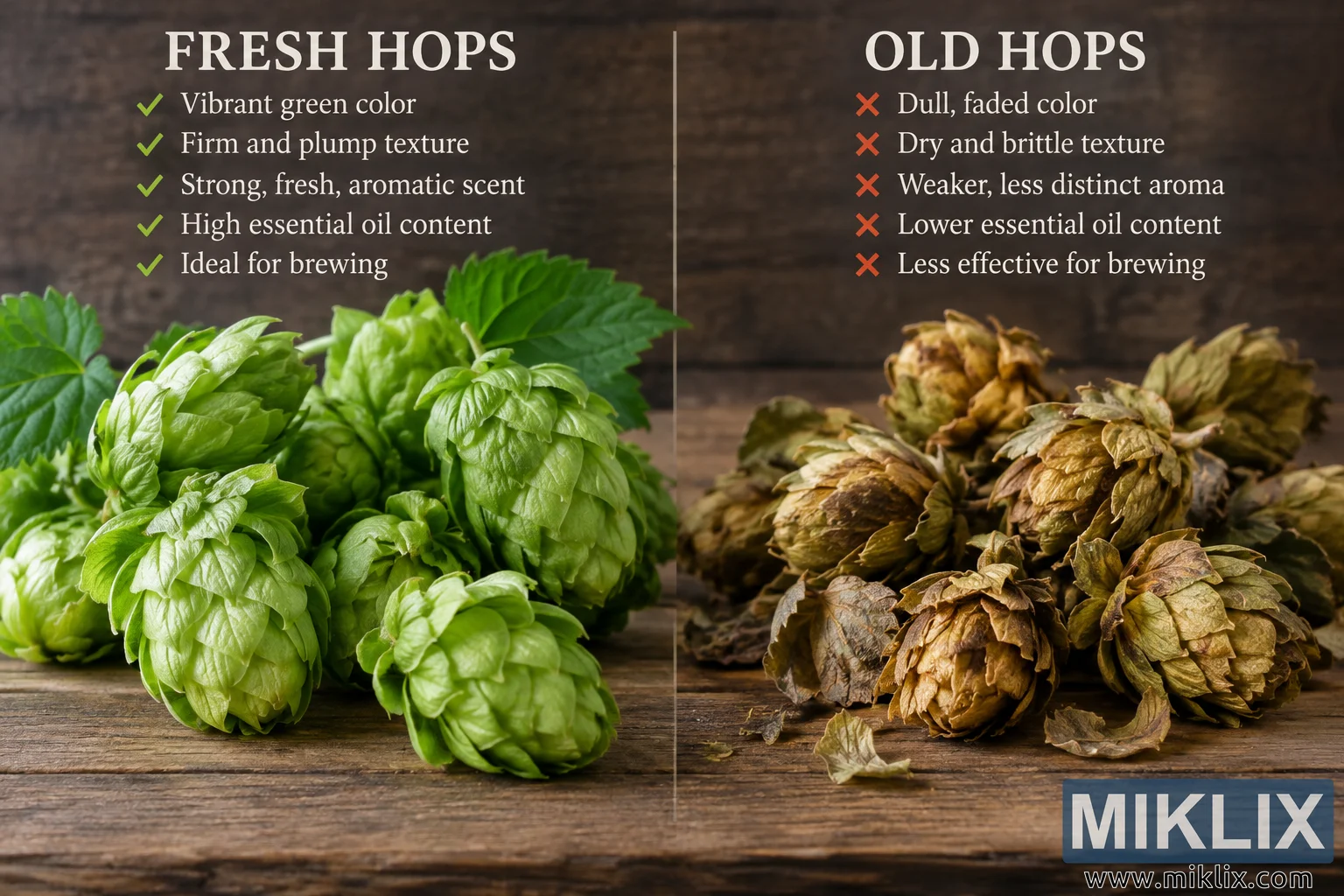
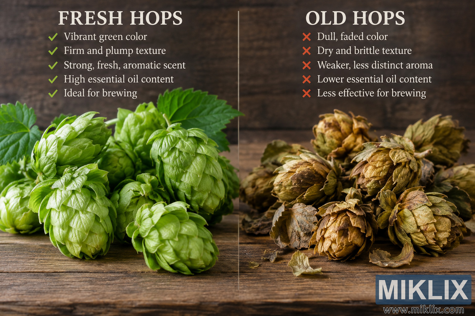
Compare fresh and old hops side by side, showing differences in color, texture, aroma, essential oil content, and brewing suitability.
Available versions of this image
The image files available for download below are less compressed and higher resolution - and as a result of that, higher quality - than the images embedded in articles and pages on this website, which are more optimized for file size in order to reduce bandwidth consumption.
Regular size (1,536 x 1,024)
Large size (3,072 x 2,048)
Very large size (4,608 x 3,072)
Extra large size (6,144 x 4,096)
Comically large size (1,048,576 x 699,051)
- Still uploading... ;-)
Image description
A high-resolution, landscape-oriented comparison image presents fresh hops and old hops side by side in a carefully staged, studio-lit photographic composition. The scene is divided vertically into two approximately equal sections by a thin, light-colored line running from near the top of the image toward the bottom. Both sides share the same rustic setting: a dark brown wooden background with visible grain and a weathered wooden tabletop extending across the foreground. This consistent setting makes the differences in the hops themselves especially prominent. The overall visual style combines realistic food and botanical photography with a clean educational infographic layout. There are no visible commercial brands, logos, product packages, trademarks, or other branded elements anywhere in the image.
The left half is devoted to fresh hops. At the top, a large uppercase heading reads “FRESH HOPS” in a bold, light-colored serif typeface. Beneath the heading is a series of five green check marks, each followed by a short statement describing characteristics associated with fresh hops. The statements read “Vibrant green color,” “Firm and plump texture,” “Strong, fresh, aromatic scent,” “High essential oil content,” and “Ideal for brewing.” The green check marks visually reinforce the positive qualities listed on this side and coordinate with the vivid green color of the hops below.
The lower portion of the left panel contains a generous arrangement of fresh hop cones. They appear full, plump, and tightly layered, with overlapping papery bracts that form the characteristic cone shape of hops. Their coloration ranges from light yellow-green to richer leaf green, and the studio lighting creates bright highlights across the layered surfaces. Some cones are positioned upright while others rest at slight angles, creating natural variation and depth. The closest cones are sharply detailed, allowing individual bracts, ridges, folds, and subtle surface textures to be seen clearly. Several healthy green leaves and stems appear behind and around the cones, further emphasizing freshness and a recently harvested appearance. The leaves are broad and textured, with visible veins and gently serrated edges. The fresh hops occupy much of the foreground and middle ground on the left, giving them substantial visual weight.
The right half provides a contrasting presentation of old hops. At the top, a matching large uppercase heading reads “OLD HOPS.” Beneath it are five orange-red X symbols paired with descriptions of deterioration. The statements read “Dull, faded color,” “Dry and brittle texture,” “Weaker, less distinct aroma,” “Lower essential oil content,” and “Less effective for brewing.” The warm orange-red X symbols contrast with the green check marks on the opposite side and visually communicate undesirable or diminished characteristics without relying on any brand-specific imagery.
Below the text on the right is a pile of visibly aged hop cones. Compared with the fresh examples, these cones have substantially duller coloration, including muted olive green, tan, ochre, brown, and dark gray-brown areas. Their layered bracts look dry, curled, wrinkled, and brittle rather than supple and full. Some cones appear partially collapsed or uneven, while others have loose or damaged outer layers. Several dried fragments and detached pieces are scattered across the wooden surface around the pile, suggesting brittleness and degradation over time. The old hops have a rougher, more desiccated appearance, with deeper shadows between their curled layers and fewer glossy highlights. A few cones retain traces of green or yellow-green color, but the dominant impression is one of fading, oxidation, drying, and age.
The lighting is directional and dramatic while remaining naturalistic. It appears to come primarily from the front and upper left, illuminating the fresh hops particularly strongly and producing crisp highlights on their green surfaces. The old hops are also clearly visible but appear somewhat darker and more subdued because of their naturally brown and muted coloration. Soft shadows beneath both groups anchor the cones to the tabletop and create a convincing three-dimensional effect. The shallow-to-moderate depth of field keeps the foreground hops highly detailed while allowing the dark wooden background to remain slightly softer and less distracting.
The composition is intentionally symmetrical in concept but asymmetrical in organic detail. Both halves use comparable headings, descriptive lists, and groups of hop cones, making the image easy to scan as a direct quality comparison. The fresh side feels brighter, greener, more vigorous, and visually lush, whereas the old side feels drier, darker, more fragile, and more subdued. The central divider makes the before-and-after or good-versus-degraded comparison immediately understandable. The large headings establish the two categories at a glance, while the check and X symbols provide an additional layer of rapid visual communication.
The rustic wood contributes a natural agricultural and brewing-related atmosphere without introducing unrelated props. The tabletop has prominent horizontal grain, scratches, seams, and variations in brown tone, while the vertical background is darker and more softly focused. This restrained environment ensures that the botanical material remains the central subject. No bottles, cans, brewing equipment, labels, packaging, people, or identifiable commercial products are included. The image therefore functions as a generic educational quality comparison rather than an advertisement.
Overall, the image communicates how fresh hops may visually differ from hops that have become old, dry, or degraded. Fresh hops are represented by bright green coloration, substantial volume, intact layered cones, healthy leaves, and a lively appearance. Old hops are represented by faded brownish coloration, curled and brittle-looking layers, loose fragments, reduced fullness, and a generally desiccated appearance. The accompanying infographic text expands the comparison beyond visible characteristics by mentioning aroma, essential oil content, and brewing suitability. The landscape format provides ample horizontal space for the two categories to sit beside one another, making the contrast immediately legible and suitable for an educational article, brewing guide, agricultural reference, presentation, or informational webpage.
The image is related to: Hops in Beer Brewing: MultiHead