
Image: Citra vs Neo1: A Visual Comparison of Hop Character
Published: October 15, 2026 at 7:40:36 PM UTC
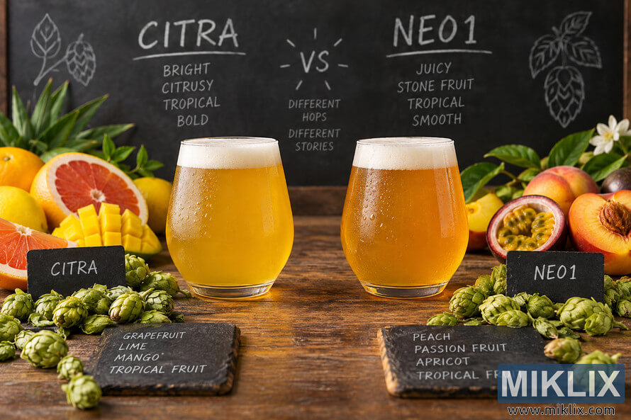
A high-resolution craft-beer still life comparing Citra and Neo1 hop character, with two golden beers, fresh hops, citrus and tropical fruit for Citra, and peach, apricot and passion fruit for Neo1.
Available versions of this image
The image files available for download below are less compressed and higher resolution - and as a result of that, higher quality - than the images embedded in articles and pages on this website, which are more optimized for file size in order to reduce bandwidth consumption.
Regular size (1,536 x 1,024)
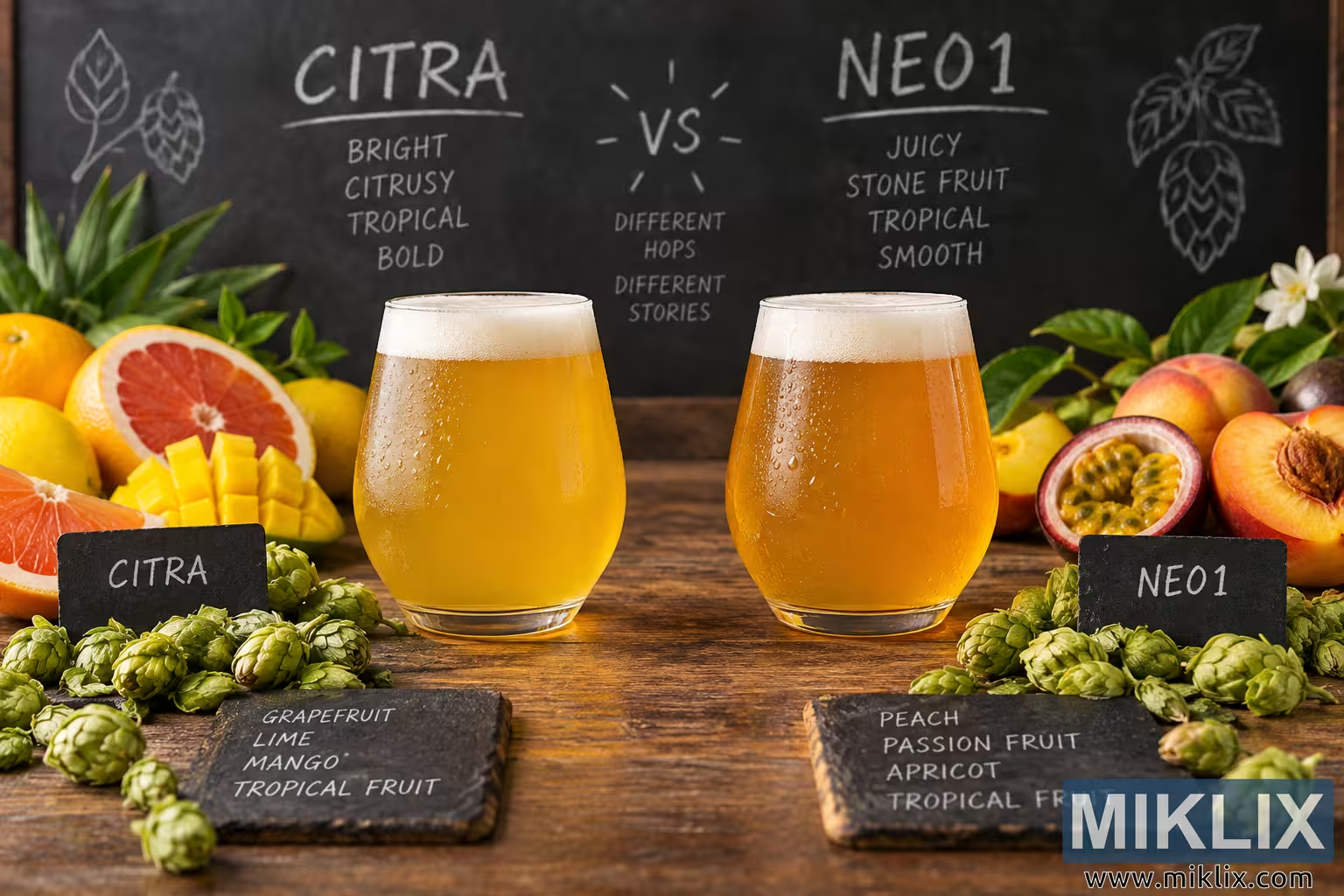
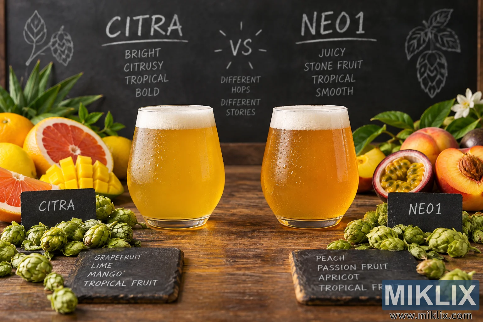
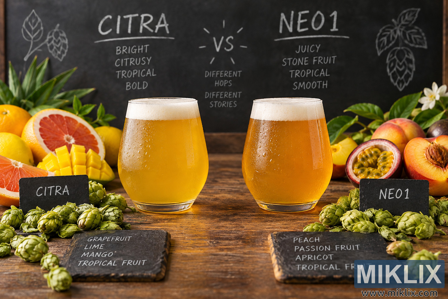
Large size (3,072 x 2,048)
Very large size (4,608 x 3,072)
Extra large size (6,144 x 4,096)
Comically large size (1,048,576 x 699,051)
- Still uploading... ;-)
Image description
A landscape-oriented, high-resolution product-comparison still life presents two glasses of golden beer side by side, visually contrasting the character associated with Citra and Neo1 hops. The composition is arranged symmetrically on a richly textured, rustic wooden tabletop, with the two beer glasses occupying the central foreground and middle ground. Behind them is a large, dark chalkboard framed in wood, giving the scene the atmosphere of a craft brewery tasting room, hop workshop, or educational beer presentation. There are no commercial brewery logos, packaging designs, or other actual consumer brands visible in the scene.
The glass on the left represents Citra. It is a clear, gently tapered beer glass filled with a luminous golden-yellow beer. A dense, creamy white foam cap sits at the top, while numerous tiny droplets of condensation cover the outside of the glass, suggesting that the beer has just been poured and is pleasantly cold. The liquid is bright and saturated, catching the warm ambient light and appearing slightly hazy. Immediately in front of the glass is a small black chalkboard-style sign labeled “CITRA” in white handwritten lettering. Around this side of the composition are abundant green hop cones and a colorful arrangement of fruits intended to evoke the aromatic profile of the hop. These include grapefruit, lime or lemon-like citrus, mango, and other tropical fruit imagery. A halved pink grapefruit is especially prominent, its vivid reddish-pink flesh providing a strong visual contrast with the yellow beer and green hops. Pieces of ripe mango and additional citrus fruit reinforce the impression of bright, juicy, citrus-forward and tropical aromas.
The beer on the right represents Neo1. It is presented in a matching clear glass, creating an immediate side-by-side comparison with the Citra beer. The Neo1 beer has a somewhat deeper golden-to-amber appearance, with a warm orange cast that distinguishes it subtly from the brighter yellow beer on the left. Like the Citra glass, it carries a creamy pale foam head and visible condensation droplets, giving it a fresh, chilled appearance. A small black sign in front of the glass reads “NEO1” in handwritten white lettering. The surrounding fruit arrangement emphasizes stone-fruit and tropical associations. Visible ingredients include a peach or nectarine cut open to expose its stone, passion fruit with its distinctive seed-filled interior, and other ripe yellow-orange fruits. Green leaves and hop cones frame the arrangement, integrating the fruit imagery with the brewing theme. The right side therefore feels slightly softer, riper and more stone-fruit-driven than the sharper citrus imagery associated with the left side.
Across the bottom foreground, clusters of fresh green hop cones are scattered naturally over the wooden surface. Their layered, papery bracts and varying orientations give the scene considerable tactile detail. Two rectangular dark slate or chalkboard tasting cards sit near the bottom edge. The card beneath the Citra side contains handwritten descriptors including “GRAPEFRUIT,” “LIME,” “MANGO,” and “TROPICAL FRUIT.” The corresponding card beneath the Neo1 side lists “PEACH,” “PASSION FRUIT,” “APRICOT,” and “TROPICAL FRUIT.” These cards make the comparison explicit while maintaining the informal, handcrafted visual language of a brewery tasting session.
The chalkboard in the background reinforces the comparison. Large white chalk-style lettering places “CITRA” over the left half and “NEO1” over the right half, with a prominent “VS” centered between them. Under Citra are short descriptors such as “BRIGHT,” “CITRUSY,” “TROPICAL,” and “BOLD.” Under Neo1 are descriptors including “JUICY,” “STONE FRUIT,” “TROPICAL,” and “SMOOTH.” In the central area beneath the versus marker is the phrase “DIFFERENT HOPS DIFFERENT STORIES,” arranged vertically in small handwritten lettering. Simple chalk drawings of hop cones and leaves decorate the upper corners of the board, adding visual interest without competing with the two central glasses.
Lighting is warm, directional, and polished, resembling professional food and beverage photography. Highlights on the glass rims, beer surfaces, foam, and condensation create a crisp sense of freshness, while softer shadows beneath the glasses and fruit provide depth. The dark chalkboard background helps the luminous beer and colorful fruit stand out dramatically. The wooden tabletop contributes warm brown and amber tones that harmonize with the beer, while the vivid greens of the hops and foliage create complementary contrast. The shallow-to-moderate depth of field keeps the principal beers, nearby ingredients, and important labels sharp while allowing peripheral foliage and background details to feel slightly softer and more atmospheric.
Overall, the image communicates a sensory comparison between two hop characters through beer color, fruit symbolism, tasting descriptors, and fresh hop cones. Citra is visually associated with bright citrus, grapefruit, mango, lime, tropical fruit, and a bold aromatic impression, whereas Neo1 is represented through peach, apricot, passion fruit, tropical fruit, juiciness, and a smoother stone-fruit character. The balanced composition makes the two sides easy to compare at a glance while retaining the inviting, tactile quality of an editorial craft-beer photograph. The absence of brewery branding keeps the focus on the hop varieties, their contrasting sensory profiles, and the two freshly poured beers.
The image is related to: Hops in Beer Brewing: Neo1