
Image: Mosaic vs Neo1 Hop Character: A Side-by-Side Beer Comparison
Published: October 15, 2026 at 7:40:36 PM UTC
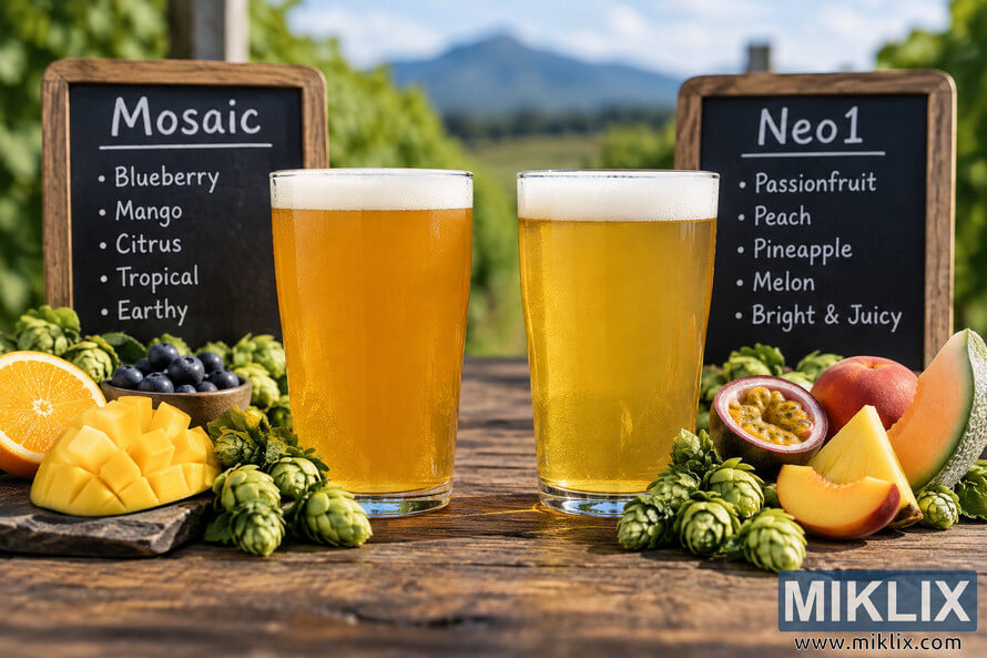
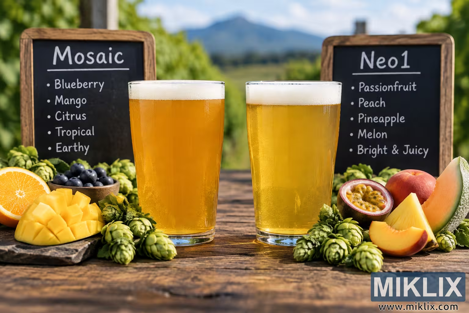
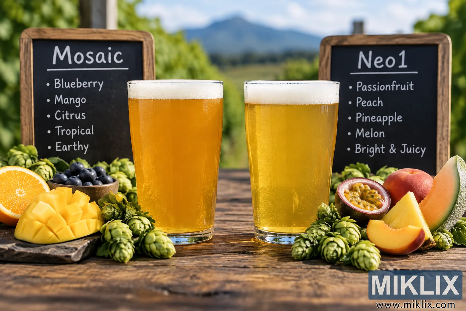
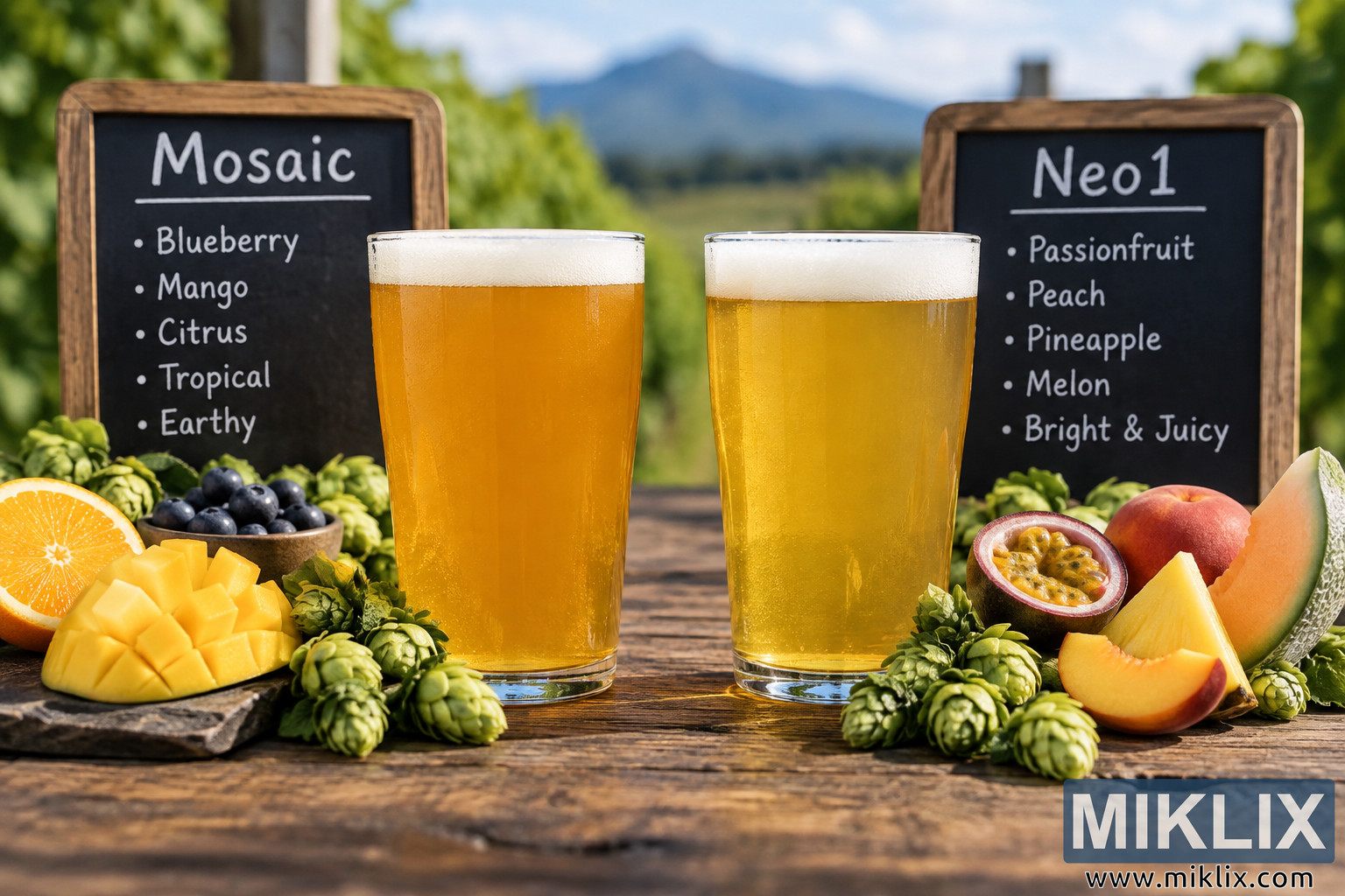
A photorealistic side-by-side comparison of Mosaic and Neo1 hop character, featuring two golden beers, fresh hops, fruit aroma cues, and tasting notes in an outdoor setting.
Available versions of this image
The image files available for download below are less compressed and higher resolution - and as a result of that, higher quality - than the images embedded in articles and pages on this website, which are more optimized for file size in order to reduce bandwidth consumption.
Regular size (1,536 x 1,024)
Large size (3,072 x 2,048)
Very large size (4,608 x 3,072)
Extra large size (6,144 x 4,096)
Comically large size (1,048,576 x 699,051)
- Still uploading... ;-)
Image description
A high-resolution, photorealistic landscape image presents two beers side by side as a visual comparison of Mosaic and Neo1 hop character. The composition is arranged at eye level on a weathered rustic wooden table, creating the feeling of a carefully staged craft-beer tasting outdoors. Two clear pint glasses occupy the center of the frame, positioned close together with a balanced amount of space between them. The glass on the left contains a rich golden-orange beer associated with Mosaic hop character, while the glass on the right contains a somewhat lighter, brighter golden beer associated with Neo1 hop character. Both beers have a fresh, creamy white head of foam that sits evenly across the surface, with fine bubbles and a natural, freshly poured appearance. The transparent glassware allows the color, clarity, and subtle differences between the two beers to remain clearly visible. There are no actual commercial brands, logos, branded packaging, or recognizable company marks anywhere in the image. Behind the glasses, two simple dark chalkboard-style signs provide an educational visual cue. The left sign is headed “Mosaic” and lists blueberry, mango, citrus, tropical, and earthy characteristics. The right sign is headed “Neo1” and lists passionfruit, peach, pineapple, melon, and bright and juicy characteristics. The lettering has a casual hand-written chalk appearance, reinforcing the impression of an informal tasting comparison rather than a commercial advertisement. The signs are framed in natural wood and positioned slightly behind the respective glasses, making the left and right sides of the comparison immediately understandable. The foreground contains whole and cut ingredients that visually reinforce the aromatic associations described on the boards. On the Mosaic side are dark blueberries, bright orange citrus, cubed mango, and fresh green hop cones. These ingredients are arranged naturally around the base of the glass, with some resting directly on the wooden surface and others gathered on a small dark serving slab or dish. The Neo1 side features passionfruit cut open to reveal its distinctive yellow pulp and seeds, slices of peach, pale yellow pineapple, a wedge of melon, and additional fresh green hop cones. The fruit is arranged to create a colorful but believable tasting-table display rather than an overly decorative still life. Fresh hop cones appear throughout the foreground, with their layered green scales and slightly irregular natural shapes visible in detail. The ingredients are positioned symmetrically enough to communicate the comparison while retaining the organic imperfections of a real tasting setup. The background is intentionally shallow in focus. Beyond the table is a lush green outdoor landscape with softly blurred foliage, suggesting a hop-growing or agricultural environment. A distant mountain or hill rises near the center of the background, partially softened by atmospheric haze. Above it is a bright blue sky with light, soft clouds. The natural setting gives the image an outdoorsy, fresh, agricultural character that connects the beer with its botanical ingredients and hop origins without depicting a specific identifiable location. Warm natural daylight illuminates the entire scene, creating realistic highlights along the glass rims, gentle reflections in the beer, and subtle shadows beneath the glasses and fruit. The lighting also brings out the golden hues of both beers and the vivid green of the hop cones. The left beer appears deeper and more orange-gold, while the right beer is lighter and more luminous, helping establish a visual distinction between the two hop profiles without suggesting that color alone determines flavor. The photographic treatment emphasizes realistic textures: condensation and reflections on the glass, tiny bubbles in the beer, soft foam, rough wood grain, detailed hop bracts, juicy fruit surfaces, and natural imperfections in the ingredients. The image uses a moderately shallow depth of field, keeping the two beers and the most important foreground elements sharp while allowing the distant scenery and portions of the chalkboards to soften gently toward the edges. The composition is wide and horizontal, with the two glasses serving as the dominant focal point. The signs rise behind them without obscuring the beer, while the fruit and hop cones create a visual frame along the lower portion of the image. The left and right sides intentionally mirror one another: Mosaic is represented through blueberry, mango, citrus, tropical, and earthy visual cues, while Neo1 is represented through passionfruit, peach, pineapple, melon, and a brighter juicy fruit impression. The resulting image communicates a side-by-side sensory comparison in a single photographic scene. It feels suitable for an educational article, brewing presentation, tasting guide, hop comparison feature, or editorial discussion of hop aroma and flavor. The overall aesthetic is premium but natural, with the realism of professional food and beverage photography rather than a stylized illustration. There are no people in the frame, allowing the viewer's attention to remain entirely on the two beers, the hop cones, the fruit references, and the comparison boards. The visual hierarchy is clear: first the two glasses, then the respective hop and fruit ingredients, followed by the chalkboard descriptions and the softly scenic background. The image therefore works as a concise visual explanation of two distinct hop character profiles while remaining an appealing, realistic photograph of freshly poured beers in an outdoor tasting environment.
The image is related to: Hops in Beer Brewing: Neo1