
Image: Amarillo vs Neo1: A Visual Comparison of Hop Character
Published: October 15, 2026 at 7:40:36 PM UTC
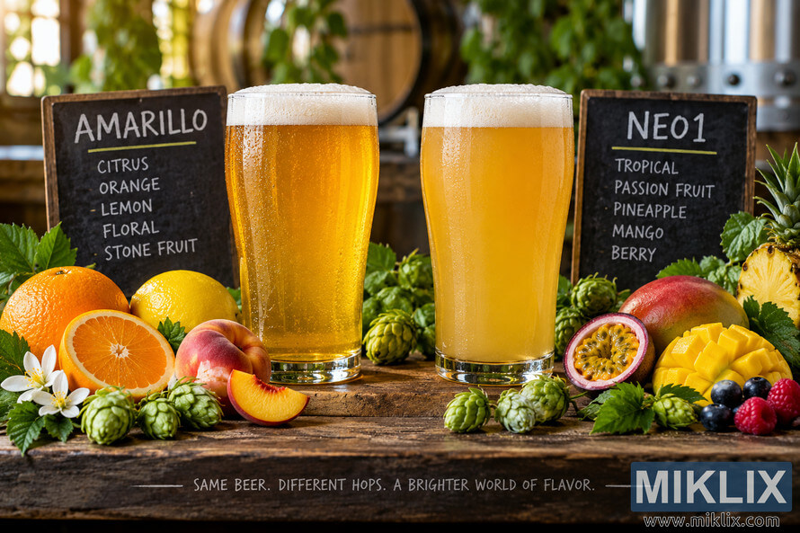
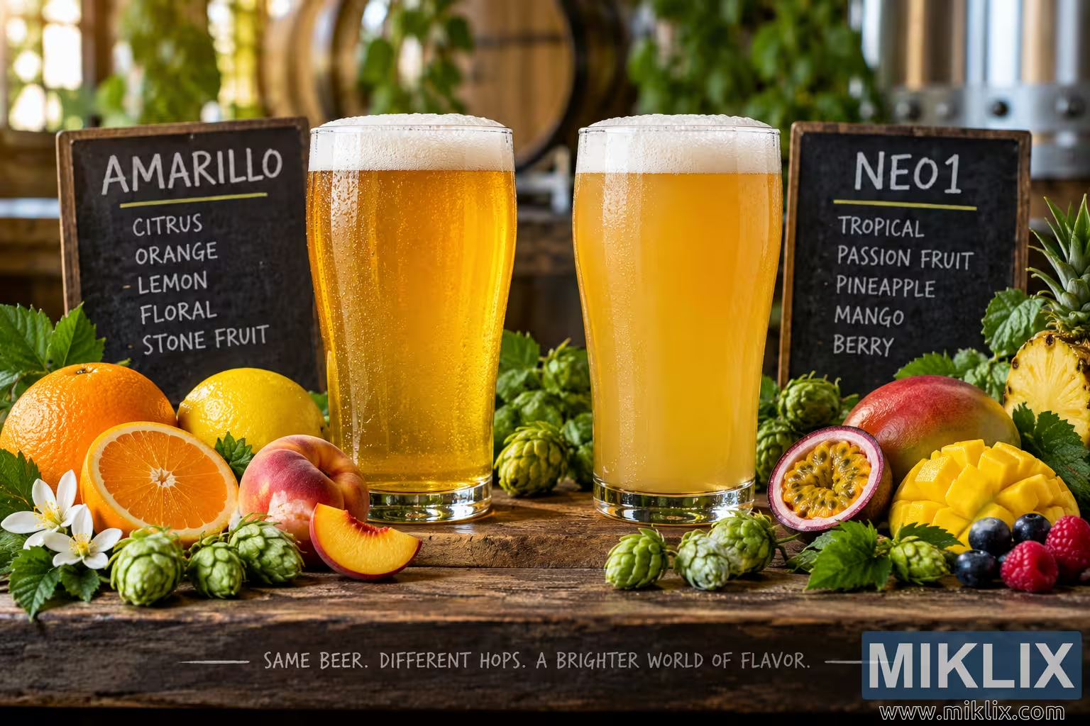
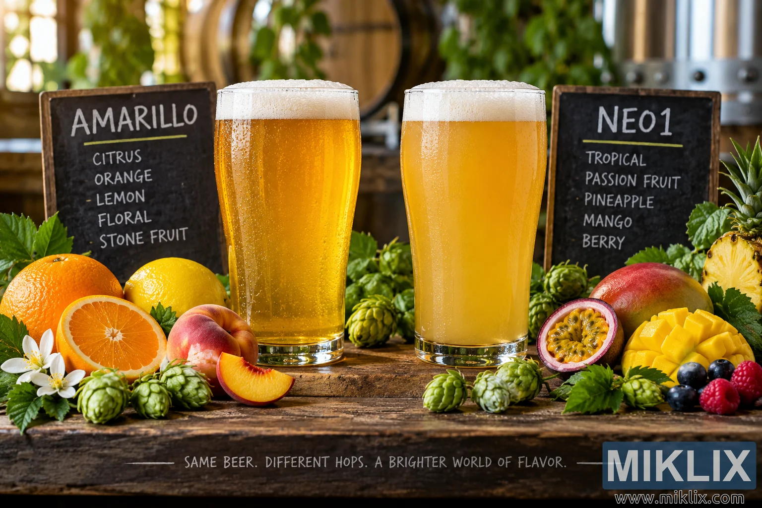
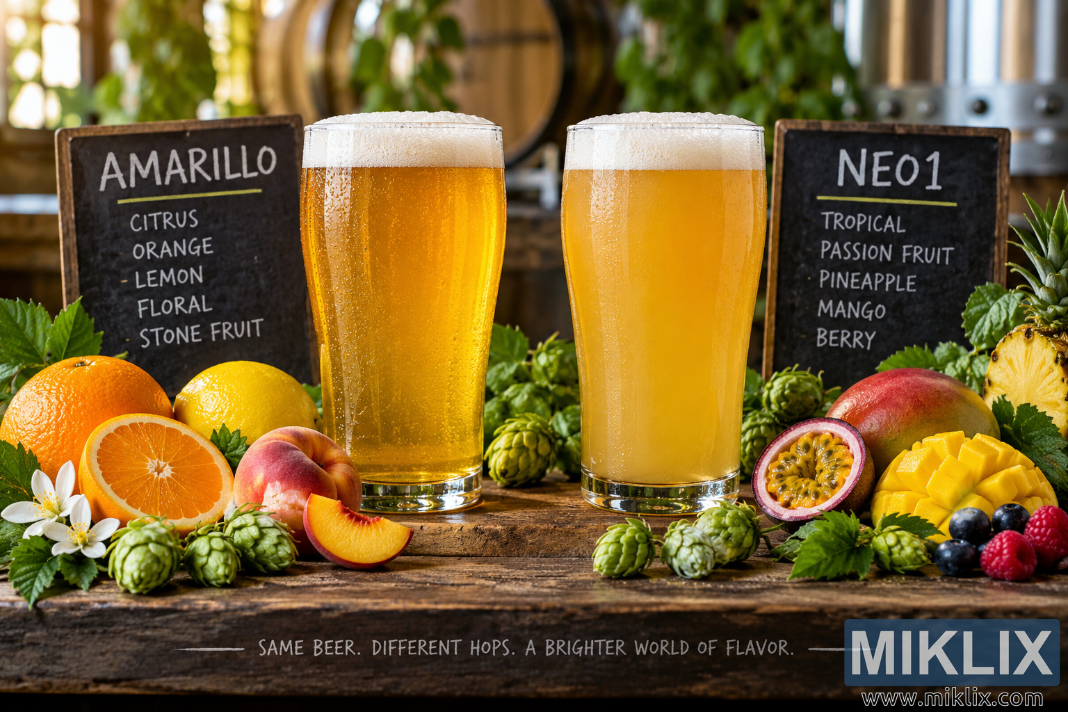
A photorealistic side-by-side beer tasting scene comparing Amarillo and Neo1 hop character through citrus, floral, stone-fruit, tropical, passion-fruit, pineapple, mango, and berry-inspired visual cues.
Available versions of this image
The image files available for download below are less compressed and higher resolution - and as a result of that, higher quality - than the images embedded in articles and pages on this website, which are more optimized for file size in order to reduce bandwidth consumption.
Regular size (1,536 x 1,024)
Large size (3,072 x 2,048)
Very large size (4,608 x 3,072)
Extra large size (6,144 x 4,096)
Comically large size (1,048,576 x 699,051)
- Still uploading... ;-)
Image description
A high-resolution, photorealistic landscape image presents a side-by-side sensory comparison of two beers designed to illustrate contrasting hop character. Two tall, clear pint glasses stand prominently in the center of the composition on a weathered wooden tasting board. The left beer, associated with Amarillo hop character, is bright golden-amber and relatively clear, with a lively stream of fine carbonation rising through the beer and a substantial white head of foam resting across the top. The right beer, associated with Neo1 hop character, is a deeper, hazier golden yellow with a softly opaque appearance, giving it a distinctly juicy and contemporary visual impression. Both glasses are covered with realistic condensation and subtle highlights, emphasizing their cold temperature and freshly poured appearance.
Behind and slightly beside the left glass is a dark rustic chalkboard carrying the large handwritten-style heading “AMARILLO.” Beneath the heading, the board presents a concise sensory vocabulary: citrus, orange, lemon, floral, and stone fruit. The lettering has the informal appearance of chalk written by hand, reinforcing the atmosphere of a small brewery tasting room rather than a commercial advertisement. Behind the right-hand glass is a second dark chalkboard headed “NEO1,” with the descriptors tropical, passion fruit, pineapple, mango, and berry. The two boards create an immediate visual framework for comparing the aromas and flavors suggested by the two hop varieties.
The foreground is deliberately abundant with natural ingredients and hop cones that visually reinforce the tasting notes. Around the Amarillo side are whole and sliced oranges, lemons, a ripe peach or similar stone fruit, fresh green hop cones, and small white blossoms. The sliced citrus reveals detailed juicy interiors, while the peach and other stone fruit add warm pink, orange, and yellow tones. On the Neo1 side, the foreground features passion fruit cut open to expose its vivid seed-filled interior, chunks and slices of bright yellow mango, pineapple, berries including blueberries and raspberries, and numerous fresh green hop cones. These ingredients are arranged naturally around the base of the glass rather than appearing as a rigid diagram, making the scene resemble an elevated brewery tasting presentation.
The wooden surface beneath everything has visible grain, knots, scratches, and variations in tone, providing a tactile rustic foundation. The tasting board extends across the lower portion of the image and contains an additional handwritten-style statement: “SAME BEER. DIFFERENT HOPS. A BRIGHTER WORLD OF FLAVOR.” This phrase functions as a concise visual summary of the comparison and emphasizes that the image is about how hop selection can change a beer’s aromatic and flavor expression. The typography remains integrated into the physical scene rather than appearing as a modern digital overlay.
The background is softly blurred with a shallow depth of field. Warm wooden brewery barrels, green foliage, industrial brewing equipment, and softly glowing highlights create an inviting craft-brewery atmosphere without distracting from the two beers. The use of warm natural and ambient light produces gentle reflections on the glassware, highlights the foam, and gives the beer a rich luminous quality. The background bokeh contains rounded highlights and muted green and brown shapes, suggesting a spacious brewery environment while preserving strong visual focus on the tasting glasses.
Compositionally, the two beers are positioned almost symmetrically around the center, making the comparison immediately legible. The left glass is balanced by the right glass, while the corresponding chalkboard, hop cones, and fruit on each side create two distinct but harmonious visual zones. The Amarillo side communicates bright citrus, floral, and stone-fruit impressions through clearer golden beer and orange, lemon, peach, and floral elements. The Neo1 side communicates intense tropical and berry-like impressions through hazier golden beer and passion fruit, pineapple, mango, and mixed berries. The repeated green hop cones visually connect both sides and reinforce the common role of hops while allowing their sensory differences to stand out.
The image uses realistic textures throughout: tiny bubbles inside the beer, foam bubbles along the heads, droplets of condensation on the glass, translucent citrus flesh, fibrous pineapple, glossy mango, seeded passion fruit, delicate berry skins, layered hop bracts, weathered wood, chalk residue, and softly illuminated brewery surfaces. The photographic treatment is polished but natural, with realistic proportions, convincing reflections, and a premium food-and-beverage photography aesthetic. There are no recognizable commercial beer brands, logos, branded packaging, or trademarked visual identities. The presentation instead relies on generic glassware, handwritten tasting boards, fresh ingredients, hop cones, and a rustic brewery setting.
Overall, the scene communicates a direct visual comparison between two hop-driven sensory profiles. It presents Amarillo as a bright, citrus-forward, floral and stone-fruit-oriented character, while presenting Neo1 as a tropical, juicy, fruit-forward character associated with passion fruit, pineapple, mango, and berries. The landscape orientation gives the composition room to breathe horizontally and allows the two sensory worlds to sit clearly beside one another. The result resembles a carefully staged brewery tasting photograph intended to help viewers understand hop character through color, ingredients, atmosphere, and visual association rather than through packaging or brand identity.
The image is related to: Hops in Beer Brewing: Neo1