
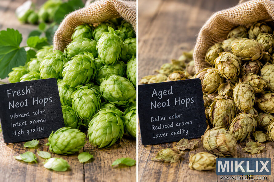
Image: Fresh vs. Aged Neo1 Hops: Color and Quality Comparison
Published: October 15, 2026 at 7:40:36 PM UTC
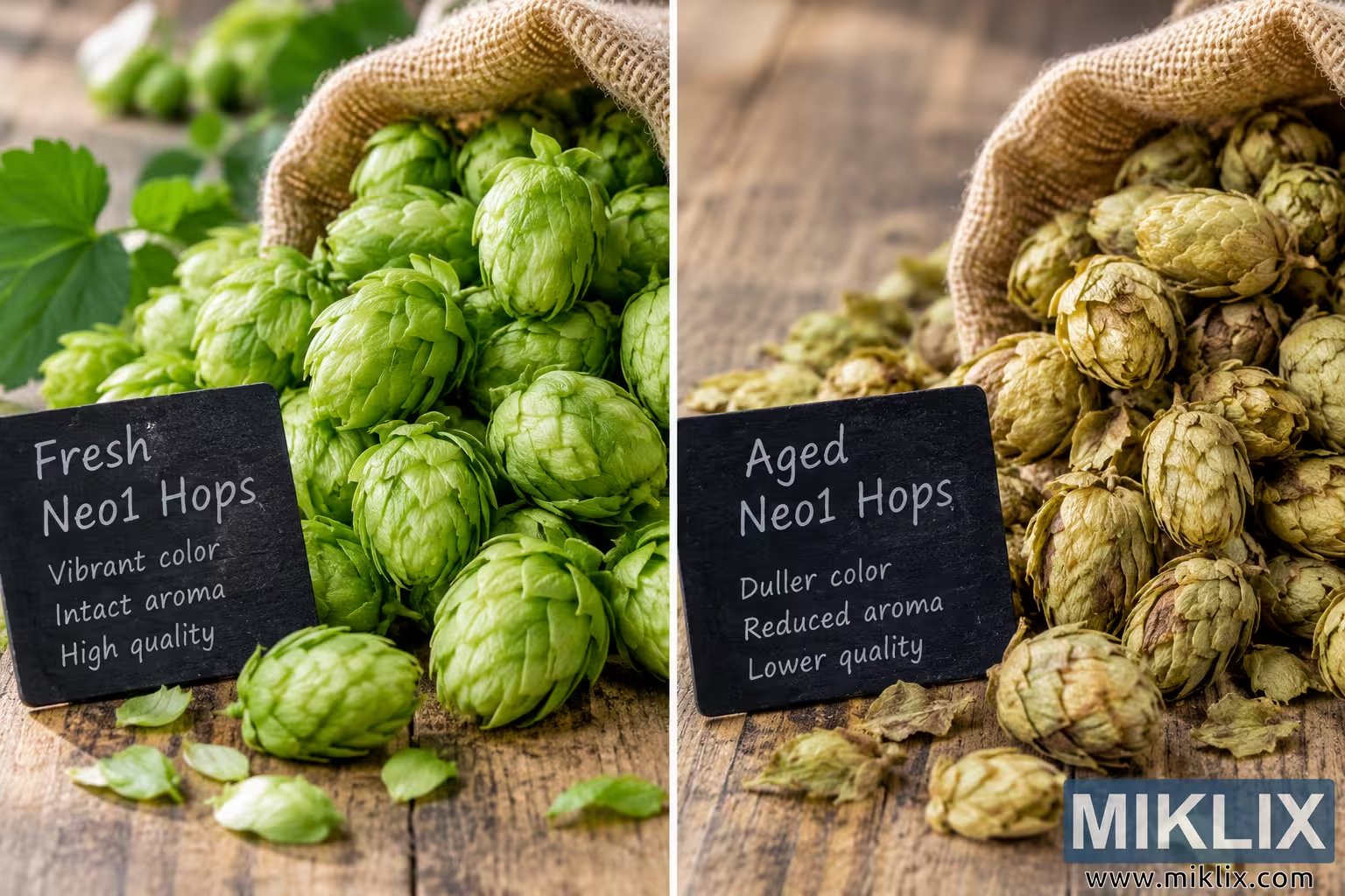
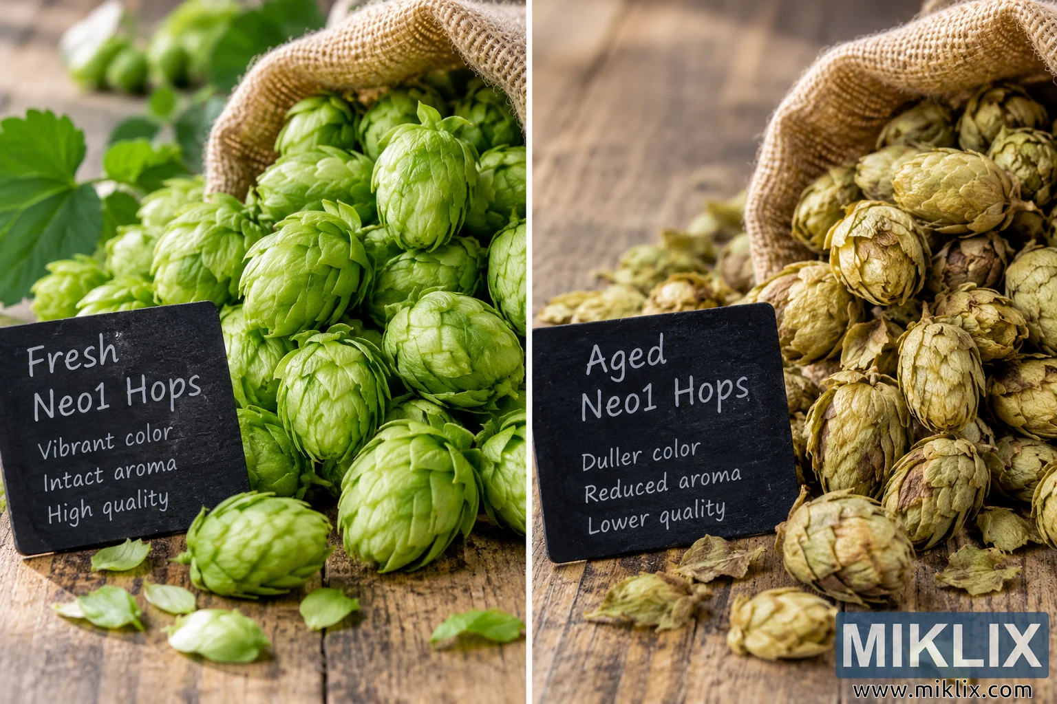
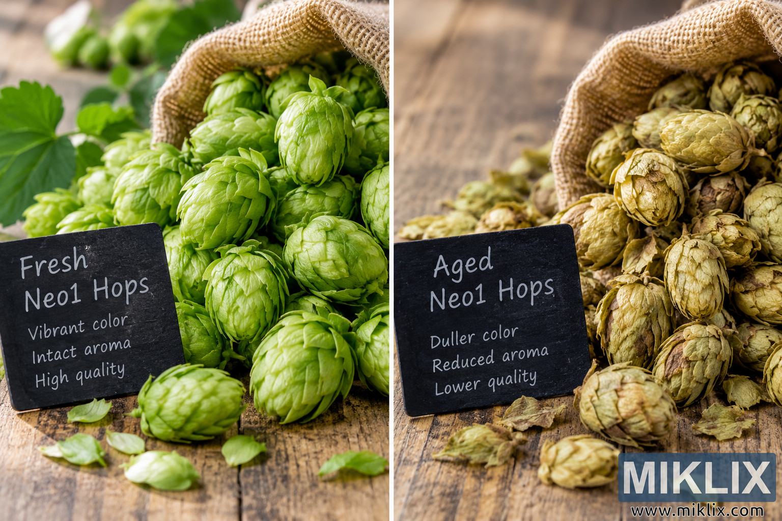
A detailed visual comparison of fresh versus aged Neo1 hops, highlighting differences in green color, dryness, cone condition, texture, and overall visual quality.
Available versions of this image
The image files available for download below are less compressed and higher resolution - and as a result of that, higher quality - than the images embedded in articles and pages on this website, which are more optimized for file size in order to reduce bandwidth consumption.
Regular size (1,536 x 1,024)
Large size (3,072 x 2,048)
Very large size (4,608 x 3,072)
Extra large size (6,144 x 4,096)
Comically large size (1,048,576 x 699,051)
- Still uploading... ;-)
Image description
This landscape-oriented image presents a clear visual comparison between fresh and aged Neo1 hops, emphasizing the differences in appearance, color, condition, and perceived quality. The composition is divided vertically into two contrasting halves, creating an immediately understandable side-by-side comparison. The left side represents fresh Neo1 hops, while the right side represents aged Neo1 hops. Both sides are arranged on a rustic wooden tabletop and use burlap sacks and chalkboard-style signs to create a natural agricultural and product-photography setting. The overall photographic treatment uses soft, warm natural-looking illumination, realistic textures, shallow depth of field, and close-up framing to make the hop cones the central visual subject. On the left side, the fresh hops are displayed as numerous compact, intact cones with a vivid green appearance. The cones have layered, overlapping bracts that look full and relatively firm, with subtle variations in green tones that reinforce their freshness and natural character. Several cones are piled in and around an open tan burlap sack, while additional cones and loose hop bracts are arranged across the wooden surface. The greenery is visually rich and saturated, with the strongest impression coming from the bright green color of the hop cones. Some green leaves and plant material appear in the softly blurred background, adding botanical context without distracting from the primary subject. A dark chalkboard-style sign in the foreground identifies this side as “Fresh Neo1 Hops” and includes the descriptive phrases “Vibrant color,” “Intact aroma,” and “High quality.” The sign is angled naturally on the tabletop and visually anchors the fresh-hop section while reinforcing the intended comparison. On the right side, the image depicts aged Neo1 hops using the same general rustic setting, but with a noticeably different visual character. The cones are paler and more muted, shifting from vivid green toward yellow-green, tan, beige, and light brown tones. Their bracts appear drier and less vibrant, with some cones showing darker areas and signs of deterioration or aging. Loose fragments and dry hop material are scattered across the tabletop, adding to the impression of reduced freshness. An open burlap sack behind the pile contains additional aged cones, maintaining a parallel composition with the fresh-hop side while making the difference in condition easy to observe. A second dark chalkboard sign identifies the right side as “Aged Neo1 Hops” and lists “Duller color,” “Reduced aroma,” and “Lower quality.” The matching signage creates a deliberate visual symmetry between the two halves. A narrow light-colored vertical divider separates the fresh and aged examples, making the comparison particularly suitable for educational, editorial, product-quality, agricultural, brewing, or ingredient-focused contexts. The image is photographed from a close, slightly elevated perspective, allowing the viewer to see both the tops and sides of the hop cones as well as the surrounding tabletop. The shallow depth of field keeps the principal hop cones and foreground signs relatively prominent while allowing the background elements to soften naturally. On the fresh side, the strong green coloration dominates the visual impression, whereas the aged side is characterized by more subdued, yellowed, tan, and brown hues. This contrast communicates the central subject without requiring complex graphical elements. The rustic wood grain provides a neutral, tactile background beneath both groups, while the burlap sacks introduce a recognizable agricultural texture and help visually connect the two sides. The lighting is warm and diffuse rather than harsh, revealing the fine layered structure of the hop bracts and the differences in surface texture. The image contains no people and does not rely on recognizable commercial packaging. It is presented as a generic photographic comparison rather than an advertisement for a specific company or commercial product. The term Neo1 is used as the descriptive hop variety name shown on the chalkboard labels. Overall, the image functions as a straightforward visual study of freshness versus aging in hop cones. Its strongest communicative feature is the immediate contrast between vivid, intact green cones on the left and duller, more yellowed and brown, visibly drier cones on the right. The repeated composition, matching burlap sacks, wooden tabletop, paired signs, and central divider make the comparison easy to scan and understand. The resulting photograph is appropriate for use where a visual explanation of hop color and condition is needed, including educational materials, brewing-related articles, ingredient-quality discussions, agricultural content, product-quality guides, or web pages explaining how fresh and aged hops can differ in appearance.
The image is related to: Hops in Beer Brewing: Neo1