
Image: Palisade Hops and Substitute Varieties: Side-by-Side Comparison
Published: October 20, 2026 at 5:48:45 PM UTC
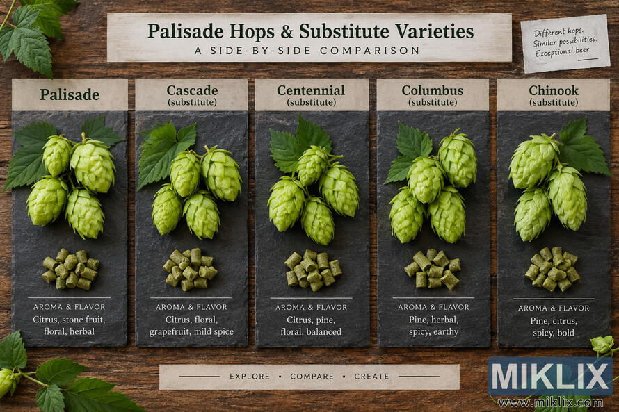
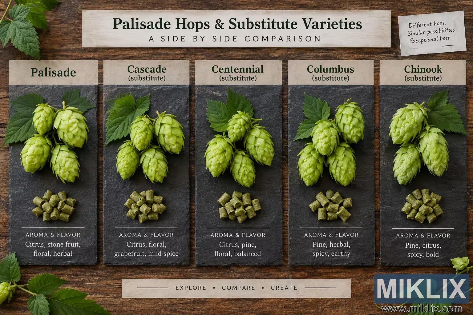
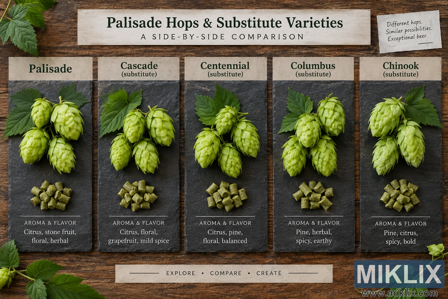
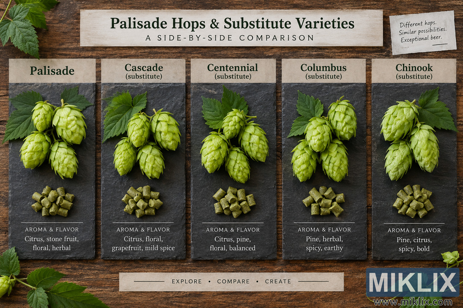
Explore a side-by-side visual comparison of Palisade hops and Cascade, Centennial, Columbus, and Chinook substitutes, including hop cones, pellets, and key aroma and flavor characteristics.
Available versions of this image
The image files available for download below are less compressed and higher resolution - and as a result of that, higher quality - than the images embedded in articles and pages on this website, which are more optimized for file size in order to reduce bandwidth consumption.
Regular size (1,536 x 1,024)
Large size (3,072 x 2,048)
Very large size (4,608 x 3,072)
Extra large size (6,144 x 4,096)
Comically large size (1,048,576 x 699,051)
- Still uploading... ;-)
Image description
A high-resolution, landscape-oriented infographic-style photograph presents a side-by-side comparison of Palisade hops and four substitute hop varieties. The composition is photographed from directly overhead, creating an orderly flat-lay presentation on a richly textured, dark brown rustic wooden tabletop. The overall visual style combines natural botanical photography with the appearance of a handcrafted brewing reference chart. Earthy wood, charcoal-gray slate, cream-colored paper, and fresh shades of green dominate the palette, giving the image a warm, agricultural, artisanal character appropriate to brewing and hop cultivation.
Across the upper center of the image is a wide rectangular strip of lightly weathered cream paper. Printed on it in large, dark green serif lettering is the heading “Palisade Hops & Substitute Varieties.” Immediately beneath the main heading, widely spaced black capital letters read “A SIDE-BY-SIDE COMPARISON.” The restrained typography and lightly aged paper complement the rustic tabletop. In the upper-right corner, a smaller irregular piece of pale paper resembles a handwritten tasting or brewer's note. It reads, “Different hops. Similar possibilities. Exceptional beer.” followed by a short horizontal underline. Green hop leaves and sections of hop vines enter the composition around the outer edges, especially at the upper-left and lower corners, making the structured comparison feel connected to the living plant material from which the ingredients originate.
The central portion of the image contains five tall, narrow comparison panels arranged horizontally with even spacing. Each panel consists primarily of a dark charcoal slate board with a cream paper label at the top. From left to right, the panels are labeled “Palisade,” “Cascade (substitute),” “Centennial (substitute),” “Columbus (substitute),” and “Chinook (substitute).” This layout establishes Palisade as the reference variety while visually identifying the other four hop varieties as possible substitutes. No commercial logos, packaging, trademarks, or actual product brands are shown anywhere in the composition.
The first panel, labeled “Palisade,” contains several large, fresh hop cones in light yellow-green tones arranged over deep green serrated leaves. The cones have clearly visible overlapping papery bracts, giving them a realistic botanical texture. Below the whole cones is a small pile of compressed green hop pellets, represented as short cylindrical pieces with slightly irregular surfaces. Near the bottom of the slate panel, a fine white divider line separates the ingredient photography from the tasting information. The heading “AROMA & FLAVOR” appears beneath the divider, followed by the descriptors “Citrus, stone fruit, floral, herbal.” The combination of cones, pellets, and descriptors communicates both the natural and processed forms of the brewing ingredient.
The second panel is labeled “Cascade (substitute).” It repeats the same visual structure for easy comparison: fresh green hop cones and serrated leaves occupy the upper portion, while a small pile of green hop pellets sits below. The cones are arranged somewhat differently from those in the Palisade panel, helping each section retain its own identity while maintaining a consistent photographic treatment. Under the white divider, “AROMA & FLAVOR” is followed by “Citrus, floral, grapefruit, mild spice.” The slate background provides strong contrast with the luminous green cones and pellets.
The middle panel is labeled “Centennial (substitute).” A cluster of fresh hop cones rests against dark green leaves in the upper half, accompanied by another compact pile of cylindrical hop pellets in the lower half. The botanical details, including leaf veins, serrated edges, layered cone bracts, and subtle variations in green coloration, are rendered clearly. Beneath the divider, the panel lists “AROMA & FLAVOR” and the descriptors “Citrus, pine, floral, balanced.” Its central placement reinforces the symmetrical, reference-chart quality of the overall arrangement.
The fourth panel, “Columbus (substitute),” uses the same dark slate presentation. Several pale green hop cones are grouped with broad, textured leaves, and a pile of olive-green hop pellets appears beneath them. Below the horizontal rule, the aroma and flavor section reads “Pine, herbal, spicy, earthy.” The wording and imagery together distinguish this variety from the more citrus- and floral-oriented descriptions in neighboring panels while preserving the consistent side-by-side format.
The fifth and rightmost panel is labeled “Chinook (substitute).” It shows a compact grouping of fresh hop cones framed by dark green leaves, with compressed hop pellets below. The bottom portion is headed “AROMA & FLAVOR” and lists “Pine, citrus, spicy, bold.” Like the other panels, it is presented without branded packaging or manufacturer information, keeping the emphasis entirely on the hop variety, visual ingredient form, and general sensory descriptors.
A long cream-colored paper strip is centered near the bottom of the composition beneath the five panels. It carries the words “EXPLORE • COMPARE • CREATE” in widely spaced capital letters, with thin horizontal decorative rules on either side. More hop leaves and vine elements extend inward from the lower-left and lower-right edges of the frame. These organic details soften the otherwise precise grid and visually connect the comparison display with hop agriculture and brewing ingredients.
Lighting is soft, even, and directional enough to reveal the dimensional texture of the hop cones, leaves, pellets, slate boards, paper, and wood grain without producing harsh shadows. The image has the polished clarity of a professional editorial food or brewing photograph while retaining a tactile, handmade presentation. Its landscape orientation allows all five varieties to be viewed simultaneously, making differences in naming, aroma descriptors, and ingredient presentation easy to scan. The repeated slate panels create strong visual consistency, while the cream labels and dark green typography provide clear hierarchy. Overall, the image functions as an attractive educational comparison display centered on Palisade hops and several substitute varieties, combining botanical realism, brewing-oriented information, rustic materials, and a clean infographic structure in a single cohesive scene.
The image is related to: Hops in Beer Brewing: Palisade