
Slika: Columbus and Centennial Hop Cones Side-by-Side Comparison
Objavljeno:
Posljednje ažurirano: 20. septembar 2026. u 09:58:20 UTC
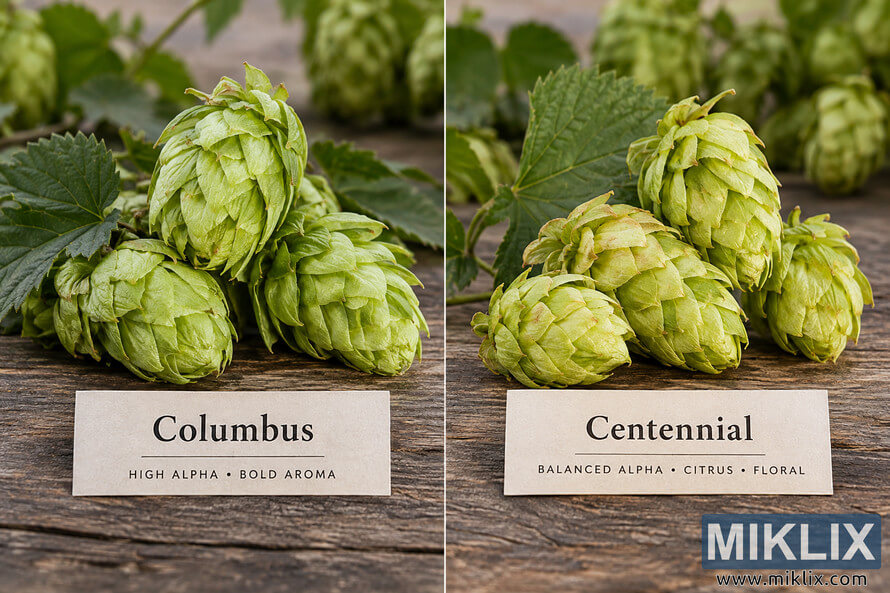
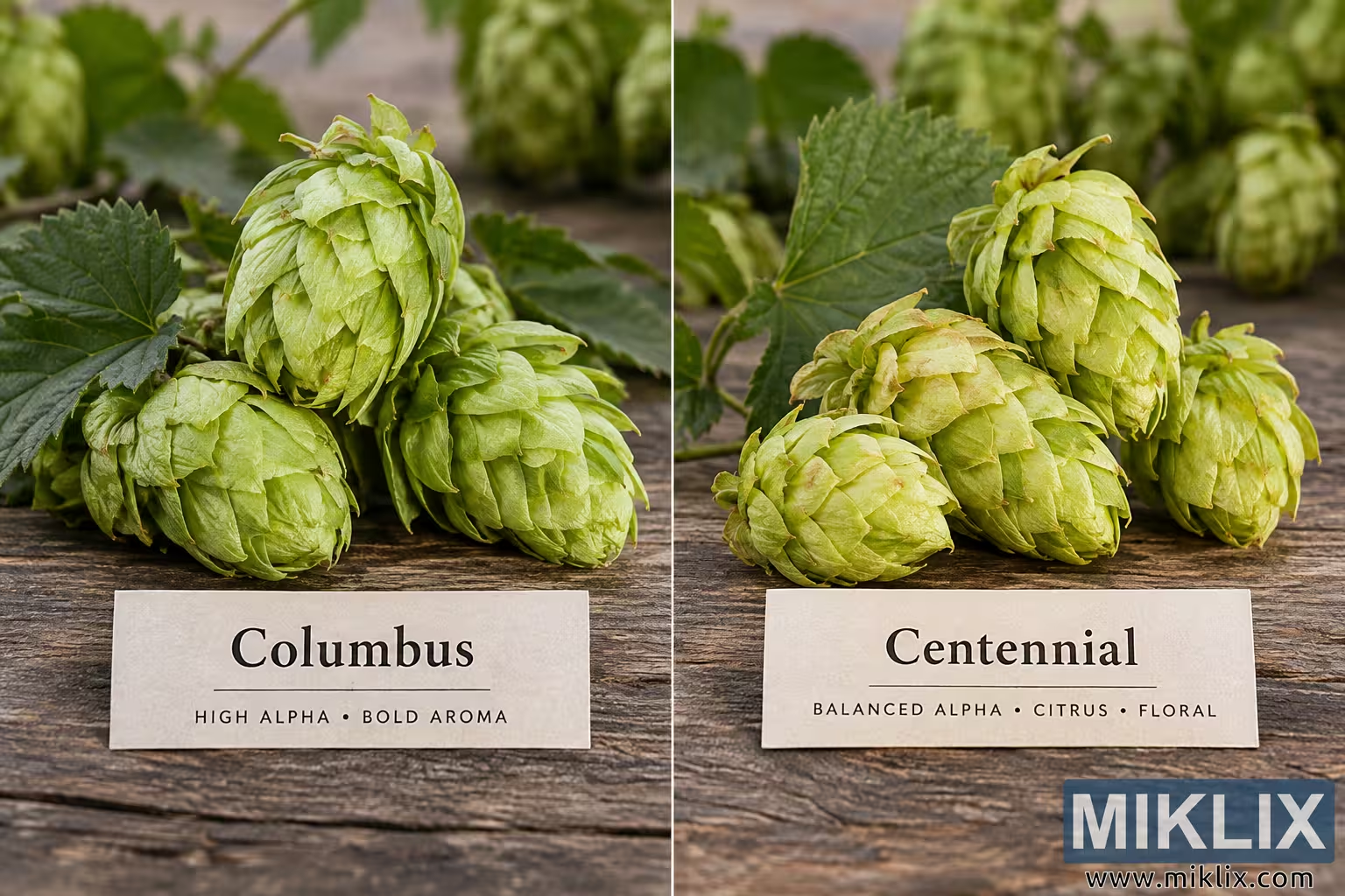
Compare Columbus and Centennial hop cones side by side in a detailed photograph showing their green cones, foliage, natural textures, and key aroma characteristics.
Columbus and Centennial Hop Cones Side-by-Side Comparison
Dostupne verzije ove slike
Slikovne datoteke dostupne za preuzimanje u nastavku su manje komprimirane i veće rezolucije - i kao rezultat toga, višeg kvaliteta - od slika ugrađenih u članke i stranice na ovoj web stranici, koje su optimiziranije za veličinu datoteke kako bi se smanjila potrošnja propusnog opsega.
Standardna veličina (1,536 x 1,024)
Velika veličina (3,072 x 2,048)
Vrlo velika veličina (4,608 x 3,072)
Ekstra velika veličina (6,144 x 4,096)
Komično velika veličina (1,048,576 x 699,051)
- Još uvijek se uploaduje... ;-)
Opis slike
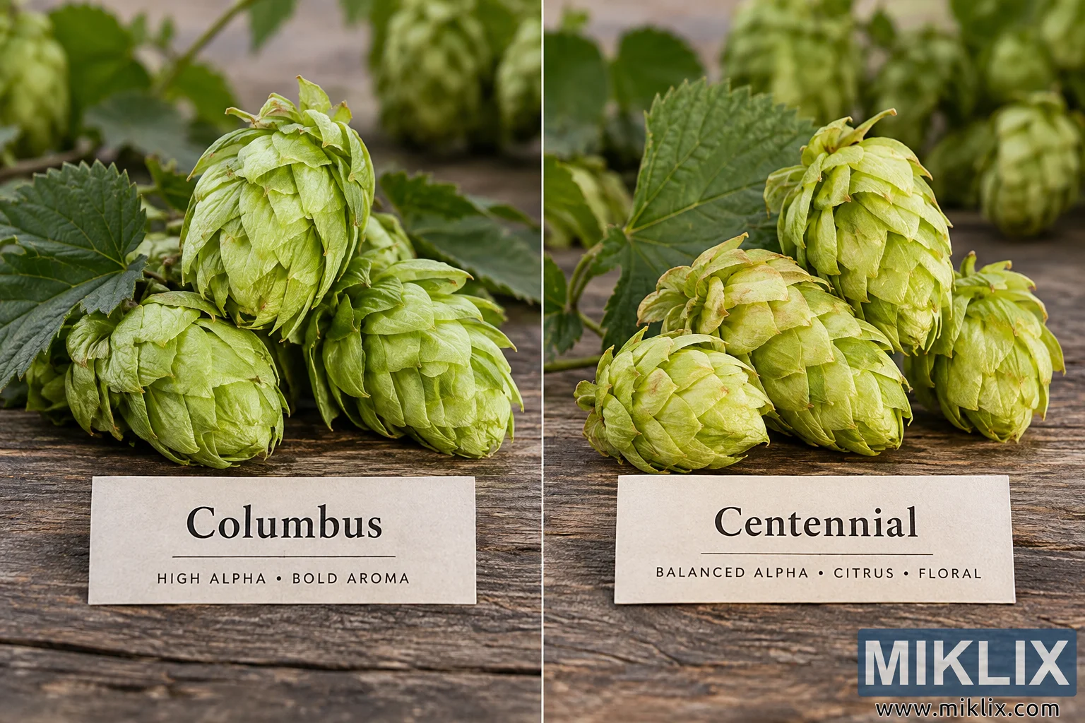
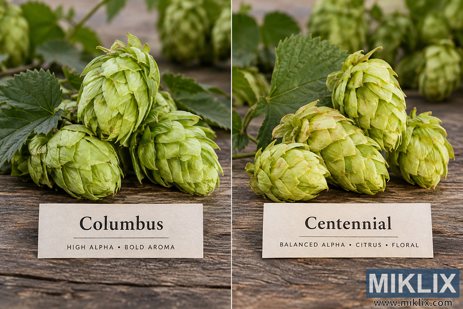
A high-resolution landscape photograph presents a direct side-by-side visual comparison of Columbus and Centennial hop cones. The composition is divided vertically into two nearly equal sections by a thin, pale line running from the top to the bottom of the image. Columbus hops occupy the left half, while Centennial hops occupy the right half. Both groups are photographed at close range on the same rustic wooden surface, creating a consistent setting that makes it easy to compare their appearance. The overall visual style is naturalistic and photographic, with soft daylight, detailed plant textures, shallow depth of field, and an agricultural atmosphere.
On the left side, several Columbus hop cones are arranged in a compact cluster. Three large cones dominate the foreground and middle of the composition, with additional hop material partially visible behind them. The most prominent cone rises toward the upper center of the left panel. It has an elongated, slightly tapered shape and consists of many overlapping pale green bracts. The bracts have delicate wrinkles, fine veins, and subtly curled edges, giving the cone a tactile, layered appearance. Two other substantial cones sit lower in the frame, one toward the left and another toward the center-right. Their overlapping scales create a dense, leafy texture. The Columbus cones are predominantly fresh yellow-green to light green, with small variations in tone and occasional slightly darker or warmer edges.
Dark green hop leaves surround and partially frame the Columbus cones. A broad leaf extends across the left side of the image and provides strong tonal contrast against the lighter cones. Other leaves and stems appear behind the cluster, reinforcing the impression that the hops have recently been harvested or are being displayed alongside portions of the vine. The background is softly blurred, with indistinct green hop cones and foliage visible behind the main subjects. This shallow depth of field keeps attention on the foreground cones while still establishing a natural hop-growing context.
The right half displays a cluster of Centennial hop cones. Approximately four prominent cones are clearly visible in the foreground arrangement, with the tallest positioned toward the upper right-center. As with the Columbus hops, the Centennial cones consist of overlapping green bracts with visible veins, folds, wrinkles, and slightly irregular edges. The Centennial cluster appears somewhat broader and more spread out in its arrangement. A rounded cone lies toward the lower left of the right panel, another larger cone occupies the lower center, and a further cone extends toward the right edge. The tallest cone rises above the group and forms the primary focal point of this half of the photograph. The coloration ranges from yellow-green to medium green, with subtle tan or warm-toned accents along some bract edges.
A large dark green hop leaf sits behind the Centennial cones and spreads diagonally through the upper middle portion of the right panel. Its pronounced veins and serrated perimeter provide a contrasting texture to the layered cones. Additional stems, leaves, and blurred hop cones fill the background. As on the Columbus side, the background is intentionally out of focus, producing a soft green agricultural backdrop while preserving crisp detail on the foreground subjects.
Both hop varieties rest on a weathered wooden tabletop made from broad horizontal planks. The wood is brown and gray-brown, with prominent grain, cracks, grooves, knots, and irregular surface markings. The rough character of the timber contrasts with the delicate, papery texture of the hop bracts. The use of the same wooden surface on both sides strengthens the impression of a controlled comparison rather than two unrelated photographs. Natural lighting falls evenly across the scene, revealing fine surface details without creating harsh shadows.
Near the bottom of each half is a rectangular cream or off-white identification card resting on the tabletop. The left card is labeled “Columbus” in large dark serif lettering. Beneath the variety name is a thin horizontal rule, followed by smaller uppercase text reading “HIGH ALPHA • BOLD AROMA.” The right card uses the same visual treatment and is labeled “Centennial.” A thin horizontal rule appears below the name, followed by the smaller uppercase wording “BALANCED ALPHA • CITRUS • FLORAL.” The cards provide an immediate textual distinction between the two hop varieties while maintaining a restrained, neutral presentation without commercial branding or logos.
The vertical dividing line passes between the two displays and emphasizes the comparison format. The arrangement is balanced but not perfectly symmetrical: each group of hops has its own natural shapes and positioning, while the matching background, tabletop, lighting, camera angle, and label design visually connect the two sides. The camera is positioned close to tabletop level but slightly above the subjects, allowing both the dimensional forms of the cones and the identification cards to remain clearly visible.
The image communicates the physical character of two hop varieties through a straightforward botanical comparison. Columbus is presented on the left as a cluster of large, layered green cones accompanied by the descriptors high alpha and bold aroma. Centennial is presented on the right with similarly detailed green cones and the descriptors balanced alpha, citrus, and floral. The scene contains no visible company logos, packaging, trademarks, or commercial brand identifiers. Its emphasis is entirely on the hop cones, their foliage, their variety names, and concise descriptive characteristics. The combination of realistic plant detail, rustic wood, soft natural light, shallow depth of field, and clearly separated labels gives the photograph the appearance of an educational or editorial comparison image intended to help viewers visually distinguish and understand Columbus and Centennial hops.
Slika je povezana sa: Hops in Beer Brewing: Columbus