
Image: Comparison of Organic and Conventional Okra
Published: July 30, 2026 at 6:37:08 PM UTC
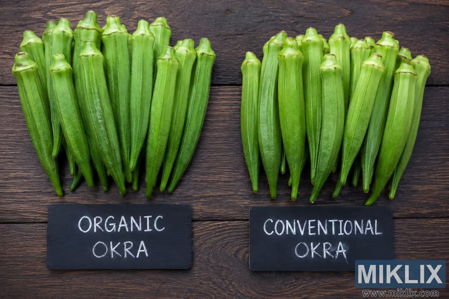
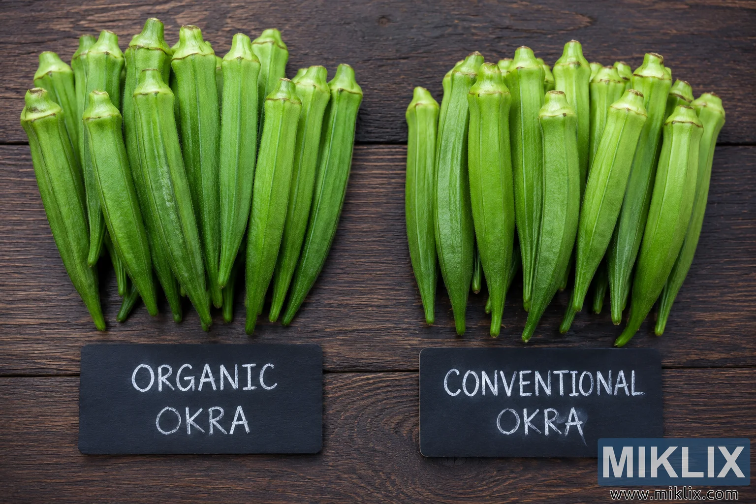
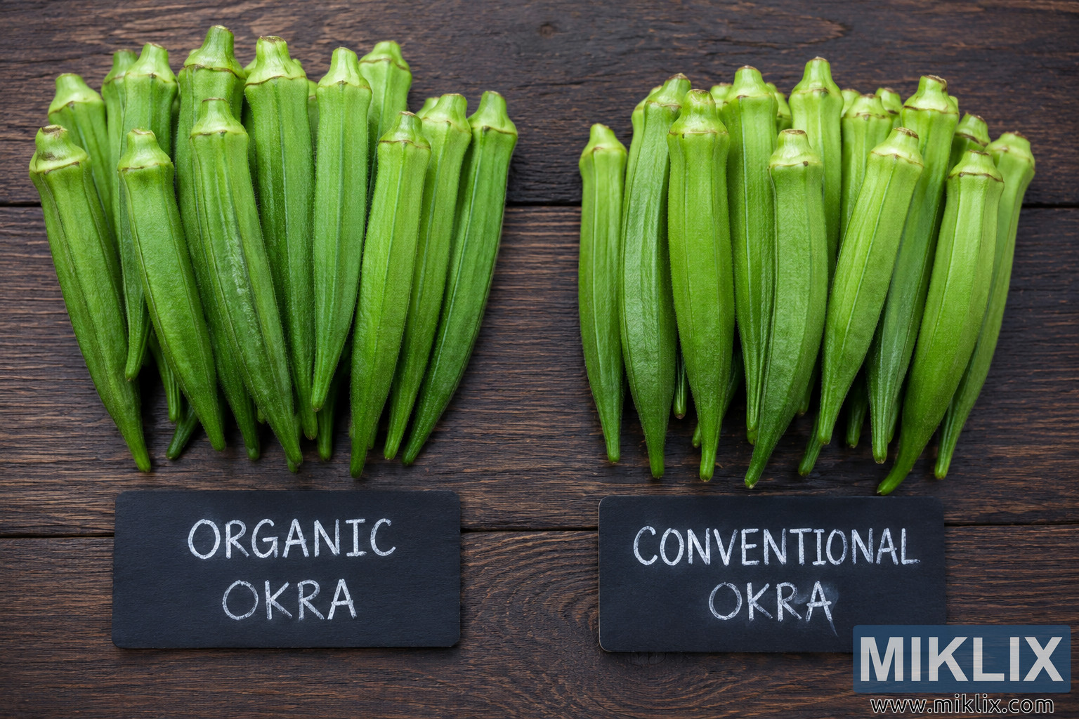
Landscape comparison image of organic and conventional okra featuring labeled fresh vegetables on a rustic wooden background and an easy-to-read comparison chart highlighting visual, agricultural, and nutritional differences.
Available versions of this image
The image files available for download below are less compressed and higher resolution - and as a result of that, higher quality - than the images embedded in articles and pages on this website, which are more optimized for file size in order to reduce bandwidth consumption.
Regular size (1,536 x 1,024)
Large size (3,072 x 2,048)
Very large size (4,608 x 3,072)
Extra large size (6,144 x 4,096)
Comically large size (1,048,576 x 699,051)
- Still uploading... ;-)
Image description
This landscape-oriented comparison image presents two carefully arranged groups of fresh okra placed side by side on a weathered wooden tabletop, creating a clean and informative visual comparison between organically grown and conventionally grown okra. The composition is symmetrical, making it easy for viewers to compare both groups at a glance while maintaining a natural, farm-inspired aesthetic. The rustic wooden background adds warmth and reinforces the agricultural theme without distracting from the vegetables themselves. Soft natural lighting evenly illuminates the scene, emphasizing the textures, shapes, and subtle color differences between the two collections of okra.
On the left side of the image is a neatly arranged pile labeled "Organic Okra." The pods are vibrant green with a fresh, healthy appearance and relatively smooth, consistent surfaces. Their shape appears full and firm, suggesting freshness and careful harvesting. Above the vegetables is a simple rectangular sign displaying the organic label in large, readable lettering accompanied by a small leaf icon that visually reinforces the natural farming theme. The left grouping is presented in a clean and attractive manner, conveying quality and freshness while remaining realistic rather than overly stylized.
On the right side is a similarly arranged collection labeled "Conventional Okra." These pods appear slightly paler in color and display more visible surface blemishes, minor discoloration, and texture variation compared to the organic group. The vegetables remain fresh and edible but intentionally exhibit greater visual inconsistency to support the educational comparison. A matching rectangular sign above this collection identifies it as conventional okra, maintaining visual balance with the left side while ensuring viewers can easily distinguish between the two categories.
Centered beneath both collections is a structured comparison table that provides an easy-to-read summary of the illustrated differences. The table is organized into multiple horizontal rows with a central category column and corresponding descriptions for each type of okra. Categories include appearance, texture, firmness, growing practice, environmental impact, and nutrition and taste. For the organic side, the table references characteristics such as vibrant green color, smooth texture, firm pods, cultivation without synthetic pesticides or chemicals, positive environmental considerations, and the possibility of higher nutrient content and richer flavor. For the conventional side, the table highlights comparatively paler coloration, rougher texture with more blemishes, thinner pods with slightly reduced firmness, cultivation using synthetic pesticides and chemicals, greater environmental impact, and comparatively lower nutrient retention with a milder taste. The chart functions as a quick educational reference that complements the visual comparison above it.
The overall design follows a balanced, top-down flat-lay composition with generous spacing between elements. Typography is bold, clean, and highly legible against neutral backgrounds, ensuring accessibility for readers while avoiding unnecessary decorative elements. The natural color palette consists primarily of greens, earthy browns, and muted beige tones, reinforcing the agricultural subject matter. No commercial logos, product branding, packaging, or recognizable trademarks are present anywhere within the image, allowing the comparison to remain generic and educational.
The blurred greenery visible beyond the wooden surface subtly suggests an outdoor garden or farm environment without drawing attention away from the foreground. Lighting remains consistent across both sides of the composition, avoiding dramatic shadows that could unintentionally bias the comparison. The image emphasizes clarity, organization, and visual balance, making it suitable for educational articles, blog posts, presentations, agricultural discussions, nutrition resources, or informational webpages discussing differences between organic and conventional produce. Overall, the image communicates its subject clearly through a combination of realistic food photography, informative labeling, and a structured comparison chart while maintaining a clean, professional, and approachable appearance.
The image is related to: Okra Benefits: How This Nutritious Vegetable Supports Your Health