
Beeld: Quality Supplement Label Comparison
Gepubliseer:
Laas opgedateer: 28 Augustus 2026 om 20:35:53 UTC
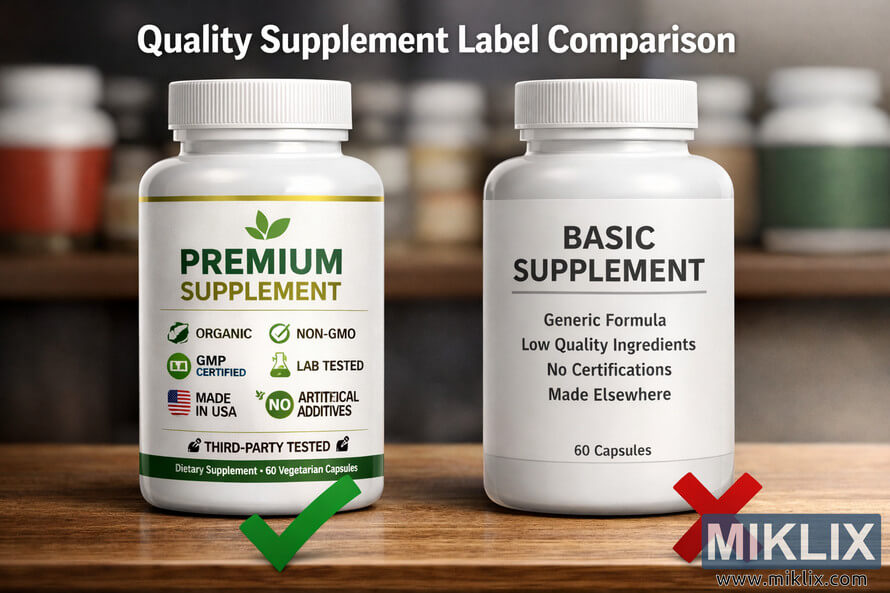
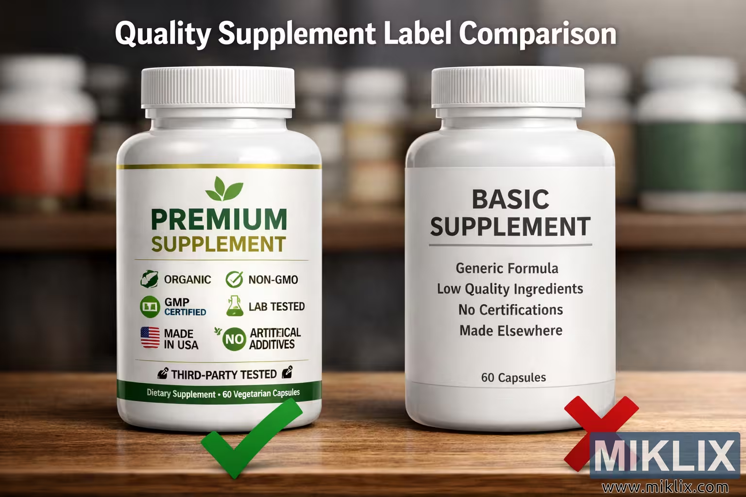
A detailed visual comparison of supplement label quality and certifications, highlighting the contrast between premium and basic products through design, clarity, and trust symbols.
Quality Supplement Label Comparison
Beskikbare weergawes van hierdie beeld
Die beeldlêers wat hieronder beskikbaar is om af te laai, is minder saamgepers en het 'n hoër resolusie - en gevolglik hoër gehalte - as die beelde wat in artikels en bladsye op hierdie webwerf ingebed is, wat meer geoptimaliseer is vir lêergrootte om bandwydteverbruik te verminder.
Gewone grootte (1,536 x 1,024)
Groot grootte (3,072 x 2,048)
Baie groot grootte (4,608 x 3,072)
Ekstra groot grootte (6,144 x 4,096)
Komies groot grootte (1,048,576 x 699,051)
- Laai steeds op... ;-)
Beskrywing van die beeld
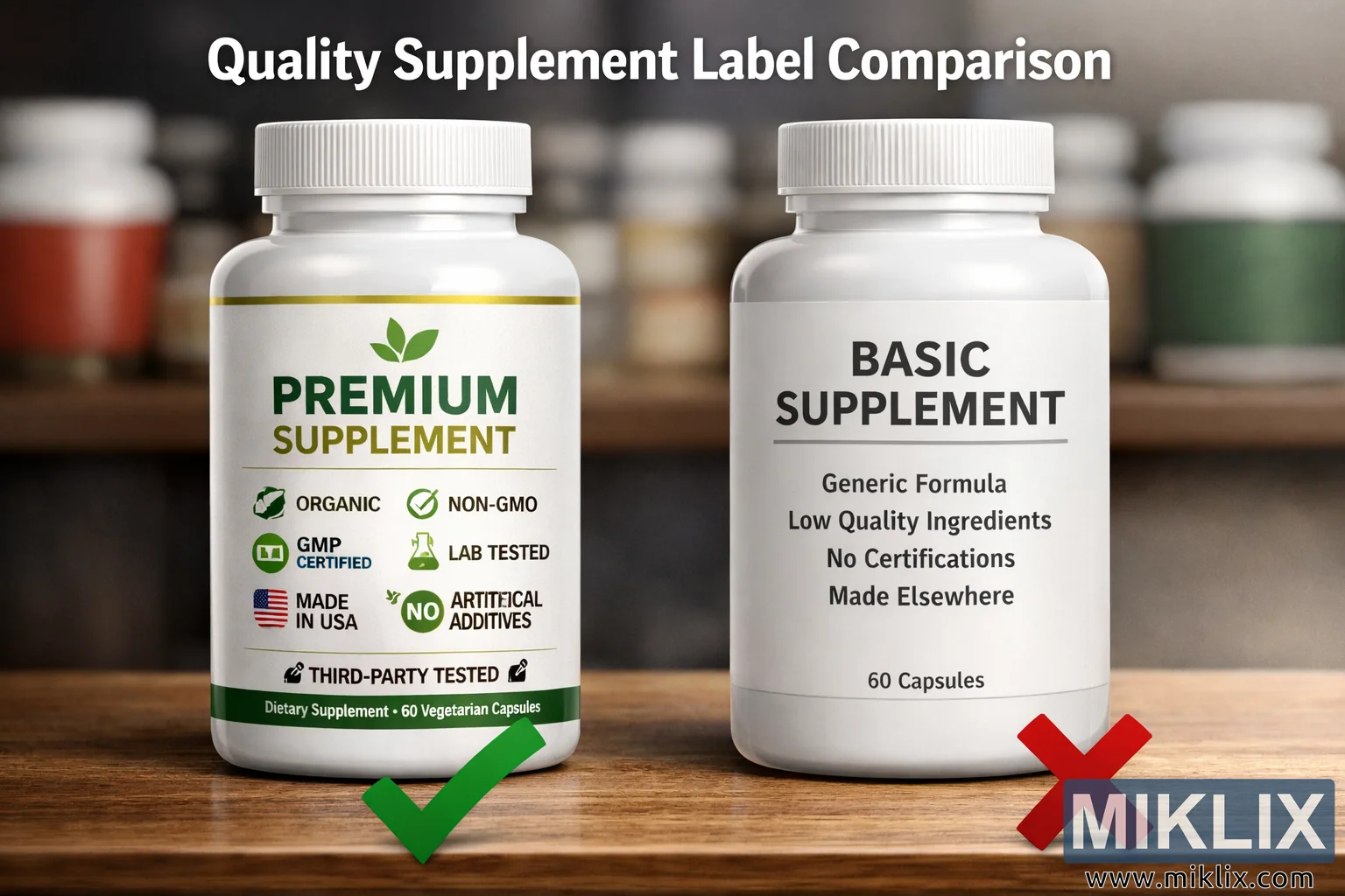
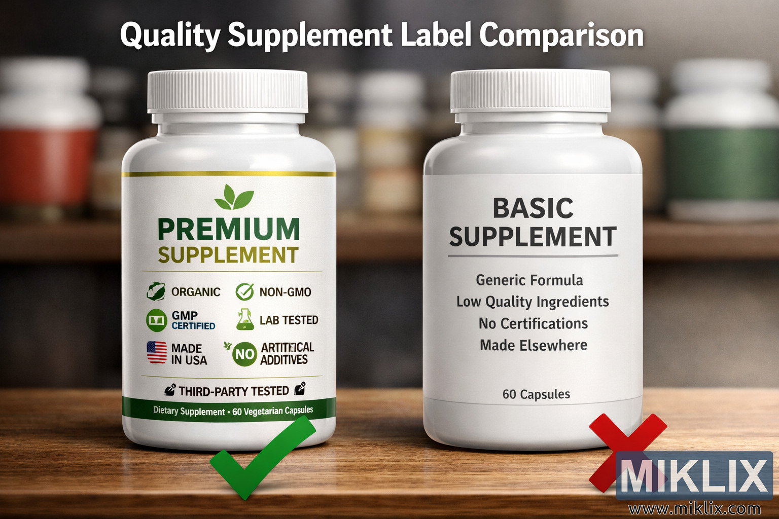
The image presents a meticulously composed landscape photograph that visually contrasts two supplement bottles placed side by side on a smooth wooden surface. The scene is illuminated by soft, natural light that enhances the textures of the bottles and the subtle grain of the wood. In the background, a blurred shelf filled with various supplement containers provides contextual depth, suggesting a retail or health-oriented environment. Above the bottles, the phrase 'Quality Supplement Label Comparison' appears in large, bold, white text, centered and slightly glowing against the muted backdrop, establishing the theme of the image.
On the left side of the composition stands the 'PREMIUM SUPPLEMENT' bottle. It features a clean, white label adorned with green and gold typography that conveys a sense of vitality and trust. A small green leaf logo sits above the product name, symbolizing natural ingredients and eco-conscious production. Beneath the main title, a series of certification icons are neatly arranged in a grid-like pattern, each representing a key quality assurance standard. The icons include 'ORGANIC' with a stylized leaf, 'NON-GMO' with a green checkmark, 'GMP CERTIFIED' enclosed in a circular badge, 'LAB TESTED' represented by a beaker, 'MADE IN USA' accompanied by a flag motif, 'NO ARTIFICIAL ADDITIVES' marked by a green circle with the word 'NO', and 'THIRD-PARTY TESTED' symbolized by a checkmark and flask combination. The bottom of the label reads 'Dietary Supplement • 60 Vegetarian Capsules' in small, precise text, reinforcing the professional and transparent presentation. Below the bottle, a large green checkmark is displayed, visually affirming its credibility and high quality.
On the right side, the 'BASIC SUPPLEMENT' bottle offers a stark contrast. Its label is plain white with bold, black lettering that reads 'BASIC SUPPLEMENT' in a utilitarian font. The design lacks decorative elements, color variation, or any visual hierarchy. Beneath the title, smaller text lists generic statements such as 'Generic Formula', 'Low Quality Ingredients', 'No Certifications', and 'Made Elsewhere'. These phrases are intentionally minimal and unembellished, emphasizing the absence of trust indicators or quality assurances. At the bottom, the label simply states '60 Capsules' in small text. Below this bottle, a red 'X' symbol reinforces the negative evaluation, serving as a visual shorthand for poor quality or lack of verification.
The composition is balanced yet deliberately asymmetrical in emotional tone. The left side radiates professionalism, health consciousness, and consumer confidence, while the right side evokes skepticism and caution. The lighting subtly favors the premium bottle, casting a gentle highlight that draws the viewer’s eye toward its detailed label. The background blur ensures that the focus remains on the two bottles, while the wooden surface adds warmth and realism to the scene.
The photograph’s color palette is dominated by whites, greens, and golds on the left, contrasted with grayscale tones on the right. This deliberate use of color psychology reinforces the message: green and gold evoke nature, purity, and excellence, while black and white suggest simplicity and lack of sophistication. The overall aesthetic is clean, modern, and educational, designed to communicate the importance of label transparency and certification in consumer health products.
Every element in the image contributes to a narrative of informed choice. The viewer is invited to consider how visual design, certification marks, and clear labeling influence perceptions of product quality. The juxtaposition of the two bottles serves as a visual metaphor for the broader marketplace, where consumers must discern between genuine quality and superficial presentation. The image succeeds in conveying this message without referencing any real brands, maintaining neutrality while emphasizing universal principles of trust, authenticity, and regulatory compliance.
In sum, the image is a high-resolution, landscape-oriented educational visual that encapsulates the essence of product differentiation through labeling. It combines aesthetic appeal with informative clarity, making it suitable for use in presentations, marketing materials, or educational contexts that explore consumer awareness and product integrity.
Die beeld hou verband met: Licorice Root: The Ancient Herb with Modern Health Benefits