
Image: Declining Yeast Cell Viability During Liquid Yeast Storage
Published: September 23, 2026 at 9:53:23 PM UTC
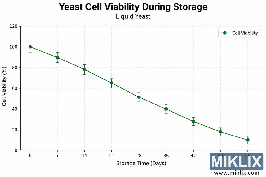
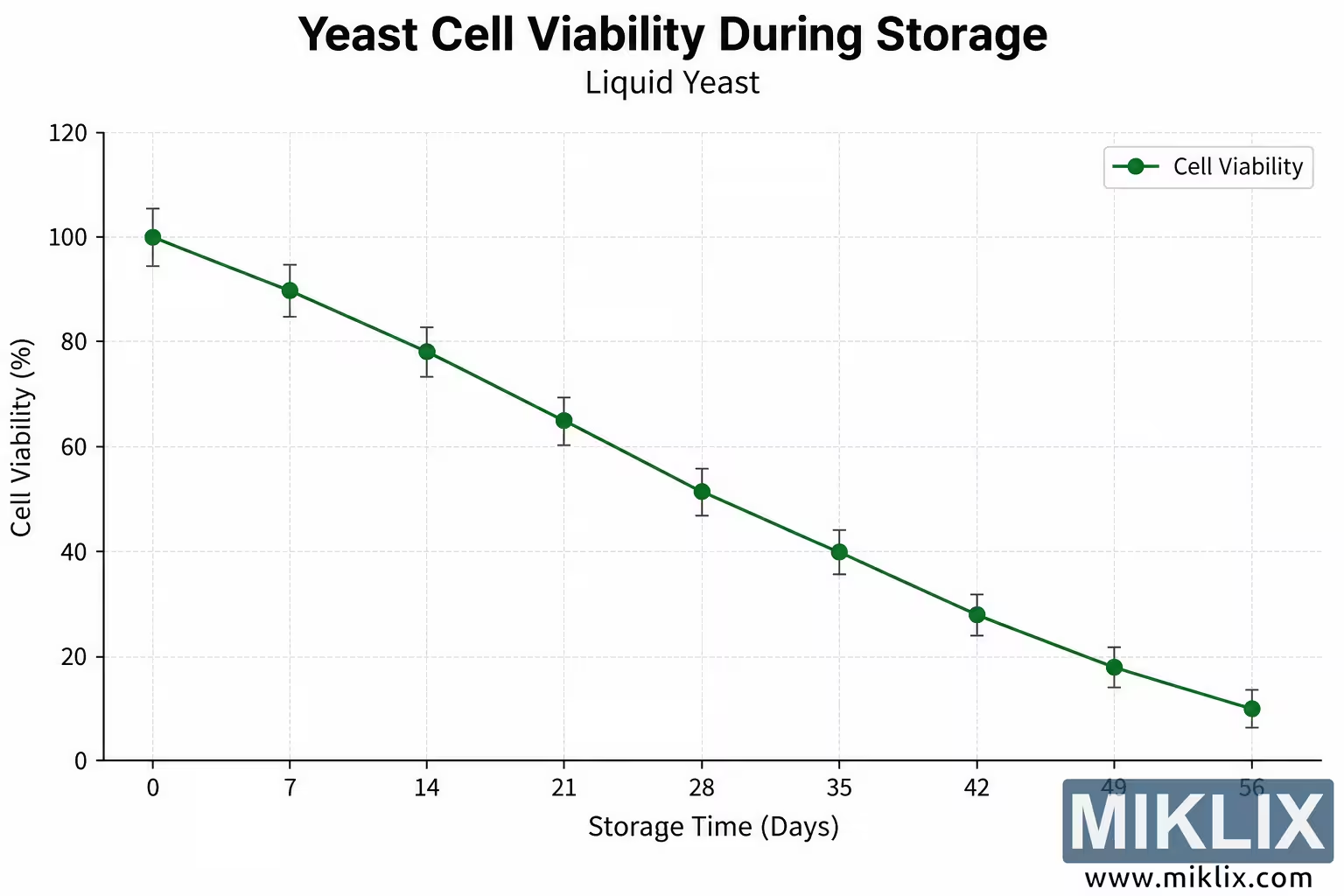
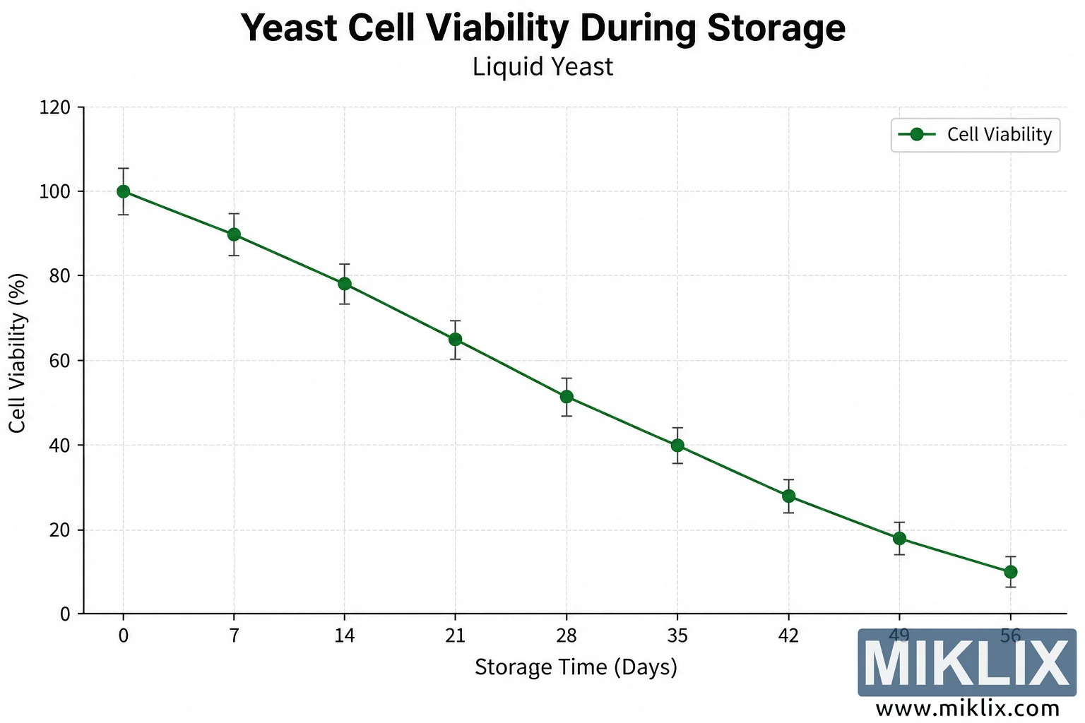
Scientific line graph illustrating the progressive decline in liquid yeast cell viability over 56 days of storage, from approximately 100% viability initially to about 10% by day 56.
Available versions of this image
The image files available for download below are less compressed and higher resolution - and as a result of that, higher quality - than the images embedded in articles and pages on this website, which are more optimized for file size in order to reduce bandwidth consumption.
Regular size (1,536 x 1,024)

Large size (3,072 x 2,048)
Very large size (4,608 x 3,072)
Extra large size (6,144 x 4,096)
Comically large size (1,048,576 x 699,051)
- Still uploading... ;-)
Image description
The image is a clean, landscape-oriented scientific graph illustrating the decline in yeast cell viability as liquid yeast is stored over time. The overall design resembles a publication-ready scientific or technical infographic, with a white background, dark typography, pale gray gridlines, and a single green data series. There are no commercial logos, product names, trademarks, packaging elements, or other brand identifiers anywhere in the image.
Centered prominently at the top is the main title, “Yeast Cell Viability During Storage,” displayed in large, bold, black text. Directly beneath it is the smaller subtitle “Liquid Yeast,” which clarifies that the plotted data refer specifically to yeast maintained in liquid form. The chart occupies most of the remaining canvas and is surrounded by generous white space, giving the image a simple and professional appearance.
The horizontal x-axis is labeled “Storage Time (Days).” It represents the duration of storage and begins at 0 days on the left, progressing in regular seven-day intervals through 7, 14, 21, 28, 35, 42, and 49 days, before ending at 56 days on the far right. These labels establish an eight-week storage period and make the progression of time straightforward to follow. The vertical y-axis is labeled “Cell Viability (%).” Its scale begins at 0% at the bottom and extends to 120% at the top, with labeled increments of 20 percentage points. Horizontal and vertical dashed light-gray gridlines extend across the plotting area, helping the viewer associate each plotted point with its approximate numerical value.
The primary data series is shown as a dark green line connecting nine green circular markers. A legend in the upper-right portion of the chart identifies this series as “Cell Viability.” The first data point, corresponding to day 0, lies at approximately 100% viability. This represents the initial condition and is visually the highest point in the series. At day 7, viability has fallen to approximately 90%. By day 14, it is approximately 78%. At day 21, the plotted value has decreased further to roughly 65%. At day 28, the viability is just above 50%, at approximately 52%. The downward trend continues at day 35, where the plotted value is approximately 40%. At day 42, viability has declined to around 28%. At day 49, it is approximately 18%, and the final measurement at day 56 is close to 10%.
Each circular data marker is accompanied by a small vertical error bar with short horizontal caps at its upper and lower ends. These error bars are rendered in a dark neutral tone and indicate a modest amount of variability or uncertainty around each plotted value. They remain relatively small compared with the overall magnitude of the decline and therefore do not obscure the central visual message. The connected markers form a smooth, consistently descending trajectory from the upper-left portion of the graph toward the lower-right portion. There are no reversals or temporary increases in the plotted values; viability decreases at every successive measurement point.
Visually, the graph communicates a strong negative relationship between storage duration and viable yeast cells in this illustrative liquid-yeast dataset. During the first two weeks, viability decreases from approximately 100% to 78%. By the third week, it is near 65%, and by four weeks it has fallen to just over half of the initial level. Around five weeks of storage, the plotted viability reaches approximately 40%, and during the final three weeks shown it continues to decline substantially, reaching roughly 10% after eight weeks. The line therefore conveys progressive loss of viable cells throughout the entire storage period rather than a sudden single drop at one particular time point.
The visual hierarchy is deliberately simple. The large title establishes the subject first, the subtitle identifies the yeast format, and the axis labels define the two variables being compared. The dark green line and markers contrast clearly against the white plotting field and pale grid, making the data trend immediately visible. Black axis lines and labels provide strong readability without competing visually with the green data series. The legend is enclosed in a subtle light-bordered box and sits away from the plotted line so that it does not cover any measurements.
The image should be interpreted primarily as a visual representation of declining yeast cell viability over storage time rather than as documentation of a particular commercial yeast strain, manufacturer, storage protocol, or experimentally validated dataset. No strain name, storage temperature, culture medium, experimental method, sample size, statistical test, or source citation is provided in the graphic. Consequently, the numerical values shown are best understood as the values depicted by the illustration itself and should not automatically be generalized to every liquid yeast culture or real-world storage condition. Factors such as yeast strain, initial cell health, temperature, oxygen exposure, nutrient availability, contamination, packaging, and storage methodology can influence actual viability rates.
In summary, the image presents a clear scientific line graph in which liquid yeast cell viability declines steadily over a 56-day storage period. The plotted series starts at approximately 100% viability on day 0 and decreases through approximately 90%, 78%, 65%, 52%, 40%, 28%, and 18% at weekly intervals before reaching about 10% at day 56. Small error bars accompany every measurement. The uncluttered landscape composition, descriptive title and subtitle, clearly labeled axes, regular gridlines, green line-and-marker treatment, and simple legend make the central message easy to understand: in the scenario represented by the graph, the proportion of viable yeast cells becomes progressively lower as liquid yeast remains in storage for a longer period.
The image is related to: Fermenting Beer with White Labs WLP039 East Midlands Ale Yeast