
影像: Columbus vs. Cascade Hop Cones: Side-by-Side Comparison
已發佈:
最後更新: 2026年9月20日 上午9:58:01 [UTC]
Compare Columbus and Cascade hop cones side by side, highlighting their visual differences in cone size, shape, structure, and characteristic aromatic profiles.
Columbus vs. Cascade Hop Cones: Side-by-Side Comparison
此圖片的可用版本
以下可供下載的圖片檔案壓縮程度較低,解析度也較高 - 因此品質也較高 - 相較於本網站文章和網頁中內嵌的圖片,這些圖片的檔案大小經過優化,以減少頻寬消耗。
一般尺寸 (1,536 x 1,024)
大尺寸 (3,072 x 2,048)
非常大的尺寸 (4,608 x 3,072)
超大尺寸 (6,144 x 4,096)
超大尺寸 (1,048,576 x 699,051)
- 仍在上傳中... ;-)
圖片說明
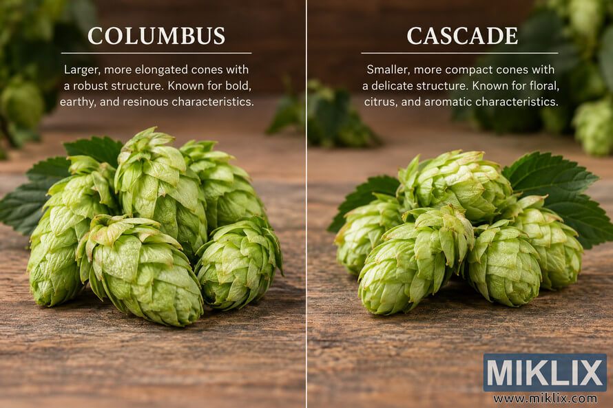
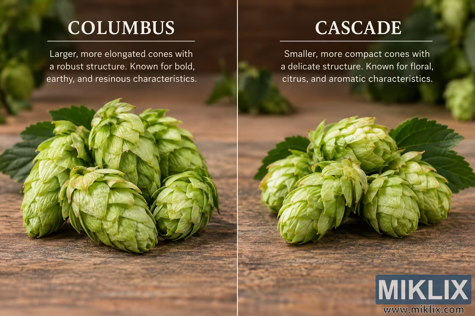
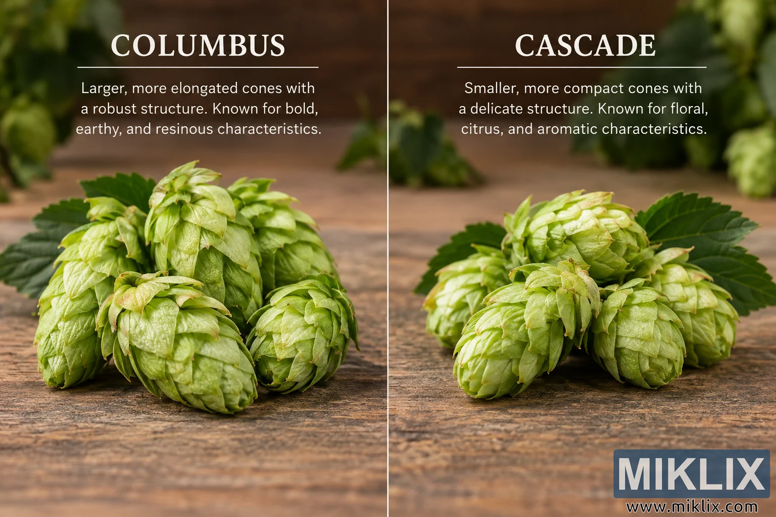
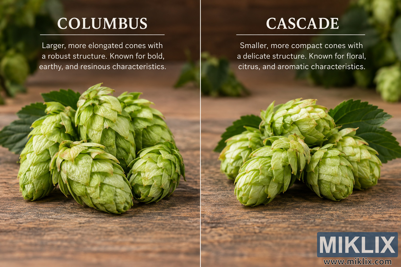
A landscape-oriented educational comparison image presents Columbus and Cascade hop cones side by side in a symmetrical split composition. The photograph has a warm, natural, rustic appearance and is divided vertically through the center by a thin light-colored line. Both halves show fresh green hop cones resting on a weathered wooden tabletop, with softly blurred hop foliage and additional cones in the background. The shallow depth of field keeps the foreground specimens visually prominent while creating a subdued, natural agricultural setting behind them.
The left half is labeled “COLUMBUS” in large, uppercase, cream-white serif lettering near the top. A thin horizontal rule appears beneath the heading. Below it, centered light-colored text describes the Columbus cones as larger and more elongated, with a robust structure, and associates the variety with bold, earthy, and resinous characteristics. The text occupies the upper portion of the left panel, leaving the lower portion for a close photographic view of the hop cones.
The Columbus hop cones are grouped together in the foreground on the left side. They appear relatively long, substantial, and tapered, with overlapping layers of pale to medium green bracts. Several cones lean or rest at slightly different angles, making their elongated profiles easy to see. The foremost cone extends toward the viewer and displays numerous layered, leaf-like scales with subtle variations in green. Other cones rise behind it, creating a dense cluster with a noticeably robust appearance. Darker green hop leaves surround portions of the cluster and provide contrast against the lighter green cones. Fine highlights on the bracts suggest fresh plant material and emphasize the texture, folds, veins, and layered structure of each cone.
The right half is labeled “CASCADE” in matching large, uppercase, cream-white serif lettering. As on the Columbus side, a thin horizontal line separates the heading from the descriptive copy below. The centered text describes Cascade as having smaller, more compact cones with a delicate structure and associates the variety with floral, citrus, and aromatic characteristics. The typography, spacing, and placement mirror the left side, reinforcing the impression of a controlled side-by-side comparison.
The Cascade hop cones are arranged in a compact foreground cluster on the right. Compared visually with the Columbus specimens, these cones appear somewhat shorter, rounder, and more tightly formed. Their overlapping green bracts create compact shapes with softly pointed ends. Several cones overlap one another, including a prominent cone near the center-front and additional cones extending toward the lower right and left of the cluster. A broad, dark green hop leaf rises behind the cones and helps frame the arrangement. The Cascade specimens share the fresh yellow-green coloration of the Columbus cones but are presented in a way that emphasizes their more compact proportions.
Across both halves, the tabletop has a strongly textured, aged appearance, with visible grain, irregular marks, and brown tones ranging from tan to deep umber. This rustic surface provides a neutral, earthy background that complements the green plant material. The upper background is deliberately out of focus. Blurred green hop cones and foliage appear along the upper left and upper right edges, while a warm brown area occupies much of the center background. This combination creates visual depth without distracting from the foreground comparison.
Lighting is soft but directional, producing gentle highlights on the hop bracts and subtle shadows beneath and between the cones. The warm illumination gives the scene an inviting agricultural and craft-oriented character while preserving enough detail to distinguish the physical structures of the two groups. The color palette is dominated by fresh greens, warm browns, and restrained cream-white typography. There are no visible commercial logos, product packages, brewery marks, or other brand identifiers.
The overall composition functions as both a botanical-style photograph and an informational comparison graphic. The vertical divider establishes two clearly defined sections, while matching typography and similar photographic scale make the visual differences between the hop cones straightforward to inspect. Columbus occupies the left side and is represented by a fuller group of comparatively elongated cones, whereas Cascade occupies the right side and is represented by a compact grouping of comparatively shorter, tighter cones. The combination of realistic plant photography, rustic wood, shallow depth of field, concise explanatory text, and balanced side-by-side organization gives the image the appearance of a polished educational graphic about hop varieties used in brewing.